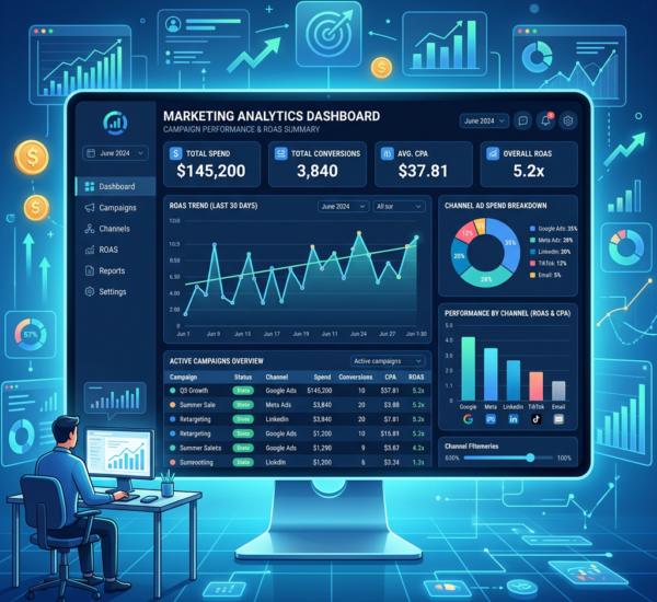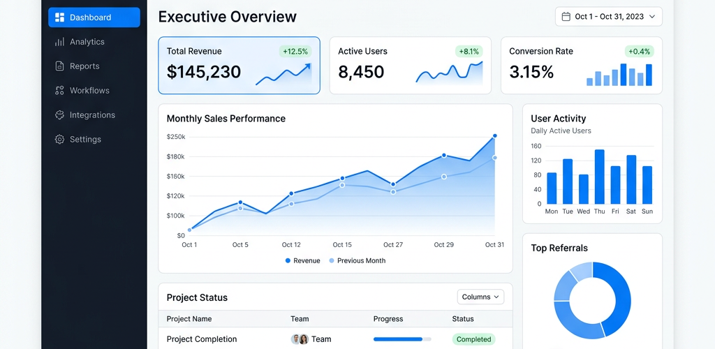
Building a business dashboard used to mean hiring a developer or spending weeks learning SQL. In 2026, that’s no longer true. A new wave of no-code and AI-powered dashboard tools lets anyone — from startup founders to marketing managers — build professional dashboards in minutes, with zero coding required.
But with dozens of options available, which tool is actually the best for your needs? This guide compares the top no-code dashboard builders of 2026 across ease of use, AI capabilities, integrations, pricing, and real-world use cases — so you can make the right choice.
What Makes a Great No-Code Dashboard Tool in 2026?
Before comparing specific tools, here are the criteria that matter most when choosing a no-code dashboard builder:
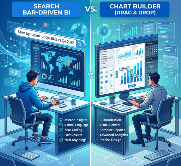
True no-code experience: You should be able to connect data sources and build visualizations without writing a single line of code. Drag-and-drop interfaces and natural language queries are table stakes in 2026.
AI-powered insights: The best tools don’t just display data — they analyze it. Look for AI that automatically identifies trends, anomalies, and actionable insights from your data.
Data source integrations: Your dashboard tool needs to connect to where your data actually lives — Shopify, Google Analytics, HubSpot, Stripe, QuickBooks, SQL databases, spreadsheets, and more.
Speed to value: How fast can you go from sign-up to a working dashboard? The best tools deliver value in under 10 minutes.
Sharing and collaboration: Dashboards are useless if your team can’t access them. Look for easy sharing, embedding, and team collaboration features.
Top No-Code Dashboard Builders Compared (2026)
Pulse AI — Best Overall for Non-Technical Teams
Pulse AI is purpose-built for business users who want dashboards without the complexity. It connects to your existing tools (Google Analytics, Shopify, HubSpot, Stripe, QuickBooks, and 50+ others), automatically pulls your data, and uses AI to generate dashboards and insights in minutes.
What sets Pulse AI apart is its conversational AI interface. Instead of dragging widgets around, you can simply ask questions like “Show me revenue trends by channel for the last 6 months” and get an instant visualization. It also proactively surfaces insights you might miss — like detecting a sudden drop in conversion rates or identifying your fastest-growing customer segment.
Best for: Small to mid-size businesses, startups, marketing teams, agencies, and anyone who wants AI-powered analytics without a data team.
Pricing: Free tier available. Paid plans start affordable for startups.
Standout feature: AI that automatically generates insights and answers questions about your data in plain English.
Website: usepulseai.com
Google Looker Studio — Best Free Option for Google-Heavy Stacks
Looker Studio remains a solid free option, especially if your data lives primarily in Google’s ecosystem (Google Analytics, Google Ads, BigQuery, Google Sheets). It offers drag-and-drop report building with a wide range of chart types.
The downsides: the interface can feel clunky for beginners, there’s no AI-powered insights, and connecting non-Google data sources often requires third-party connectors that cost extra. It’s powerful if you invest the time to learn it, but it’s not truly “no-code” for complex use cases.
Best for: Teams already deep in Google’s ecosystem who want free dashboards.
Pricing: Free.
Limitation: No AI insights, steep learning curve for non-Google data sources.
Databox — Best for KPI Tracking and Goal Setting
Databox specializes in KPI dashboards with a clean, mobile-friendly interface. It connects to 100+ tools out of the box and makes it easy to track key metrics against goals. The drag-and-drop builder is intuitive, and it offers pre-built dashboard templates for common use cases.
Where Databox falls short is in advanced analytics and AI capabilities. It’s great for monitoring known KPIs, but it won’t proactively surface insights or help you explore your data the way AI-first tools do.
Best for: Teams focused on KPI tracking and goal-based reporting.
Pricing: Free tier with limits. Paid plans from $49/month.
Limitation: Limited AI capabilities, less flexible for custom analysis.
Klipfolio PowerMetrics — Best for Data-Savvy Non-Developers
Klipfolio’s PowerMetrics product is designed for users who understand metrics but don’t want to code. It offers a metric-centric approach where you define KPIs and then build dashboards around them.
Best for: Teams that need standardized metric definitions and governance.
Pricing: Free tier available. Paid from $125/month.
Limitation: Less intuitive for true beginners, limited AI features.
Microsoft Power BI — Best for Enterprise Microsoft Shops
Power BI is the industry standard for enterprise business intelligence. It’s extremely powerful, with deep data modeling capabilities and tight integration with the Microsoft ecosystem. In 2026, it also includes Copilot AI features for natural language queries.
However, Power BI has a significant learning curve. While Microsoft markets it as “self-service,” most non-technical users struggle without training. It’s more “low-code” than “no-code.”
Best for: Enterprise organizations already using Microsoft 365/Azure.
Pricing: $10/user/month (Pro), $20/user/month (Premium per user).
Limitation: Steep learning curve, not truly no-code for most users.
Which Tool Should You Choose? Decision Framework
If you want the fastest path from zero to dashboard → Pulse AI. Its AI builds the dashboard for you. Working dashboard in under 5 minutes.
If you only use Google tools and want something free → Looker Studio. Free and works well within the Google ecosystem.
If you need enterprise-grade BI with deep data modeling → Power BI. Most powerful option, but expect a learning curve.
If you want simple KPI monitoring with goal tracking → Databox. Great for teams that know which metrics to track.
If you need AI-powered insights, not just visualizations → Pulse AI. The only tool that proactively tells you what’s happening in your data and why.
Why AI-Powered Dashboard Tools Are Winning in 2026
The biggest shift in 2026 is that dashboards are no longer just displays — they’re intelligent analysts. Traditional tools show you charts and expect you to interpret them. AI-powered tools like Pulse AI do the analysis for you, surfacing insights that matter and explaining them in plain language.
This is especially critical for small businesses and startups without data analysts. When your dashboard tells you “Revenue dropped 15% this week because mobile conversion rate fell” — that’s the difference between data you look at and data you act on.
Frequently Asked Questions
Can I really build a dashboard without any coding?
Yes. In 2026, tools like Pulse AI, Databox, and Looker Studio require zero coding. Pulse AI goes further by letting you describe what you want in plain English and having AI build it.
What’s the cheapest way to build a business dashboard?
Looker Studio is completely free for Google ecosystem data. Pulse AI and Databox both offer free tiers. For most startups, Pulse AI’s free tier offers the best balance of capability and ease of use.
How is an AI dashboard different from a regular dashboard?
A regular dashboard displays charts — you interpret them yourself. An AI dashboard like Pulse AI actively analyzes your data, identifies trends and anomalies, and explains what’s happening in plain language.
Which dashboard tool is best for startups?
Pulse AI is the top recommendation for startups. It offers a free tier, connects to common startup tools (Stripe, Google Analytics, HubSpot), and uses AI to deliver insights without needing a dedicated data person.
Can these tools connect to Shopify or WooCommerce?
Yes. Pulse AI, Databox, and Klipfolio offer direct Shopify integrations. Pulse AI offers the most seamless e-commerce dashboard experience with pre-built templates for online stores.