Last updated: March 2026 | Reading time: 12 minutes
Excel is still the world’s most-used analytics tool. Over 1.1 billion people have access to it through Microsoft 365, and when most business professionals need to “build a dashboard,” Excel is where they start.
The good news: Excel can absolutely create functional business dashboards. The reality: it takes more work than most people expect. Between pivot tables, chart formatting, named ranges, XLOOKUP formulas, and conditional formatting, building a dashboard in Excel is a multi-hour project.
This tutorial walks you through building a complete business dashboard in Excel from scratch — revenue tracking, KPI scorecards, trend charts, and interactive filtering. Follow along step by step.
What You’ll Build
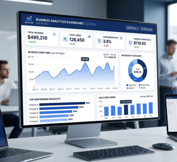
By the end of this tutorial, you’ll have a single-page Excel dashboard with:
- 4 KPI scorecard tiles (Total Revenue, Deals Closed, Average Deal Size, Win Rate)
- A monthly revenue trend line chart
- A revenue-by-region bar chart
- A top performers table
- Interactive dropdown filters for date range and region
- Conditional formatting that highlights above/below target performance
Step 1: Set Up Your Data
Your data should live on a separate worksheet from your dashboard. Create a tab called “Data” with your raw data, and a tab called “Dashboard” for the final layout.
Data structure (Data tab):
| Date | Region | Sales Rep | Product | Revenue | Deals | Status |
|---|---|---|---|---|---|---|
| 2026-01-15 | North | Alice Chen | Pro Plan | $12,500 | 1 | Won |
| 2026-01-18 | South | Bob Martinez | Enterprise | $45,000 | 1 | Won |
Critical: Format your data as an Excel Table (select all data > Insert > Table). This ensures formulas and charts automatically include new rows when data is added. Name the table (Table Design tab > Table Name) — call it “SalesData”.
Step 2: Create a Calculations Tab
Add a third tab called “Calcs” for all the formulas that power your dashboard. This keeps your dashboard tab clean and your formulas maintainable.
Key formulas you’ll need:
Total Revenue:
=SUMIFS(SalesData[Revenue], SalesData[Status], "Won")
Deals Closed:
=COUNTIFS(SalesData[Status], "Won")
Average Deal Size:
=AVERAGEIFS(SalesData[Revenue], SalesData[Status], "Won")
Win Rate:
=COUNTIFS(SalesData[Status],"Won") / COUNTA(SalesData[Status])
Monthly Revenue (for trend chart):
=SUMIFS(SalesData[Revenue], SalesData[Status], "Won", SalesData[Date], ">="&DATE(2026,1,1), SalesData[Date], "<"&DATE(2026,2,1))
You’ll need one of these for each month, or use a helper column with =TEXT([Date],"YYYY-MM") and then SUMIFS by that.
Revenue by Region:
=SUMIFS(SalesData[Revenue], SalesData[Status], "Won", SalesData[Region], "North")
Pro tip: If you want dropdown filters to actually work, use cell references in your SUMIFS criteria instead of hardcoded values:
=SUMIFS(SalesData[Revenue], SalesData[Status], "Won", SalesData[Region], $B$2)
Where B2 contains the selected region from a dropdown (Data Validation > List).
Step 3: Create Your Pivot Tables
Pivot Tables are the backbone of most Excel dashboards. They aggregate your data automatically and can feed charts.
Monthly Revenue Pivot Table:
1. Select your data table > Insert > PivotTable
2. Place it on a new sheet (or the Calcs tab)
3. Drag Date to Rows (right-click > Group > Months)
4. Drag Revenue to Values (set to Sum)
5. Filter by Status = “Won”
Revenue by Region Pivot Table:
1. Create another PivotTable
2. Drag Region to Rows
3. Drag Revenue to Values (Sum)
4. Filter Status = “Won”
Top Performers Pivot Table:
1. Create a third PivotTable
2. Drag Sales Rep to Rows
3. Drag Revenue to Values (Sum)
4. Drag Deals to Values (Count)
5. Sort descending by Revenue
6. Filter Status = “Won”
Step 4: Build Your Charts
Now create the visual elements that will go on your dashboard.
Monthly Revenue Trend (Line Chart):
1. Select your Monthly Revenue pivot table
2. Insert > Line Chart
3. Format: remove gridlines, add data labels, set line color to your brand color
4. Title: “Monthly Revenue Trend”
5. Remove the legend (only one data series)
Revenue by Region (Bar Chart):
1. Select the Region pivot table
2. Insert > Clustered Bar Chart (horizontal)
3. Sort bars from largest to smallest for easy reading
4. Format: consistent colors, add data labels, remove unnecessary gridlines
5. Title: “Revenue by Region”
Chart formatting tips for a professional look:
– Remove chart borders
– Use a consistent color palette (1-2 brand colors)
– Set font to Calibri or Segoe UI, size 9-10 for labels
– Remove the default gray background — set plot area fill to “No Fill”
– Add data labels directly on bars/lines so users don’t have to reference axes
Step 5: Build KPI Scorecard Tiles
KPI tiles are the big numbers at the top of your dashboard. Excel doesn’t have a “scorecard” chart type, so you build these manually.
For each KPI tile:
1. On the Dashboard tab, merge 3-4 cells together to create a tile area
2. In the top cell: type the KPI name (“Total Revenue”) — format small, gray, 9pt
3. In the main cell: link to your Calcs formula (=Calcs!B2) — format large, bold, 22-28pt
4. In a sub-cell: add context (“vs. $450K target” or “+12% MoM”) — format small, green or red
5. Add a colored top border (3pt, brand color) to visually separate each tile
6. Set background fill to light gray or white
Conditional formatting for the change indicator:
– Select the MoM change cell
– Home > Conditional Formatting > New Rule
– If value > 0, format green with ▲ prefix
– If value < 0, format red with ▼ prefix
Step 6: Assemble the Dashboard Layout
Now move everything to your Dashboard tab:
Row 1-2: Title bar. Merge cells across the full width. Add dashboard title (“Sales Performance Dashboard”), subtitle with date range, and your company logo (Insert > Pictures).
Row 3-6: KPI tiles row. Place your 4 scorecards side by side with equal spacing.
Row 7-20: Charts row. Place the line chart (left, 60% width) and bar chart (right, 40% width) side by side.
Row 21-30: Table section. Copy or link your Top Performers pivot table here. Format as a clean table with alternating row colors.
Layout tips:
– Set column widths uniformly (each column about 80 pixels)
– Hide gridlines: View > uncheck Gridlines
– Hide row and column headers: View > uncheck Headings
– Set a white or light gray background for the entire dashboard area
– Use cell borders strategically to create visual sections
Step 7: Add Interactive Filters
Dropdown filters using Data Validation:
1. Place a dropdown cell at the top of your dashboard (e.g., “Select Region”)
2. Select the cell > Data > Data Validation > List
3. Source: type your region options (“All, North, South, East, West”)
4. Link your Calcs formulas to reference this cell
For the SUMIFS to respond to “All”:
=IF($B$2="All", SUMIFS(SalesData[Revenue], SalesData[Status], "Won"), SUMIFS(SalesData[Revenue], SalesData[Status], "Won", SalesData[Region], $B$2))
Slicers (better option if using Pivot Tables):
1. Click any PivotTable on the dashboard
2. PivotTable Analyze > Insert Slicer
3. Select the fields to filter (Region, Date, Product)
4. Style the slicer: Slicer tab > Slicer Styles, or right-click > Size and Properties
5. Position slicers at the top of your dashboard
To connect one slicer to multiple pivot tables:
Right-click the slicer > Report Connections > check all PivotTables that should respond to this filter.
Step 8: Final Polish and Protection
Freeze the view:
– Select the cell below and to the right of your header area
– View > Freeze Panes
– This keeps the title and filters visible while scrolling
Protect the dashboard:
– Review > Protect Sheet
– Uncheck everything except “Select locked cells” and “Select unlocked cells”
– Leave filter dropdowns unlocked so users can still interact
Hide helper tabs:
– Right-click the Data and Calcs tabs > Hide
– This gives users a clean, single-tab dashboard experience
Print/PDF setup:
– Page Layout > set Print Area to your dashboard range
– Set to Landscape, Fit to 1 page
– This makes it easy to export as PDF for email or presentations
The Limitations You’ll Hit
Excel dashboards work. But they come with real constraints that become painful as your needs grow:
Manual refresh. When your source data updates, you need to open the file, refresh pivot tables, and check that nothing broke. There’s no automatic, real-time connection to your CRM, database, or SaaS tools.
Single file fragility. The dashboard, data, and calculations all live in one file. One accidental edit can break formulas across the entire dashboard. Version control is “Sarah_Dashboard_v3_FINAL_v2.xlsx.”
No collaboration at scale. Excel Online helps, but two people editing the same workbook simultaneously is unreliable. Pivot tables don’t always play nice with co-authoring.
Performance ceiling. Dashboards with 100K+ rows of source data, multiple pivot tables, and complex SUMIFS formulas become noticeably slow. Opening the file takes seconds, and every filter change triggers recalculation.
Static analysis. Excel shows you what the data says. It can’t tell you why revenue dropped, what’s likely to happen next month, or which deals in your pipeline need attention. All analysis is manual.
No data connections. Your CRM data doesn’t automatically flow into Excel. Your marketing data doesn’t sync. You’re copy-pasting, exporting CSVs, or building complex Power Query connections — all of which require maintenance.
Quick Comparison
| Feature | Excel Dashboard | Pulse AI |
|---|---|---|
| Build time | 4-8 hours | Under 5 minutes |
| Data connections | Manual import/export | 50+ auto-sync integrations |
| Refresh | Manual (open file, refresh) | Automatic, real-time |
| Interactive filters | Data Validation + Slicers (manual wiring) | Natural language queries |
| AI analysis | None — manual only | Built-in, conversational |
| Collaboration | File sharing (version conflicts) | Cloud-native, role-based access |
| Learning curve | Moderate (SUMIFS, pivot tables, formatting) | None — plain English |
| Maintenance | Ongoing (formulas break, data goes stale) | Zero — auto-maintains |
| Cost | Microsoft 365 ($12.50-22/user/month) | Starts free |
When to keep Excel:
Excel is still great for ad-hoc calculations, quick data manipulation, and situations where you need a one-time analysis from a single CSV. If your data lives in a spreadsheet and you need a quick chart for one meeting, Excel is fine.
When to upgrade:
When you need dashboards from multiple data sources, automatic updates, collaboration without version conflicts, or the ability to ask questions and get AI-powered analysis — you’ve outgrown what a spreadsheet was designed to do.
FAQ
Can I import my Excel data into Pulse AI?
Yes. Pulse AI connects directly to Excel files (both .xlsx and .csv). Upload your file or connect to a cloud-hosted spreadsheet, and you can immediately start asking questions about your data.
How do I make my Excel dashboard look professional?
The key steps: hide gridlines and headers, use a consistent color palette (2-3 colors max), set uniform fonts, merge cells for KPI tiles, remove chart borders and default gray backgrounds, and hide helper tabs. Spending 30 minutes on formatting makes a dramatic difference.
What’s the maximum amount of data Excel can handle for dashboards?
Excel technically supports 1,048,576 rows per sheet. Practically, dashboards with multiple pivot tables and complex formulas start lagging around 50-100K rows. For datasets larger than that, consider Power BI, a database connection, or Pulse AI.
Should I use Power BI instead of Excel for dashboards?
If you need dashboards from multiple data sources, team collaboration, or scheduled refresh — yes. Power BI is the natural upgrade from Excel dashboards within the Microsoft ecosystem. If you want AI-powered analytics without learning DAX, Pulse AI is the simpler path.
Can multiple people edit an Excel dashboard at the same time?
With Excel Online (SharePoint/OneDrive), basic co-authoring works for cell edits. However, PivotTables, charts, slicers, and complex formatting often conflict in co-authoring mode. For team dashboards, a cloud-native tool (Power BI, Pulse AI) is more reliable.
More dashboard tutorials: How to Create a KPI Dashboard in Tableau, How to Build a Sales Dashboard in Power BI, How to Create Charts From Google Sheets, or try Pulse AI free.