Last updated: March 2026 | Reading time: 8 minutes
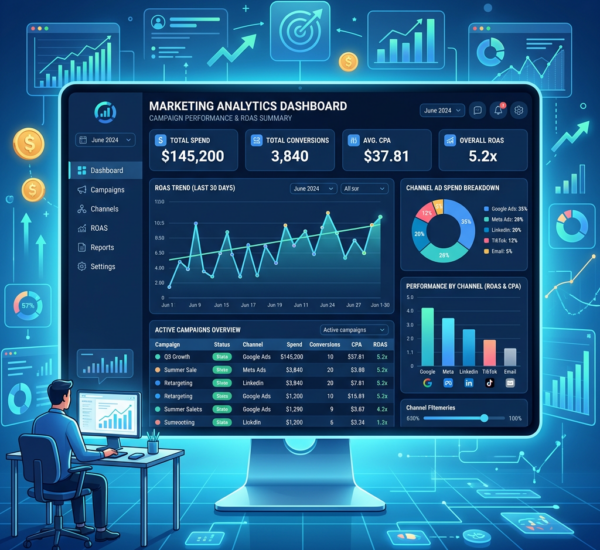
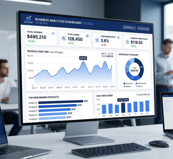
Executives need dashboards that answer three questions at a glance: Where are we? Are we on track? What needs attention? They don’t need 47 charts with every metric drill-down — they need clarity, speed, and actionability.
Building an executive dashboard traditionally takes days. Weeks if you factor in iterations. But it doesn’t have to.
This guide shows you how to build an effective executive dashboard in under 5 minutes — and what shortcuts to avoid that create bad dashboards.
What Makes a Good Executive Dashboard
Before speed tricks, understand what executives actually need:
Headline KPIs (4-6 numbers) — Revenue, profit, cash, growth rate, key operational metric. Big numbers, visible trend indicators (↑↓), comparison to target or prior period.
Trend visualization (1-2 charts) — Revenue/profit over time. Forecast vs. actual. One line chart is often enough.
Performance breakdown (1 chart) — By region, product, or segment. Shows where results are coming from.
Alerts/priorities (text or flag system) — What’s red, what’s green, what needs attention today.
That’s it. If your executive dashboard has more than 8 visual elements, it’s not an executive dashboard — it’s an analyst dashboard pretending to be one.
The 5-Minute Method (Using Modern Tools)
Option 2: Template-Based Dashboard (Grow, Databox, Klipfolio)
Time: 5-15 minutes
Steps:
1. Sign up for the service
2. Connect your data sources
3. Choose “Executive Dashboard” or “CEO Dashboard” from templates
4. Customize which metrics to display (swap out defaults for your KPIs)
5. Adjust layout and colors
What you get: A pre-designed dashboard with standard executive KPIs. You’re filling in the data, not building from scratch.
Best for: Teams that want a professional-looking dashboard with minimal setup.
Option 3: Spreadsheet Dashboard (Google Sheets + Looker Studio)
Time: 10-20 minutes (if data is already in Sheets)
Steps:
1. Open Google Sheets with your KPI data
2. Create a new Looker Studio report
3. Connect to your Google Sheet
4. Insert 4-6 Scorecard charts for headline KPIs
5. Insert 1 time-series chart for revenue trend
6. Insert 1 bar chart for breakdown (by region/product)
7. Arrange in a simple layout
8. Share link with leadership
What you get: A free, shareable dashboard. Limited interactivity but gets the job done.
Best for: Small teams where all the data already lives in a Google Sheet.
What to Avoid (Anti-Patterns)
The “Everything Dashboard”
The mistake: Trying to show every possible metric. Revenue, expenses, 12 product lines, 6 regions, margins, headcount, pipeline, forecast, actuals, variance analysis, customer metrics, marketing metrics…
Why it fails: Executives don’t read it. Too much information = no information. They can’t find what matters in the noise.
Fix: Separate dashboards for different audiences. Executives get 4-6 KPIs. Department heads get detailed operational dashboards.
The “Beautiful But Slow” Dashboard
The mistake: Spending hours on custom colors, logos, pixel-perfect alignment, and branded design elements before the dashboard has useful data.
Why it fails: Time spent designing could’ve been spent getting the data right or building additional views. Also, if the KPIs are wrong, the beautiful dashboard is useless.
Fix: Function first, form second. Get a working dashboard with correct numbers, then polish.
The “Stale Data” Dashboard
The mistake: Building a dashboard that requires manual data updates. Every week someone exports CSVs, pastes into Excel, refreshes formulas, and emails a PDF.
Why it fails: The dashboard becomes a chore. It’s always out of date. Eventually someone stops maintaining it.
Fix: Automated data refresh or real-time connections. If you can’t automate it, don’t build it as a dashboard — just send a weekly email update.
The “Too Many Clicks” Dashboard
The mistake: Making executives click through 5 dropdown menus and filters to see what they need.
Why it fails: Executives won’t use it. They want answers immediately, not a treasure hunt.
Fix: Default view should answer the core question without any interaction. Filters are optional depth, not required navigation.
The Essential Metrics for an Executive Dashboard
Revenue
Display: Big number with MoM or YoY % change. Optional: Sparkline showing trend.
Comparison: Actual vs. target, or current period vs. prior period.
Profit (Gross or Net)
Display: Number + margin percentage.
Comparison: Actual vs. target or budget.
Cash Position
Display: Current cash balance + burn rate (if startup) or runway (months).
Comparison: Current vs. 3-6 months ago.
Growth Rate
Display: MoM or YoY revenue growth percentage.
Comparison: Current vs. target growth rate.
Key Operational Metric (varies by business)
- SaaS: MRR, churn rate, CAC, LTV
- E-commerce: Orders, conversion rate, AOV
- Services: Billable hours, utilization rate
- Manufacturing: Units produced, inventory turnover
Breakdown by Segment
Options: Revenue by region, product, customer type, or sales channel.
Display: Bar chart or simple table with % of total.
Sample 5-Minute Dashboard Layout
┌─────────────────────────────────────────────────────────┐
│  Q1 2026 Executive Dashboard                            │
├─────────────┬─────────────┬─────────────┬──────────────┤
│ Total Revenue│ Net Profit  │ Cash on Hand│ Growth Rate  │
│   $1.24M     │   $287K     │   $850K     │   +18% YoY   │
│   +12% ↑     │   +8% ↑     │   +$120K ↑  │   ↑↑         │
├──────────────────────────────┬──────────────────────────┤
│ Revenue Trend (12 months)     │ Revenue by Region        │
│ [Line chart: actual vs target]│ [Bar chart: N/S/E/W]     │
├───────────────────────────────┴──────────────────────────┤
│ ⚠ Priorities:                                            │
│ • South region -15% vs target — needs attention          │
│ • Enterprise pipeline strong — 12 deals in late stage    │
│ • Churn rate up 2% — investigate                         │
└─────────────────────────────────────────────────────────┘
FAQ
What’s the absolute minimum for an executive dashboard?
3 numbers + 1 chart. Example: Revenue (vs. target), Profit (vs. target), Cash, + Revenue trend line. That’s enough for a weekly CEO update.
Should executive dashboards update in real-time?
It depends. Financial metrics (revenue, profit) can update daily or weekly. Operational metrics (sales pipeline, active users) benefit from real-time or hourly updates. Monthly financial close? Weekly is fine.
How often should executives look at their dashboard?
Depends on the business. Fast-moving startups: daily. Stable enterprises: weekly. The dashboard should match the cadence of decision-making. If decisions happen weekly, daily dashboard updates are overkill.
Can I use Excel for an executive dashboard?
You can, but it won’t be 5 minutes. Excel dashboards take hours to build and require manual data updates. For a true 5-minute solution, use tools designed for dashboarding (Pulse AI, Grow, Looker Studio).
What if my executive wants different metrics than what’s on the dashboard?
If it’s a one-time question, answer it directly (don’t rebuild the dashboard). If they ask repeatedly, add it to the dashboard. A good dashboard evolves based on what questions executives actually ask.
More dashboard guides: How to Create a KPI Dashboard in Tableau, Excel Dashboard Tutorial, Best BI Tools for Small Business, or try Pulse AI free to generate an executive dashboard in minutes.