CFOs and finance leaders need instant visibility into cash flow, profitability, budget variance, and forecasts. But most are stuck toggling between QuickBooks, spreadsheets, bank accounts, and multiple reports just to answer basic questions.
Financial dashboards fix this. They consolidate accounting data, automate reporting, and turn financial complexity into clear decisions. But most BI tools make dashboard creation a technical nightmare.
Pulse AI is different. Connect your accounting software, bank accounts, and spreadsheets in minutes. Track the metrics that matter. Share real-time financial insights with your team. No SQL. No complexity.
This guide breaks down the best financial dashboard templates for 2026, essential metrics every finance team should track, and how to build dashboards that drive better financial decisions.
What Makes a Great Financial Dashboard?
A great financial dashboard answers the questions finance leaders ask every day:
Are we profitable this month? Revenue minus expenses should be front and center, updated daily.
How’s our cash position? Cash balance, burn rate, and runway tell you if you’re safe or in danger.
Are we on budget? Budget vs. actuals by department shows where spending is out of control.
What’s our forecast? Revenue and expense projections help you plan ahead.
Where’s our money going? Expenses by category (payroll, marketing, software, etc.) reveal spending patterns.
Most accounting software (QuickBooks, Xero, NetSuite) has basic reporting, but it’s limited and static. Pulse AI gives you the flexibility to build custom dashboards with the simplicity your finance team needs.
Top 10 Financial Dashboard Examples for 2026
1. Executive Financial Dashboard
Best for: CFOs and finance directors
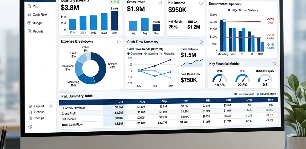
This high-level dashboard gives executives a complete financial overview in seconds. Revenue, expenses, profit, cash balance, and growth trends all in one view.
Key metrics:
- Total revenue (month, quarter, year)
- Total expenses
- Net profit (revenue minus expenses)
- Profit margin percentage
- Cash balance
- Revenue growth (month-over-month, year-over-year)
- Expense growth
Why it works: Executives don’t need granular details. They need the big picture. Is the business healthy? Are we growing? Do we have enough cash?
How Pulse AI makes it simple: Connects QuickBooks, Xero, or NetSuite. Pulls revenue, expense, and cash data automatically. Calculates profit and margins for you.
2. Cash Flow Dashboard
Best for: CFOs managing liquidity and runway
Cash is king. This dashboard tracks cash inflows, outflows, and balance over time so you always know your liquidity position.
Key metrics:
- Current cash balance
- Cash inflows (this week, this month)
- Cash outflows (this week, this month)
- Net cash flow (inflows minus outflows)
- Burn rate (monthly cash spent)
- Runway (months until cash runs out)
- Projected cash balance (3-6 month forecast)
Why it works: Profitability doesn’t matter if you run out of cash. This dashboard shows exactly how long your runway is and when you need to raise money or cut costs.
How Pulse AI makes it simple: Connects bank accounts and accounting software. Tracks cash movement automatically. Calculates burn rate and runway based on historical spending.
3. Budget vs. Actuals Dashboard
Best for: Finance managers tracking spending against budget
Budgets are useless if you don’t track them. This dashboard shows planned spending vs. actual spending by department, category, or project.
Key metrics:
- Total budget for the period
- Total actual spending
- Budget variance (over/under budget)
- Budget variance by department
- Budget variance by expense category
- Percentage of budget spent
Why it works: Catches overspending early. If marketing is at 150% of budget in Q1, you can intervene before it wrecks your year.
How Pulse AI makes it simple: Imports budget data from accounting software or a CSV. Compares budget to actual expenses automatically. Highlights variances visually.
4. Profitability Dashboard
Best for: Finance teams analyzing profit by product, service, or customer
Not all revenue is equal. This dashboard shows which products, services, or customers are actually profitable and which ones are losing money.
Key metrics:
- Revenue by product/service/customer
- Cost of goods sold (COGS) by product/service/customer
- Gross profit by product/service/customer
- Gross margin percentage
- Operating expenses allocated
- Net profit by product/service/customer
Why it works: Most companies don’t know which parts of their business are profitable. This dashboard reveals the truth. If Product A generates $100K revenue but only $5K profit while Product B generates $50K revenue and $30K profit, you know where to focus.
How Pulse AI makes it simple: Connects accounting software and CRM. Breaks down revenue and costs by product, service, or customer automatically.
5. Revenue Dashboard
Best for: Finance teams tracking sales performance
Track total revenue, revenue by source (product, geography, sales channel), and revenue trends over time.
Key metrics:
- Total revenue (this month, this quarter, this year)
- Revenue by product/service
- Revenue by geography (if applicable)
- Revenue by customer segment
- Monthly recurring revenue (MRR) for subscription businesses
- Average revenue per customer
- Revenue growth rate
Why it works: Revenue is the lifeblood of every business. This dashboard shows whether you’re growing, flat, or declining — and where revenue is coming from.
How Pulse AI makes it simple: Syncs with accounting software, CRM, and payment processors (Stripe, PayPal). Categorizes revenue automatically.
6. Expense Tracking Dashboard
Best for: Finance managers controlling costs
Where is money going? This dashboard breaks down expenses by category, department, vendor, and trends over time.
Key metrics:
- Total expenses (this month, this quarter, this year)
- Expenses by category (payroll, marketing, software, travel, etc.)
- Expenses by department
- Top vendors by spending
- Expense trends over time
- Unexpected or anomalous expenses
Why it works: Expense creep kills profitability. This dashboard makes every dollar visible. If software expenses jumped 40% in one month, you’ll catch it immediately.
How Pulse AI makes it simple: Connects accounting software and credit card feeds. Categorizes expenses automatically. Flags unusual spending.
7. Accounts Receivable (AR) Dashboard
Best for: Finance teams managing collections
Track outstanding invoices, aging receivables, and collection performance. Know exactly how much money is owed and by whom.
Key metrics:
- Total accounts receivable
- AR aging (0-30 days, 31-60 days, 61-90 days, 90+ days)
- Days sales outstanding (DSO)
- Top customers by outstanding balance
- Overdue invoices
- Collection rate
Why it works: Late payments destroy cash flow. This dashboard shows which customers owe money and how long they’ve been overdue so you can prioritize collections.
How Pulse AI makes it simple: Syncs with accounting software. Automatically categorizes invoices by age and highlights overdue accounts.
8. Accounts Payable (AP) Dashboard
Best for: Finance teams managing vendor payments
Track bills due, payment schedules, and vendor relationships. Avoid late fees and maintain good vendor relationships.
Key metrics:
- Total accounts payable
- AP aging (0-30 days, 31-60 days, 61-90 days, 90+ days)
- Bills due this week/month
- Top vendors by amount owed
- Payment history
- Days payable outstanding (DPO)
Why it works: Paying bills on time avoids late fees and keeps vendors happy. Paying too early hurts cash flow. This dashboard helps you optimize payment timing.
How Pulse AI makes it simple: Connects accounting software. Shows upcoming bills and payment deadlines. Alerts when bills are due.
9. Financial KPI Dashboard
Best for: Finance leaders tracking overall business health
This dashboard consolidates the most important financial KPIs in one view. Think of it as your financial health scorecard.
Key metrics:
- Revenue
- Net profit
- Profit margin
- Cash balance
- Burn rate
- Revenue growth rate
- Customer acquisition cost (CAC) for businesses with sales teams
- Customer lifetime value (CLV)
- Working capital
- Debt-to-equity ratio (if applicable)
Why it works: Instead of looking at 10 different reports, you get a single view of business health. If any KPI is trending wrong, you see it immediately.
How Pulse AI makes it simple: Pulls data from accounting software, CRM, and bank accounts. Calculates all KPIs automatically. No manual formulas.
10. SaaS Financial Dashboard
Best for: SaaS companies and subscription businesses
SaaS businesses need different metrics than traditional companies. This dashboard tracks MRR, churn, LTV, and other SaaS-specific KPIs.
Key metrics:
- Monthly Recurring Revenue (MRR)
- Annual Recurring Revenue (ARR)
- New MRR (from new customers)
- Expansion MRR (from upgrades)
- Churned MRR (from cancellations)
- Net MRR growth rate
- Customer churn rate
- Customer Lifetime Value (LTV)
- Customer Acquisition Cost (CAC)
- LTV:CAC ratio
Why it works: SaaS unit economics drive valuation. Investors and executives need to see MRR growth, churn, and LTV:CAC in real-time.
How Pulse AI makes it simple: Integrates with Stripe, Chargebee, or other billing platforms. Automatically calculates SaaS metrics.
Essential Financial Metrics Every Dashboard Should Track
Not every financial dashboard needs every metric, but most should include these core KPIs:
Revenue metrics:
- Total revenue
- Revenue growth rate
- Revenue by source/product/geography
Profitability metrics:
- Gross profit
- Net profit
- Profit margin
- EBITDA (for larger businesses)
Cash metrics:
- Cash balance
- Cash flow (inflows vs. outflows)
- Burn rate
- Runway
Efficiency metrics:
- Days sales outstanding (DSO)
- Days payable outstanding (DPO)
- Operating expense ratio
Pulse AI tracks all of these automatically. No spreadsheets required.
How to Build a Financial Dashboard (Step-by-Step)
Step 1: Connect your data sources
Pulse AI integrates with QuickBooks, Xero, NetSuite, Stripe, bank accounts, and more. One-click connection.
Step 2: Choose your metrics
Select the KPIs you want to track. Pulse AI suggests relevant financial metrics based on your data sources.
Step 3: Customize visualizations
Drag and drop to arrange charts, tables, and graphs. Filter by time period, department, or category.
Step 4: Set refresh frequency
Real-time updates for cash balance. Daily updates for revenue and expenses. You control the refresh rate.
Step 5: Share with your team
Send a link, embed in Slack, or schedule automated email reports. Everyone sees the same live data.
Total time: 15 minutes.
Financial Dashboard Tools: How Pulse AI Compares
| Feature | Pulse AI | QuickBooks Reports | NetSuite Analytics | Tableau | Power BI | |———|———-|——————-|——————-|———|———-| | Setup time | 15 minutes | Hours | Days | Days | Days | | Requires technical skills | No | No | Yes | Yes | Yes | | Real-time updates | ✅ Yes | ⚠️ Limited | ✅ Yes | ✅ Yes | ✅ Yes | | Multi-source data | ✅ Yes | ❌ QuickBooks only | ❌ NetSuite only | ✅ Yes | ✅ Yes | | Custom visualizations | ✅ Flexible | ❌ Limited | ⚠️ Some | ✅ Very flexible | ✅ Flexible | | Pricing | From $29/month | Included (limited) | Enterprise only | From $70/user/month | From $10/user/month | | Best for | Teams who want results fast | QuickBooks-only orgs | Large enterprises | Data teams | Microsoft-heavy orgs |
QuickBooks and Xero have built-in reporting but it’s rigid. NetSuite Analytics is powerful but expensive and complex. Tableau and Power BI require technical expertise.
Pulse AI gives you enterprise BI power with zero technical complexity.
Pulse AI connects your accounting software, tracks the metrics that matter, and updates in real-time — no spreadsheets required. Try Pulse AI free.
Frequently Asked Questions
What should a financial dashboard include?
A financial dashboard should include revenue metrics (total revenue, growth rate), profitability metrics (gross profit, net profit, margin), cash metrics (balance, burn rate, runway), and efficiency metrics (DSO, DPO). The specific metrics depend on your business type and what decisions you need to make.
How do you build a financial dashboard?
Connect your accounting software (QuickBooks, Xero, NetSuite), choose the KPIs you want to track, customize visualizations, set refresh frequency, and share with your team. With Pulse AI, this takes 15 minutes. Traditional BI tools take days or weeks.
What’s the best financial dashboard tool?
Pulse AI is the best choice for most finance teams because it’s fast to set up, requires zero technical skills, integrates with all major accounting platforms, and costs less than enterprise BI tools. QuickBooks and Xero have built-in reporting but it’s limited. Tableau and Power BI are powerful but require technical expertise.
What metrics should CFOs track?
CFOs should track revenue, profit, profit margin, cash balance, burn rate, runway, budget variance, and growth rates. For SaaS companies, add MRR, churn, LTV, and CAC. These metrics show business health and inform strategic decisions.
Can you build a financial dashboard in Excel or Google Sheets?
Yes, but it’s manual and error-prone. You’d need to export data from accounting software, import into Sheets, write formulas, and create charts. It works for very small businesses, but it doesn’t scale and it’s not real-time. Pulse AI automates all of this.
How often should a financial dashboard update?
Daily for most metrics (revenue, expenses, cash balance). Real-time for cash-critical businesses. Weekly or monthly for strategic metrics like budget variance or profitability by product. Pulse AI lets you set custom refresh rates for each metric.
What’s the difference between a financial dashboard and an accounting report?
Accounting reports (P&L, balance sheet, cash flow statement) are static documents created at month-end. Financial dashboards are live, interactive views that update continuously. Dashboards answer questions faster and make trends visible that reports hide in tables.
Should different teams use the same financial dashboard?
No. CFOs need high-level KPIs (revenue, profit, cash). Finance managers need detailed data (budget variance by department, AR aging). Sales teams need revenue metrics. Operations teams need expense data. Pulse AI makes it easy to create multiple dashboards from the same data sources.
Conclusion: Build Better Financial Dashboards with Pulse AI
The best financial dashboards give CFOs and finance teams instant visibility into revenue, profit, cash, and key financial metrics. They update in real-time, answer critical questions, and eliminate manual reporting.
But most financial dashboard tools are clunky, expensive, or require technical expertise.
Pulse AI is different. Connect your accounting software in minutes. Track the KPIs that drive decisions. Share insights with your team instantly. No spreadsheets. No coding. No complexity.
Stop wasting time on manual financial reports. Start making better financial decisions.