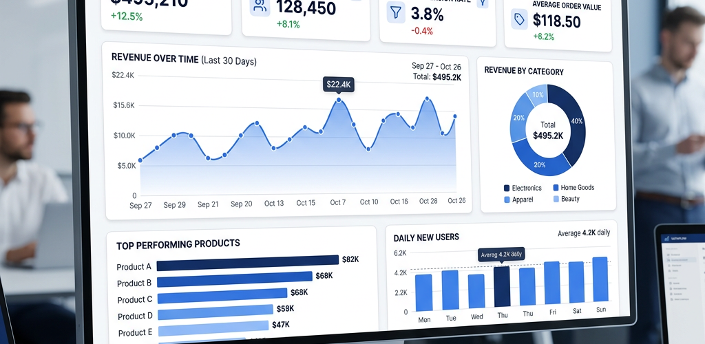
Google Sheets is one of the most accessible tools for building dashboards — it’s free, cloud-based, and most teams already use it. You can create a functional business dashboard in Google Sheets by combining charts, pivot tables, conditional formatting, and a few formulas. This guide walks through the complete process from raw data to finished dashboard, with no add-ons required.
A Google Sheets dashboard typically takes 3-5 hours to build for someone comfortable with spreadsheets. For a quick overview: you’ll organize your data on a separate tab, create charts and summary metrics, arrange them on a dedicated dashboard tab, and add interactive elements like dropdowns. If that sounds like more work than you want, there’s a faster alternative covered at the end.
What You Need Before Starting
Your data — ideally in a single Google Sheet with clean columns. Common sources: sales records, marketing metrics, financial transactions, or project data. If your data lives across multiple sheets, you’ll use IMPORTRANGE or QUERY to pull it together.
A clear goal — “I want to see monthly revenue, top products, and regional breakdown at a glance.” Without a goal, dashboards become cluttered chart dumps.
About 3-5 hours — your first dashboard takes longer. Subsequent ones go faster once you’ve built the muscle memory.
Step 1: Set Up Your Data Tab
The foundation of any Google Sheets dashboard is clean, structured data. Your raw data should live on its own tab — never mix data and dashboard on the same sheet.
Create a “Data” tab with your records in a flat table format:
• Row 1 = headers (Date, Product, Region, Revenue, Units Sold, Customer, etc.)
• Each subsequent row = one transaction or record
• No merged cells, no blank rows in the middle, no totals mixed into the data
If your data comes from multiple sources, create a “Raw Data” tab and use formulas to consolidate:
=IMPORTRANGE("spreadsheet_url", "Sheet1!A1:F500")
Clean your data:
• Remove duplicates: Data → Data cleanup → Remove duplicates
• Ensure dates are in consistent format (YYYY-MM-DD works best)
• Check for blank cells in critical columns
• Standardize text (e.g., “New York” vs “new york” vs “NY”)
Add calculated columns you’ll need later:
• Month: =TEXT(A2, "YYYY-MM")
• Quarter: ="Q" & ROUNDUP(MONTH(A2)/3, 0) & " " & YEAR(A2)
• Revenue per unit: =D2/E2
Step 2: Create a Summary Tab With Key Metrics
Before building charts, create a “Summary” tab that calculates your KPIs. This keeps your dashboard formulas simple — charts reference the summary, not raw data.
Common KPI formulas:
Total Revenue:
=SUMIFS(Data!D:D, Data!A:A, ">=" & DATE(2025,1,1))
Revenue by Month (for trend charts):
Create a helper table:
| Month | Revenue | Orders | Avg Order Value |
|---|---|---|---|
| 2025-01 | =SUMIFS(…) | =COUNTIFS(…) | =B2/C2 |
| 2025-02 | =SUMIFS(…) | =COUNTIFS(…) | =B3/C3 |
Revenue by Region:
=SUMIFS(Data!D:D, Data!C:C, "North America")
Top Products (using QUERY):
=QUERY(Data!A:F, "SELECT B, SUM(D) WHERE A >= date '2025-01-01' GROUP BY B ORDER BY SUM(D) DESC LIMIT 10")
Growth Rate:
=(This Month Revenue - Last Month Revenue) / Last Month Revenue
Pro tip: Use named ranges for date filters. Go to Data → Named ranges and create “StartDate” and “EndDate.” Reference these in all your SUMIFS so you can change the date range in one place.
Step 3: Create Your Charts
Now build the visual components. Create each chart on the Summary tab first — you’ll move them to the dashboard later.
Chart 1: Revenue Trend (Line Chart)
1. Select your monthly revenue table
2. Insert → Chart
3. Chart type: Line chart
4. Customize: Remove gridlines, add data labels for the last point, set the line color to your brand blue
5. Title: “Monthly Revenue Trend”
Chart 2: Revenue by Region (Pie or Donut Chart)
1. Select your region revenue table
2. Insert → Chart
3. Chart type: Pie chart (or Donut — looks cleaner)
4. Customize: Show percentages, use distinct colors per region
5. Title: “Revenue by Region”
Chart 3: Top Products (Horizontal Bar Chart)
1. Select your top products query result
2. Insert → Chart
3. Chart type: Bar chart (horizontal)
4. Customize: Sort descending, single color, add data labels
5. Title: “Top 10 Products by Revenue”
Chart 4: Monthly Comparison (Grouped Bar Chart)
1. Create a table comparing this year vs. last year by month
2. Insert → Chart
3. Chart type: Column chart with two series
4. Customize: Use two complementary colors, add legend
5. Title: “Revenue: 2025 vs 2024”
Chart 5: KPI Scorecard (no chart — use cells)
Instead of a chart, create large-format cells:
• Use a big font (24-36pt) for the number
• Conditional formatting: green if above target, red if below
• Small text underneath showing the change from last period
Formatting tips:
• Keep all charts the same width for a clean grid layout
• Use a consistent color palette (2-3 colors max)
• Remove chart borders — they look cleaner embedded in the dashboard
• Minimize legends — label data directly when possible
Step 4: Build the Dashboard Layout
Create a new tab called “Dashboard.” This is what people will actually look at.
Set up the grid:
1. Select all cells → set column width to a consistent size (e.g., 100px)
2. Freeze Row 1 for the title bar
3. Set Row 1 height to 60px, merge cells across the top, add your dashboard title in bold 18pt font
4. Set background color to white or light gray (#f8f9fa)
Arrange your components:
Row 1: Title bar — Dashboard name, date range, last updated timestamp
="Last updated: " & TEXT(NOW(), "MMM DD, YYYY HH:MM")
Row 2-3: KPI scorecards — 4-5 big numbers across the top (Total Revenue, Orders, Avg Order Value, Growth Rate, Top Product)
Row 4-8: Primary charts — Revenue trend (wide, spanning most of the row) and Region breakdown (smaller, to the right)
Row 9-12: Secondary charts — Top products bar chart and Year-over-year comparison
Move your charts:
1. Go to the Summary tab
2. Click on a chart → three-dot menu → “Move to own sheet” or just cut and paste to the Dashboard tab
3. Resize and position within your grid
Add interactive dropdowns:
1. Data → Data validation on a specific cell
2. Set criteria to “List of items” → your regions or date ranges
3. Reference this cell in your SUMIFS formulas so charts update when the dropdown changes
Step 5: Add Conditional Formatting and Polish
Conditional formatting for KPI cards:
1. Select the revenue cell
2. Format → Conditional formatting
3. Rule: “Greater than [target]” → green background
4. Rule: “Less than [target]” → red background
Add sparklines for quick trends next to KPI numbers:
=SPARKLINE(B2:M2, {"charttype","line";"color","#2563eb";"linewidth",2})
Visual polish:
• Hide gridlines: View → uncheck “Gridlines”
• Set tab color to blue so it stands out
• Add subtle borders between sections (light gray, not black)
• Use alternating background colors for table rows
• Add a company logo image in the top-left corner
Lock the dashboard:
1. Right-click the Dashboard tab → Protect sheet
2. Allow editing only for dropdown filter cells
3. This prevents accidental changes to charts and layout
Step 6: Set Up Auto-Refresh
Google Sheets formulas update automatically when data changes. But if your data source is external, you need refresh logic:
For IMPORTRANGE: Updates automatically every ~30 minutes. Force refresh by editing any cell.
For IMPORTDATA (CSV URLs): Same auto-refresh cycle. Not real-time.
For Google Apps Script (custom refresh):
function refreshDashboard() {
  var sheet = SpreadsheetApp.getActive().getSheetByName('Data');
  // Force recalculation
  SpreadsheetApp.flush();
  // Update timestamp
  var dash = SpreadsheetApp.getActive().getSheetByName('Dashboard');
  dash.getRange('A1').setValue('Last updated: ' + new Date().toLocaleString());
}
Set a trigger: Extensions → Apps Script → Triggers → Add trigger → Time-driven → Every hour.
Email the dashboard:
You can set up an Apps Script to email a PDF snapshot daily:
function emailDashboard() {
  var ss = SpreadsheetApp.getActive();
  var dashSheet = ss.getSheetByName('Dashboard');
  var url = ss.getUrl().replace(/edit.*$/, '') + 'export?format=pdf&gid=' + dashSheet.getSheetId();
  var pdf = UrlFetchApp.fetch(url, {headers: {Authorization: 'Bearer ' + ScriptApp.getOAuthToken()}});
  MailApp.sendEmail('[email protected]', 'Daily Dashboard', 'See attached.', {attachments: [pdf.getBlob().setName('dashboard.pdf')]});
}
The Honest Limitations of Google Sheets Dashboards
Performance degrades with data volume. Once you exceed ~50,000 rows, Google Sheets gets noticeably slow. QUERY formulas on large datasets can take 10-30 seconds to calculate. If your business generates thousands of transactions daily, Sheets will struggle.
Interactivity is limited. You get dropdown filters and that’s about it. No drill-through, no click-to-filter on chart elements, no dynamic date range pickers. Compared to purpose-built BI tools, the interaction model is primitive.
Design constraints are real. Charts can’t overlap, precise positioning is difficult, and there’s no concept of responsive layout. Your dashboard looks different on every screen size.
Collaboration creates chaos. Multiple people editing simultaneously can break formulas, overwrite filters, or accidentally delete chart references. Sheet protection helps but adds friction.
No real-time data. The fastest refresh cycle is ~30 minutes for IMPORTRANGE. There’s no streaming data, no webhooks, no live database connections.
Maintenance is manual. When your data structure changes (new columns, renamed fields), you have to update every formula, every chart reference, every QUERY string. There’s no abstraction layer.