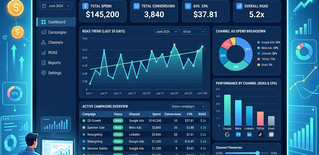
A marketing dashboard in Power BI lets you track campaign performance, channel attribution, conversion rates, and ROI in one place. This guide walks through building one from scratch — connecting your marketing data, creating the data model, building key visualizations, and publishing for your team. Expect 4-8 hours for your first dashboard if you’re familiar with Power BI, longer if you’re new.
The quick version: connect your marketing data sources (Google Analytics, ad platforms, CRM), model the relationships, build KPI cards for spend/revenue/ROAS/conversions, add trend charts by channel, create a campaign performance table, and add date/channel filters. If that sounds like more work than it should be, there’s a faster approach covered at the end.
What You’ll Need
Data sources — at minimum, you’ll want:
- Google Analytics (website traffic, conversions)
- Ad platform data (Google Ads, Meta Ads, LinkedIn Ads)
- CRM data (HubSpot, Salesforce) for lead-to-revenue tracking
- Email platform data (Mailchimp, Klaviyo) for email metrics
Power BI Desktop — free download from Microsoft. Windows only.
Basic Power BI knowledge — this guide assumes you’ve opened Power BI before. If not, expect extra time learning the interface.
About 4-8 hours — connecting data takes the longest. The actual dashboard building goes faster once your data model is right.
Step 1: Connect Your Marketing Data Sources
Open Power BI Desktop → Home → Get Data.
Google Analytics 4:
Power BI has a native Google Analytics connector. Click Get Data → Online Services → Google Analytics → Connect. Sign in with your Google account, select your GA4 property, and choose the dimensions and metrics you need:
- Dimensions: Date, Source/Medium, Campaign, Landing Page, Device Category
- Metrics: Sessions, Users, New Users, Conversions, Revenue (if e-commerce)
Load the data. Note: GA4’s API can be slow for large date ranges — start with 12 months.
Google Ads:
Get Data → Online Services → Google Ads. Connect with your Google account. Select your account and pull:
- Campaign Name, Ad Group, Date
- Impressions, Clicks, Cost, Conversions, Conversion Value
Meta Ads (Facebook/Instagram):
Power BI doesn’t have a direct Meta Ads connector. Two options:
- Export CSV from Meta Ads Manager (Ads → Reports → Export → CSV) and load into Power BI via Get Data → Text/CSV
- Use a connector tool like Supermetrics, Funnel.io, or Fivetran to sync Meta data to a database or Google Sheets, then connect Power BI to that
HubSpot/CRM:
Get Data → Online Services → HubSpot (if available) or connect via API using Web connector. Pull:
- Contacts: Create Date, Source, Lifecycle Stage, Deal Amount
- Deals: Close Date, Pipeline Stage, Amount, Source
- Campaign Name, Send Date, Recipients, Opens, Clicks, Unsubscribes, Revenue
Email platform:
Most email platforms (Mailchimp, Klaviyo) require CSV export or API connector. Pull:
Step 2: Build the Data Model
This is where most marketing dashboards fail. Without a proper data model, your numbers won’t add up across sources.
Create a Date Table:
Every marketing dashboard needs a shared date dimension. In Power BI, go to Modeling → New Table:
DateTable =
ADDCOLUMNS(
CALENDARAUTO(),
"Year", YEAR([Date]),
"Quarter", "Q" & FORMAT([Date], "Q"),
"Month", FORMAT([Date], "MMMM"),
"Month Number", MONTH([Date]),
"Week", WEEKNUM([Date]),
"Day of Week", FORMAT([Date], "dddd")
)
Mark it as a Date Table (Modeling → Mark as Date Table).
Create relationships:
- DateTable[Date] → GA4[Date] (1:many)
- DateTable[Date] → GoogleAds[Date] (1:many)
- DateTable[Date] → MetaAds[Date] (1:many)
- DateTable[Date] → CRM_Deals[Close Date] (1:many)
Create a Channel mapping table to normalize source names across platforms:
Channel Mapping:
Google Ads → Paid Search
Meta Ads → Paid Social
Email Campaign → Email
Organic → Organic Search
Direct → Direct
Referral → Referral
This ensures “google / cpc” from GA4 and “Google Ads” from the ads platform roll up into the same “Paid Search” category.
Step 3: Create DAX Measures
Build these core marketing measures:
// Spend
Total Spend = SUM(GoogleAds[Cost]) + SUM(MetaAds[Spend])

// Revenue
Total Revenue = SUM(CRM_Deals[Amount])

// ROAS (Return on Ad Spend)
ROAS = DIVIDE([Total Revenue], [Total Spend], 0)

// Cost Per Acquisition
CPA = DIVIDE([Total Spend], COUNTROWS(FILTER(CRM_Deals, CRM_Deals[Stage] = "Closed Won")), 0)

// Conversion Rate (Website)
Website CVR = DIVIDE(SUM(GA4[Conversions]), SUM(GA4[Sessions]), 0)

// Cost Per Click (Blended)
Blended CPC = DIVIDE([Total Spend], SUM(GoogleAds[Clicks]) + SUM(MetaAds[Clicks]), 0)

// Email Open Rate
Email Open Rate = DIVIDE(SUM(Email[Opens]), SUM(Email[Recipients]), 0)

// MoM Growth
Revenue MoM =
VAR CurrentMonth = [Total Revenue]
VAR PreviousMonth = CALCULATE([Total Revenue], DATEADD(DateTable[Date], -1, MONTH))
RETURN DIVIDE(CurrentMonth - PreviousMonth, PreviousMonth, 0)

// Pipeline Value
Pipeline Value =
CALCULATE(SUM(CRM_Deals[Amount]), CRM_Deals[Stage] <> "Closed Won", CRM_Deals[Stage] <> "Closed Lost")

// Customer Acquisition Cost
CAC = DIVIDE([Total Spend], COUNTROWS(FILTER(CRM_Contacts, CRM_Contacts[Lifecycle Stage] = "Customer")), 0)
Step 4: Design the Dashboard Layout
Create a new report page. Set the canvas size to 1920×1080 (View → Page Size → Custom).
Row 1 — KPI Cards (top strip):
Add 5-6 Card visuals across the top:
- Total Spend (formatted as currency)
- Total Revenue (formatted as currency)
- ROAS (formatted as decimal with “x” suffix)
- Conversions (whole number)
- CPA (formatted as currency)
- Revenue MoM Growth (formatted as percentage with conditional color)
For conditional formatting on MoM Growth: select the card → Format → Conditional formatting → Font color → Rules → positive = green, negative = red.
Row 2 — Trend Charts:
Left: Revenue & Spend Over Time (combo chart)
- X-axis: DateTable[Month]
- Column values: [Total Spend]
- Line values: [Total Revenue]
- This shows the relationship between investment and return over time
Right: Traffic by Channel (stacked area chart)
- X-axis: DateTable[Month]
- Values: SUM(GA4[Sessions])
- Legend: Channel (from your mapping table)
- Shows which channels are growing or declining
Row 3 — Channel Performance:
Left: Channel Breakdown Table
Create a matrix visual:
- Rows: Channel
- Values: Spend, Revenue, ROAS, CPA, Conversions, CVR
- Add conditional formatting (data bars for Revenue, color scale for ROAS)
- Sort by Revenue descending
Right: Campaign Performance (detailed table)
- Rows: Campaign Name
- Values: Spend, Clicks, CPC, Conversions, CPA, Revenue, ROAS
- Add row-level conditional formatting
- Enable sorting on any column
Row 4 — Supporting Metrics:
Funnel visualization: Sessions → Leads → MQLs → SQLs → Customers
Use a Funnel chart visual with your CRM lifecycle stage counts.
Email performance card: Open Rate, Click Rate, Unsubscribe Rate
Small KPI cards grouped together.
Step 5: Add Interactivity
Date Range Slicer:
Add a Date slicer at the top. Set it to “Between” mode so users can pick custom ranges. Add quick-select buttons for Last 7 Days, Last 30 Days, Last Quarter, YTD.
You can create a dynamic title that updates with the selected date range:
Dashboard Title =
"Marketing Performance: " &
FORMAT(MIN(DateTable[Date]), "MMM DD, YYYY") & " — " &
FORMAT(MAX(DateTable[Date]), "MMM DD, YYYY")
Channel Filter:
Add a slicer for Channel. Set it to dropdown or tile style. This lets users isolate a single channel’s performance.
Campaign Filter:
Another slicer for Campaign Name. Useful for digging into specific campaign performance.
Cross-filtering:
By default, clicking on a channel in the bar chart filters all other visuals on the page. This is automatic in Power BI — test it to make sure the interactions work as expected. To customize: go to Format → Edit Interactions.
Drill-through page:
Create a second page called “Campaign Detail.” Add detailed metrics for a single campaign. On the main page, right-click any campaign → Drill through → Campaign Detail. This keeps the main dashboard clean while allowing deep-dives.
Step 6: Format and Polish
Color scheme: Pick 5-6 colors that match your brand or are visually distinct. Apply them consistently — same color for the same channel across all charts.
Background: Use a subtle light gray (#F5F5F5) background instead of white. It makes cards and charts pop.
Typography: Use a consistent font. Segoe UI (Power BI default) works well. Make KPI numbers large (24-28pt), labels small (10-12pt).
Borders and spacing: Add thin borders to cards. Leave consistent padding between visuals. Align everything to a grid.
Mobile layout: Go to View → Mobile Layout and arrange your visuals for phone viewing. Not optional — executives check dashboards on phones.
Step 7: Publish and Share
Publish to Power BI Service:
Home → Publish → select your workspace. The dashboard is now accessible via browser at app.powerbi.com.
Set up scheduled refresh:
In Power BI Service → Dataset Settings → Scheduled Refresh. Set it to refresh daily (or more frequently if your data sources support it). You’ll need to configure a gateway if connecting to on-premises data.
Create a dashboard:
Pin your key visuals to a Dashboard (different from a Report in Power BI). Dashboards show summary tiles and can include visuals from multiple reports.
Share with your team:
Workspace → Share → enter email addresses. Or publish as an app for a cleaner experience.
Honest Assessment: Is This the Best Approach?
A Power BI marketing dashboard is powerful once built. But let’s be realistic about what it takes:
Building time: 4-8 hours minimum for a first dashboard. Longer if you’re learning DAX or struggling with data connections (especially Meta Ads, which has no native connector).
Maintenance: When APIs change, connections break. When you add a new ad platform, you need to update the data model, create new measures, and redesign visuals. Plan for 2-4 hours/month of maintenance.
The DAX barrier: Measures like ROAS and CPA are simple. But time intelligence calculations (year-over-year comparisons, rolling averages, cohort analysis) require intermediate DAX skills. Most marketers don’t have these — and shouldn’t need them.
Data freshness: Scheduled refresh runs 1-8 times per day on Pro. You’re always looking at slightly stale data. For fast-moving campaigns, this lag matters.
FAQ
What’s the best data connector for Google Analytics 4 in Power BI?
The native GA4 connector works but is slow with large date ranges and limited in dimension/metric combinations per query. For better performance, export GA4 data to BigQuery (free for most volumes) and connect Power BI to BigQuery instead.
Can Power BI connect directly to Meta Ads?
Not natively. You need a third-party connector (Supermetrics, Funnel.io, Windsor.ai) or export CSV files manually. This is one of Power BI’s biggest gaps for marketing dashboards.
How often should a marketing dashboard refresh?
Daily is the minimum for most marketing teams. If you’re running high-spend campaigns, twice daily or more. Power BI Pro supports up to 8 refreshes/day. Premium supports 48/day.
Should I use Power BI for marketing analytics or a dedicated marketing tool?
Power BI is great if you need custom analysis across multiple data sources. But if you mainly want to see “how are my campaigns doing” without building a data model, tools like Pulse AI give you instant answers without the setup.
Can I embed the Power BI dashboard in our website or Slack?
Yes. Power BI supports iframe embedding (with proper licensing) and has a Slack integration for scheduled dashboard screenshots. You can also use Power BI’s REST API to embed visuals in custom applications.