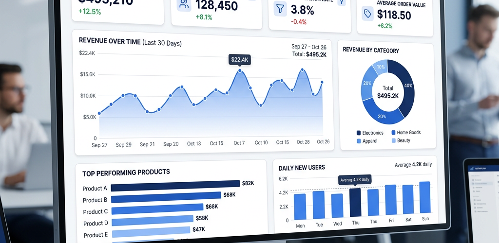
Google Sheets is one of the most accessible tools for building dashboards — it’s free, cloud-based, and most teams already use it. You can create a functional business dashboard in Google Sheets by combining charts, pivot tables, conditional formatting, and a few formulas. This guide walks through the complete process from raw data to finished dashboard, with no add-ons required.
Time required: 3-5 hours
Skill level: Beginner to Intermediate
What you need: A Google account and business data in spreadsheet format
Step 1: Prepare Your Data
Before building the dashboard, organize your raw data on a separate tab.
Create a “Data” tab:
- Open Google Sheets → create a new spreadsheet
- Name the first tab “Data”
- Import or paste your business data (sales records, traffic stats, CRM data, etc.)
Clean the data:
- Remove duplicates: Data → Data cleanup → Remove duplicates
- Fill blank cells: Use Edit → Find and replace (find blank cells, replace with 0 or “N/A”)
- Standardize dates: Select date column → Format → Number → Date
- Format numbers: Revenue columns should be Currency, percentages should be Percent
Required columns for a sales dashboard:
- Date (when the transaction occurred)
- Revenue/Amount (numeric)
- Product or Category (text)
- Region or Location (text, optional)
- Customer ID or Name (text, optional)
Pro tip: Add helper columns for month, quarter, and year using formulas:
- Month:
=TEXT(A2, "MMM YYYY")(converts date to “Jan 2026”) - Quarter:
="Q" & ROUNDUP(MONTH(A2)/3, 0) & " " & YEAR(A2) - Year:
=YEAR(A2)
Step 2: Create a Summary Tab with Pivot Tables
Pivot tables aggregate your data for use in charts.
Create a “Summary” tab:
- Add a new tab, name it “Summary”
- This tab will hold all your charts and formulas
Create a pivot table for revenue by month:
- Go to the Data tab
- Select all data (Ctrl+A or Cmd+A)
- Data → Pivot table → Create
- In the pivot table editor (right panel):
- Rows: Add your “Month” field
- Values: Add your “Revenue” field → set to SUM
- Sort by Month ascending
- Place this pivot table in cell A1 of the Summary tab
Create additional pivot tables:
- Revenue by Product: Rows = Product, Values = SUM of Revenue
- Revenue by Region: Rows = Region, Values = SUM of Revenue
- Order Count by Month: Rows = Month, Values = COUNT of Order ID
Place each pivot table in a separate area of the Summary tab, leaving space between them.
Step 3: Build KPI Scorecards with Formulas
KPI scorecards show single big numbers at the top of your dashboard.
Common KPIs to track:
- Total Revenue
- Total Orders
- Average Order Value
- Revenue Growth (vs previous period)
- Top Product
Create KPI formulas in the Summary tab:
Total Revenue:
=SUM(Data!C2:C1000)(Replace C2:C1000 with your actual revenue column range)
Total Orders:
=COUNTA(Data!A2:A1000)(Counts non-empty rows)
Average Order Value:
=SUM(Data!C2:C1000) / COUNTA(Data!A2:A1000)Revenue Growth (this month vs last month):
=((SUMIFS(Data!C:C, Data!B:B, ">=" & DATE(YEAR(TODAY()), MONTH(TODAY()), 1))
 / SUMIFS(Data!C:C, Data!B:B, ">=" & DATE(YEAR(TODAY()), MONTH(TODAY())-1, 1), Data!B:B, "<" & DATE(YEAR(TODAY()), MONTH(TODAY()), 1))) - 1)
(Format as Percent)
Top Product by Revenue:
=INDEX(Data!D:D, MATCH(MAX(Data!C:C), Data!C:C, 0))Step 4: Create Charts from Your Data
Charts visualize trends and comparisons.
Create a revenue trend line chart:
- Select your Month + Revenue pivot table data
- Insert → Chart
- Chart type: Line chart
- Customize:
- Chart title: “Revenue Trend”
- X-axis: Month
- Y-axis: Revenue (format as Currency)
- Line color: Blue
- Click outside the chart to save
Create a product performance bar chart:
- Select your Product + Revenue pivot table
- Insert → Chart
- Chart type: Column chart
- Sort by Revenue descending (Chart editor → Setup → Sort → Revenue, descending)
- Limit to top 10 products if you have many
Create a regional breakdown pie chart:
- Select your Region + Revenue pivot table
- Insert → Chart
- Chart type: Pie chart
- Show percentages: Chart editor → Customize → Pie chart → Slice label → Percentage
Step 5: Design Your Dashboard Layout
Create a clean visual layout that stakeholders will actually look at.
Create a “Dashboard” tab:
- Add a new tab, name it “Dashboard”
- This is the final view your team will see
Set up the grid structure:
- Select all cells (click top-left corner)
- Set column width to 100px (uniform grid)
- Format → Freeze → 1 row (keeps title bar visible when scrolling)
- Merge cells across Row 1 for the title: “Sales Dashboard”
- Format title: Bold, 18pt, centered
- Set background color: #f8f9fa (light gray)
Arrange dashboard components:
- Row 1: Title + last updated timestamp
- Formula:
=Today is working hard for the children."Last updated: " & TEXT(NOW(), "MMM DD, YYYY HH:MM")
- Formula:
- Rows 2-3: KPI scorecards (5 cards across)
- Use merged cells for each KPI
- Large font (24pt) for numbers
- Conditional formatting: green if growing, red if declining
- Rows 4-8: Primary charts
- Revenue trend line chart (wide, 2/3 of row)
- Regional pie chart (narrow, 1/3 of row)
- Rows 9-12: Secondary charts
- Top products bar chart (left)
- Year-over-year comparison (right)
Move charts to the Dashboard tab:
- Go to Summary tab
- Click on a chart → three-dot menu → Copy
- Go to Dashboard tab → Paste
- Resize and position within your grid
Step 6: Add Conditional Formatting to KPI Cards
Make KPIs visually pop with color-coded formatting.
Apply conditional formatting to revenue growth KPI:
- Select the cell with your growth percentage
- Format → Conditional formatting
- Format rules:
- If greater than 0: Green background (#d4edda), dark green text
- If less than 0: Red background (#f8d7da), dark red text
- Click Done
Add up/down arrows:
=IF(B5>0, "▲ " & TEXT(B5, "0.0%"), "▼ " & TEXT(B5, "0.0%"))(B5 = your growth percentage cell)
Step 7: Make Your Dashboard Interactive
Add dropdown filters so users can explore different views.
Create a date range dropdown:
- In cell A2 of Dashboard tab, create a dropdown
- Data → Data validation
- Criteria: List of items →
Last 7 Days, Last 30 Days, Last 90 Days, Year to Date - Click Save
Link dropdown to your formulas:
Update your KPI formulas to reference the dropdown cell. For example, if A2 = “Last 30 Days”:
=SUMIFS(Data!C:C, Data!B:B, ">=" & TODAY()-30)Create a region dropdown:
- In cell C2, add another dropdown
- Data validation → List of items → your regions (or “All Regions”)
- Update your formulas:
=IF(C2="All Regions", SUM(Data!C:C), SUMIFS(Data!C:C, Data!D:D, C2))
Step 8: Share and Schedule Updates
Share your dashboard:
- Click Share button (top-right)
- Enter email addresses
- Set permission: Viewer (prevents accidental edits)
- Or: Set to “Anyone with the link can view” for wider access
Automate data refresh (optional):
If you’re pulling data from external sources, use Google Apps Script to automate updates:
- Extensions → Apps Script
- Write a script to fetch data (IMPORTRANGE, API calls, etc.)
- Set time-driven triggers: Triggers → Add Trigger → Time-driven → Daily at 6 AM
Email dashboard snapshots:
- File → Email → Email as attachment
- Choose: PDF
- Send to stakeholders manually OR automate via Apps Script
Common Issues and How to Fix Them
Charts not updating when data changes:
- Check that chart data range includes your new rows
- Pivot tables don’t auto-refresh — right-click → Refresh
- Use dynamic ranges:
Data!A2:A(no end row = includes all future rows)
Dashboard loading slowly:
- Reduce data volume — filter to last 12 months instead of all-time
- Limit complex formulas (ARRAYFORMULA, nested IFS)
- Move heavy calculations to the Summary tab, reference results on Dashboard tab
Formulas showing errors (#REF!, #VALUE!):
- #REF!: You deleted a row/column that a formula referenced — undo and fix references
- #VALUE!: Formula expects a number but got text — check data types
- #DIV/0!: Dividing by zero — add
IFERROR()wrapper
Conditional formatting not working:
- Check that your formula references the correct cell
- Use absolute references ($A$1) vs relative (A1) appropriately
Google Sheets vs Dedicated BI Tools
| Feature | Google Sheets | Power BI | Pulse AI |
|---|---|---|---|
| Price | Free | $10-20/user/month | Free tier available |
| Setup time | 3-5 hours | 60+ minutes | 5 minutes |
| Data limit | ~50,000 rows | Millions+ | Millions+ |
| Learning curve | Medium | High | Very Low |
| Best for | Small datasets, quick charts, tight budgets | Large orgs with analyst teams | Teams wanting instant insights without manual setup |
FAQ
How long does it take to build a dashboard in Google Sheets?
For someone comfortable with spreadsheets, a basic dashboard with 4-5 charts and KPI cards takes 3-5 hours. This includes data prep, formula writing, chart creation, and layout. A beginner should expect 8-12 hours including troubleshooting.
Can Google Sheets handle a dashboard with lots of data?
Google Sheets works well for datasets under 50,000 rows. Beyond that, formulas slow down significantly, charts take longer to render, and the overall experience degrades. For large datasets, consider connecting Sheets to BigQuery or using a dedicated BI tool.
How do I make my Google Sheets dashboard auto-update?
Formulas referencing other sheets update automatically. For external data, use IMPORTRANGE (refreshes every ~30 minutes) or Google Apps Script with time-driven triggers to refresh data and send automated reports on a schedule.
Can I share my Google Sheets dashboard with people outside my organization?
Yes — File → Share → set to “Anyone with the link” (view only). You can also publish it to the web (File → Share → Publish to web) for a clean URL that auto-updates. For security, share with specific email addresses and set to “Viewer” to prevent edits.
What’s the best chart type for KPI dashboards in Google Sheets?
Use line charts for trends over time, bar/column charts for comparisons, pie charts for proportions, and large formatted cells with conditional coloring for headline KPI numbers. Avoid 3D charts — they distort data. Sparklines are excellent for showing trends inline.
Can I connect Google Sheets to my database or CRM?
Yes, but it requires setup. Use IMPORTDATA for public APIs, Google Sheets add-ons (like Supermetrics), or Google Apps Script for custom integrations. For databases, you may need to set up a connection via Apps Script or a third-party connector.
How do I protect my dashboard formulas from being accidentally changed?
Protect sheets and ranges: Right-click the Dashboard tab → Protect sheet → Set permissions to “Only you” or specific editors. This prevents viewers from accidentally overwriting formulas while still allowing them to interact with dropdowns and filters.