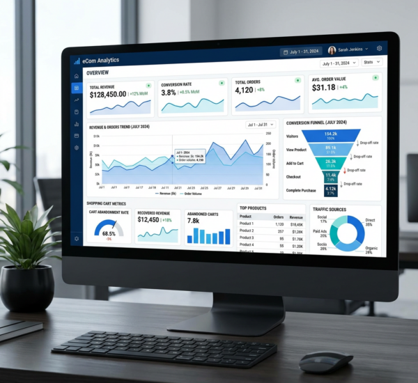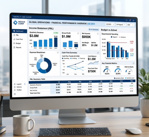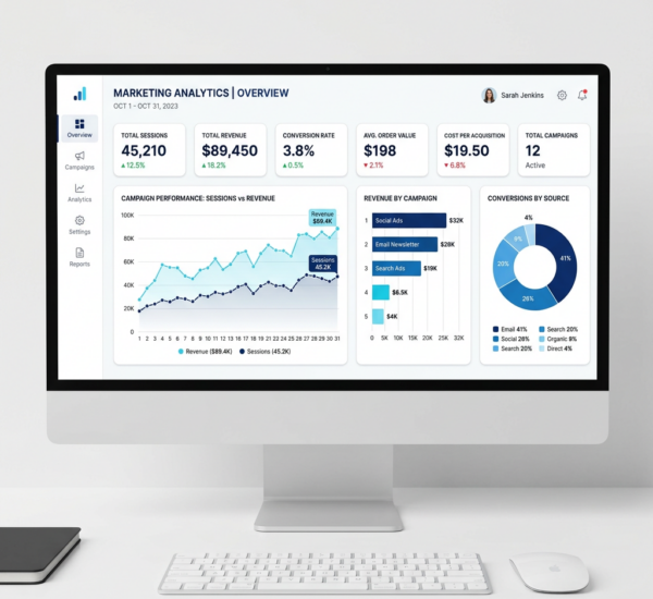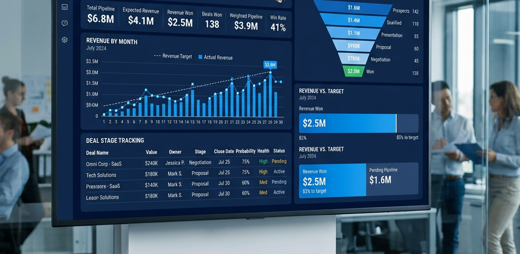
Sales teams live and die by their numbers. Pipeline coverage. Win rate. Revenue forecast. Deal velocity. These metrics determine whether you hit quota or miss it.
But most sales dashboards fail. They either show too much data (overwhelming reps with noise) or too little (executives can’t see what’s actually happening). And updating them manually wastes hours that could be spent selling.
Pulse AI fixes this. Connect your CRM, automate your sales dashboard, and get real-time visibility into the metrics that matter. No spreadsheets. No manual updates. Just clean, actionable insights.
This guide breaks down the best sales dashboard examples for 2026, the metrics every sales team should track, and how to build dashboards that drive better sales decisions.
What Makes a Great Sales Dashboard?
A great sales dashboard answers the questions sales leaders ask every day:
Are we on track to hit our number this quarter? Revenue forecast vs. quota should be front and center.
Where are deals getting stuck? Pipeline by stage shows bottlenecks. If 50% of deals die in “Proposal Sent,” your pricing or proposal process needs work.
Which reps are performing? Individual performance by rep (closed revenue, win rate, activity) helps you coach effectively.
What’s our win rate? Overall and by deal size, industry, or lead source. If you win 60% of enterprise deals but only 20% of SMB deals, adjust your target market.
How long do deals take to close? Average sales cycle length. If it’s creeping up, something’s broken.
Most CRMs (Salesforce, HubSpot, Pipedrive) have built-in reporting, but it’s clunky and limited. Pulse AI gives you the flexibility of a BI tool with the simplicity your sales team actually needs.
Top 10 Sales Dashboard Examples for 2026
1. Sales Pipeline Dashboard
Best for: Sales managers tracking deal flow
This is the core dashboard every sales team needs. It shows how many deals are in each stage, total pipeline value, and deal movement over time.
Key metrics:
- Total pipeline value
- Pipeline by stage (Prospecting, Qualification, Proposal, Negotiation, Closed Won, Closed Lost)
- Number of deals in each stage
- Deals added this week/month
- Deals moved forward this week
- Deals stuck longer than 30/60/90 days
- Pipeline coverage ratio (pipeline ÷ quota)
Why it works: Instant visibility into deal flow. If pipeline is too thin, reps need to prospect more. If deals are piling up in one stage, there’s a process problem.
How Pulse AI makes it simple: Connects to Salesforce, HubSpot, Pipedrive, Zoho CRM, and others. Automatically categorizes deals by stage and tracks movement.
2. Sales KPI Dashboard
Best for: VPs of Sales and executives tracking high-level performance
This executive dashboard strips away deal details and focuses on the metrics that matter to leadership: revenue, win rate, quota attainment, and growth.
Key metrics:
- Closed revenue (this month, this quarter, this year)
- Quota attainment (team and individual)
- Win rate (overall and by deal type)
- Average deal size
- Sales cycle length
- New customers acquired
- Revenue growth (month-over-month, year-over-year)
Why it works: Executives don’t need to see every deal. They need to know if the team is on track and where to intervene.
How Pulse AI makes it simple: Pulls data from CRM and calculates KPIs automatically. No manual formulas.
3. Sales Rep Performance Dashboard
Best for: Sales managers coaching individual reps
Track performance at the rep level. Who’s crushing it? Who needs help? Who’s not doing enough activity?
Key metrics:
- Closed revenue by rep
- Number of deals closed by rep
- Win rate by rep
- Pipeline value by rep
- Activity by rep (calls, emails, meetings)
- Average deal size by rep
- Sales cycle length by rep
Why it works: Performance dashboards make coaching conversations data-driven. Instead of “you need to close more deals,” it’s “your win rate dropped from 40% to 25% this quarter — let’s figure out why.”
How Pulse AI makes it simple: Automatically aggregates rep-level data from CRM. Filter by rep, time period, or deal type.
4. Sales Forecast Dashboard
Best for: Revenue leaders and CFOs
Accurate forecasting is hard. This dashboard shows committed revenue, best-case revenue, and risk analysis so you can forecast with confidence.
Key metrics:
- Forecasted revenue (committed, best case, worst case)
- Closed revenue vs. forecast
- Forecast accuracy (did we hit last quarter’s forecast?)
- Deals by close date (this month, next month, this quarter)
- Weighted pipeline (pipeline × probability to close)
- At-risk deals (deals past expected close date)
Why it works: Sales forecasts are notoriously optimistic. This dashboard forces discipline — deals must have realistic close dates and win probabilities.
How Pulse AI makes it simple: Uses CRM close dates and probability fields to calculate weighted pipeline. Shows variance between forecast and actuals.
5. Sales Activity Dashboard
Best for: Sales managers ensuring reps hit activity targets
Revenue is a lagging indicator. Activity is a leading indicator. If reps aren’t making calls, sending emails, or booking meetings, pipeline will dry up.
Key metrics:
- Total calls/emails/meetings by rep (daily, weekly, monthly)
- Activity trends over time
- Calls-to-meetings ratio
- Meetings-to-opportunities ratio
- Opportunities-to-closed-deals ratio
- Reps hitting activity targets vs. missing targets
Why it works: Catches problems early. If a rep’s activity drops 50% in two weeks, you can intervene before it tanks their pipeline.
How Pulse AI makes it simple: Syncs with CRM activity logs. Automatically tracks calls, emails, and meetings logged by reps.
6. Win/Loss Analysis Dashboard
Best for: Sales ops teams and revenue leaders
Why do you win deals? Why do you lose them? This dashboard analyzes closed deals to uncover patterns.
Key metrics:
- Win rate (overall)
- Win rate by deal size (small, medium, large)
- Win rate by industry
- Win rate by lead source
- Common win reasons (from CRM loss/win notes)
- Common loss reasons (pricing, competitor, timing, etc.)
- Competitor win/loss analysis (which competitors are we losing to?)
Why it works: Most teams don’t analyze why they win or lose. This dashboard surfaces patterns — if you lose 80% of deals to Competitor X, your positioning needs work.
How Pulse AI makes it simple: Analyzes closed-won and closed-lost deals. Filters by industry, deal size, lead source, and competitor.
7. Sales Funnel Conversion Dashboard
Best for: Demand gen and sales ops teams
Track conversion rates at each stage of the funnel. Where are prospects dropping off?
Key metrics:
- Lead → Opportunity conversion rate
- Opportunity → Proposal conversion rate
- Proposal → Negotiation conversion rate
- Negotiation → Closed Won conversion rate
- Overall funnel conversion rate (lead → customer)
- Drop-off rate by stage
Why it works: If 1,000 leads convert to 500 opportunities but only 50 proposals, your qualification process is broken. If 50 proposals convert to 45 negotiations but only 5 closed deals, your pricing is the problem.
How Pulse AI makes it simple: Automatically calculates conversion rates between CRM stages. Shows drop-off points visually.
8. Sales Quota Attainment Dashboard
Best for: Sales managers tracking team performance against targets
Are reps hitting quota? This dashboard shows individual and team quota attainment in real-time.
Key metrics:
- Quota attainment by rep (% of quota achieved)
- Revenue vs. quota (this month, this quarter)
- Number of reps at 100%+ quota
- Number of reps at 50-99% quota
- Number of reps below 50% quota
- Trending toward quota (based on current pace)
Why it works: Makes quota attainment visible. Reps see where they stand. Managers see who needs help.
How Pulse AI makes it simple: Syncs quota data from CRM or imports from a CSV. Automatically calculates attainment percentage.
9. Sales Cycle Length Dashboard
Best for: Sales ops and revenue leaders
How long does it take to close a deal? Is it getting faster or slower? This dashboard tracks sales cycle length over time.
Key metrics:
- Average sales cycle length (days from opportunity created to closed won)
- Sales cycle by deal size
- Sales cycle by industry
- Sales cycle by rep
- Sales cycle trend (is it increasing or decreasing?)
- Deals closed faster than average
- Deals closed slower than average
Why it works: If average sales cycle is creeping from 45 days to 75 days, something changed — market conditions, competition, or internal process.
How Pulse AI makes it simple: Calculates days between opportunity creation and close date. Breaks down by deal characteristics.
10. Revenue Leaderboard Dashboard
Best for: Sales teams motivated by competition
Gamify sales performance. Show real-time leaderboards for closed revenue, deals closed, and activity.
Key metrics:
- Top 10 reps by closed revenue (this month, this quarter)
- Top 10 reps by deals closed
- Top 10 reps by pipeline generated
- Top 10 reps by activity (calls, emails, meetings)
- Team rankings
Why it works: Competition drives performance. Public leaderboards motivate reps to stay on top.
How Pulse AI makes it simple: Pulls CRM data and ranks reps automatically. Updates in real-time.
Essential Sales Metrics Every Dashboard Should Track
Not every sales dashboard needs every metric, but most should include these core KPIs:
Pipeline metrics:
- Total pipeline value
- Pipeline by stage
- Pipeline coverage ratio (pipeline ÷ quota)
- Weighted pipeline (pipeline × win probability)
Revenue metrics:
- Closed revenue (month, quarter, year)
- Revenue vs. quota
- Revenue growth (month-over-month, year-over-year)
- Average deal size
Performance metrics:
- Win rate (overall and by segment)
- Sales cycle length
- Quota attainment
- Forecast accuracy
Activity metrics:
- Calls, emails, meetings (by rep and team)
- Activity-to-opportunity conversion rate
- Deals created
Pulse AI tracks all of these automatically. No manual calculations.
How to Build a Sales Dashboard (Step-by-Step)
Step 1: Connect your CRM
Pulse AI integrates with Salesforce, HubSpot, Pipedrive, Zoho CRM, and others. One-click connection.
Step 2: Choose your metrics
Select the KPIs you want to track. Pulse AI suggests relevant metrics based on your CRM data.
Step 3: Customize visualizations
Drag and drop to arrange charts, tables, and graphs. Filter by rep, team, time period, or deal type.
Step 4: Set refresh frequency
Real-time updates for fast-moving sales teams. Hourly or daily refreshes for more stable pipelines.
Step 5: Share with your team
Send a link, embed in Slack, or display on a TV in the sales floor. Everyone sees the same live data.
Total time: 15 minutes.
Sales Dashboard Tools: How Pulse AI Compares
| Feature | Pulse AI | Salesforce Reports | HubSpot Reports | Tableau | Power BI | |———|———-|——————-|—————–|———|———-| | Setup time | 15 minutes | Hours | Hours | Days | Days | | Requires technical skills | No | No | No | Yes | Yes | | Real-time updates | ✅ Yes | ⚠️ Limited | ⚠️ Limited | ✅ Yes | ✅ Yes | | Custom visualizations | ✅ Flexible | ❌ Limited | ❌ Limited | ✅ Very flexible | ✅ Flexible | | Multi-CRM support | ✅ Yes | ❌ Salesforce only | ❌ HubSpot only | ✅ Yes | ✅ Yes | | Pricing | From $29/month | Included (but limited) | Included (but limited) | From $70/user/month | From $10/user/month | | Best for | Teams who want results fast | Salesforce-only orgs | HubSpot-only orgs | Data teams | Microsoft-heavy orgs |
Salesforce and HubSpot have built-in reporting, but it’s rigid and hard to customize. Tableau and Power BI are powerful but require technical expertise.
Pulse AI gives you enterprise BI power with zero technical complexity.
Pulse AI connects to your CRM, tracks the metrics that matter, and updates in real-time — no spreadsheets required. Try Pulse AI free.
Frequently Asked Questions
What should a sales dashboard include?
A sales dashboard should include pipeline metrics (total pipeline, pipeline by stage, coverage ratio), revenue metrics (closed revenue, quota attainment, forecast), performance metrics (win rate, sales cycle length), and activity metrics (calls, emails, meetings). Focus on metrics that drive decisions, not vanity numbers.
How do you build a sales dashboard?
Connect your CRM (Salesforce, HubSpot, Pipedrive, etc.), choose the KPIs you want to track, customize visualizations, set refresh frequency, and share with your team. With Pulse AI, this takes 15 minutes. Traditional BI tools take days or weeks.
What’s the best sales dashboard tool?
Pulse AI is the best choice for most sales teams because it’s fast to set up, requires zero technical skills, integrates with all major CRMs, and costs less than enterprise BI tools. Salesforce and HubSpot have built-in reporting but it’s limited. Tableau and Power BI are powerful but require technical expertise.
What metrics should sales managers track?
Sales managers should track pipeline (total value, pipeline by stage, coverage ratio), revenue (closed deals, quota attainment), rep performance (activity, win rate, deals closed), and sales cycle length. These metrics show whether the team is on track and where to intervene.
Can you build a sales dashboard in Excel or Google Sheets?
Yes, but it’s manual and time-consuming. You’d need to export CRM data, import into Sheets, write formulas, and create charts. It works for very small teams, but it doesn’t scale and it’s not real-time. Pulse AI automates all of this.
How often should a sales dashboard update?
Real-time or hourly for active sales teams. If reps are closing deals daily, you want live data. If your sales cycle is 6+ months, daily updates are fine. Pulse AI lets you set custom refresh rates.
What’s the difference between a sales dashboard and a CRM report?
CRM reports (Salesforce, HubSpot) are rigid, pre-built views with limited customization. Sales dashboards (like Pulse AI) let you combine CRM data with other sources (marketing, finance), create custom visualizations, and share across teams. Dashboards are more flexible and powerful.
Should sales reps and executives use the same dashboard?
No. Reps need detailed data (their pipeline, their activity, their deals). Executives need high-level KPIs (team revenue, quota attainment, win rate). Pulse AI makes it easy to create multiple dashboards from the same CRM data.
Conclusion: Build Better Sales Dashboards with Pulse AI
The best sales dashboards give reps and managers instant visibility into pipeline, revenue, and performance. They update in real-time, answer critical questions, and eliminate manual reporting.
But most sales dashboard tools are clunky, expensive, or require technical expertise.
Pulse AI is different. Connect your CRM in minutes. Track the KPIs that drive results. Share insights with your team instantly. No spreadsheets. No coding. No complexity.
Stop wasting time on manual sales reports. Start making better sales decisions.