Why Most Business Charts Are Wrong (And How AI Fixes Them)
Here’s an uncomfortable truth: most business charts are suboptimal. Not because the data is wrong, but because humans consistently make poor visualization choices. We use pie charts for comparisons that should be bar charts. We clutter dashboards with 3D effects that obscure the data. We choose color schemes that are inaccessible to colorblind users. We present time series in tables when a simple line chart would reveal the trend instantly.
AI data visualization solves this by applying data visualization best practices automatically. When you ask an AI BI tool like Pulse AI to “show me revenue by product category,” it doesn’t just pick a random chart type — it analyzes the data structure, the number of categories, the range of values, and the likely question being asked, then selects the most effective visualization.
How AI Chooses the Right Visualization
Data type analysis. The AI examines whether your data is temporal (time series → line chart), categorical (comparison → bar chart), proportional (part-to-whole → pie/donut chart), geographic (location-based → map), or relational (correlation → scatter plot). This alone eliminates the most common visualization mistakes.
Cardinality awareness. If you have 3 categories, a pie chart works. If you have 30 categories, the AI knows to switch to a horizontal bar chart sorted by value. This sounds obvious, but it’s a mistake humans make constantly.
Statistical significance. AI can overlay confidence intervals, trend lines, and statistical annotations automatically. When you see a line chart showing monthly revenue, the AI can add a shaded range showing expected variance — so you know instantly whether a dip is concerning or within normal bounds.
Audience optimization. AI can adjust visualization complexity based on the audience. Executive dashboards get high-level KPI cards with clear trend indicators. Analyst dashboards get detailed charts with drill-down capabilities and statistical overlays.
AI-Generated Visualization in Action
Let’s walk through a real scenario. You connect your e-commerce database to an AI BI platform and ask: “Give me a complete overview of sales performance this quarter.”
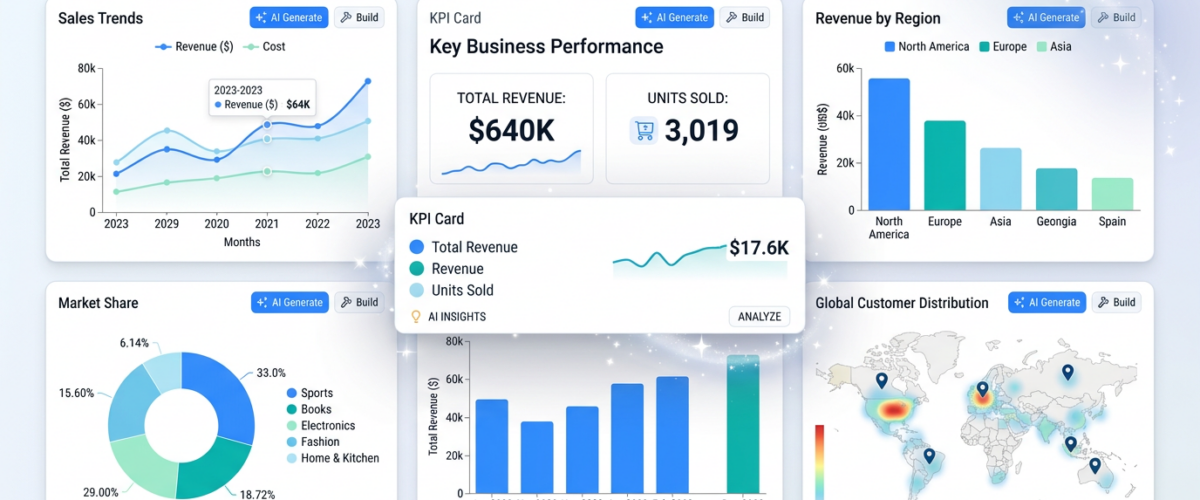
A traditional BI tool would need you to specify exactly what charts you want, which metrics, which time range, which dimensions. An AI-powered tool like Pulse AI automatically generates a dashboard with:
A KPI summary row showing total revenue, order count, and average order value as large, clear numbers with comparison to last quarter (green/red trend arrows).
A revenue trend line chart showing daily revenue with a 7-day moving average overlay, making it easy to see the trend without being distracted by daily variance.
A revenue by category bar chart sorted by value, with the top categories highlighted. The AI chose a horizontal bar chart because you have 12 categories — a pie chart would be unreadable.
A geographic map showing revenue by customer region, using a color gradient that intuitively communicates volume differences.
A ranked product list with medal icons for the top performers and progress bars showing relative performance — the AI chose this format instead of a chart because ranked lists are more scannable for “top N” questions.
All of this was generated from a single natural language request. No chart configuration, no drag-and-drop building, no formatting. The AI made dozens of visualization decisions automatically — and each one follows established data visualization principles.
The Science Behind Good Automated Visualization
AI visualization engines are built on decades of research in human perception and data visualization theory. Key principles they apply:
Pre-attentive processing. Certain visual properties (color, size, position, orientation) are processed by the brain before conscious attention. AI uses these strategically — making the most important data point the most visually prominent.
Data-ink ratio. Edward Tufte’s principle: maximize the proportion of ink used for actual data versus decoration. AI-generated charts are clean by default — no unnecessary gridlines, 3D effects, or decorative elements.
Color theory. AI applies perceptually uniform color scales for quantitative data and categorical palettes with sufficient contrast for qualitative data. It avoids red-green combinations that are invisible to colorblind users.
What’s Coming Next in AI Visualization
Animated data stories. Instead of static charts, AI will generate narrative-driven data presentations — walking the viewer through key insights with animated transitions between relevant visualizations.
Adaptive dashboards. Dashboards that rearrange themselves based on what’s most important right now. If revenue is normal but churn just spiked, the churn chart moves to the top and expands.
Natural language annotations. AI will annotate charts with plain-English explanations: “Revenue peaked on March 15, likely driven by the spring sale campaign. The subsequent 20% decline follows the typical post-promotion pattern.”
Frequently Asked Questions
Can AI visualization handle complex data relationships?
Yes. AI can generate correlation matrices, network graphs, Sankey diagrams, and other complex visualizations when the data calls for them. The key advantage is that the AI recognizes when complex visualization is needed versus when a simple bar chart tells the story better.
How do I customize AI-generated charts?
Most AI BI platforms allow you to modify any aspect of a generated visualization — change chart types, adjust colors, add annotations, modify axis ranges. The AI provides a strong starting point; you can refine as needed.
Are AI-generated visualizations accessible?
Leading AI BI platforms build accessibility into their visualization engines: colorblind-safe palettes, proper contrast ratios, alt text generation, and screen reader compatibility. This is actually an area where AI often outperforms manual chart creation.