Numbers don’t speak for themselves. A spreadsheet full of metrics won’t change minds or drive action — but a compelling narrative backed by data will. Data storytelling transforms raw analytics into persuasive narratives that influence decisions, align teams, and drive business outcomes.
AI is revolutionizing data storytelling by automating the discovery of insights, generating narratives at scale, and personalizing stories for different audiences. This guide explores how modern AI-powered analytics platforms turn numbers into narratives — and why this matters more than ever in 2026.
Why Data Storytelling Matters
Research from Stanford shows that people are 22 times more likely to remember information presented as a story compared to facts alone. Yet most business analytics still consist of dashboards crammed with charts, leaving interpretation entirely to the viewer.
Effective data storytelling answers three questions:
What happened? The key facts — revenue increased 12%, churn dropped 3%, customer acquisition cost rose 8%.
Why did it happen? The context and drivers — revenue grew because we launched in two new regions and ran a successful Q4 campaign. CAC increased because competition intensified in our core market.
What should we do about it? The actionable recommendations — double down on the new regions, optimize the Q4 campaign playbook for Q1, and test new acquisition channels to reduce CAC.
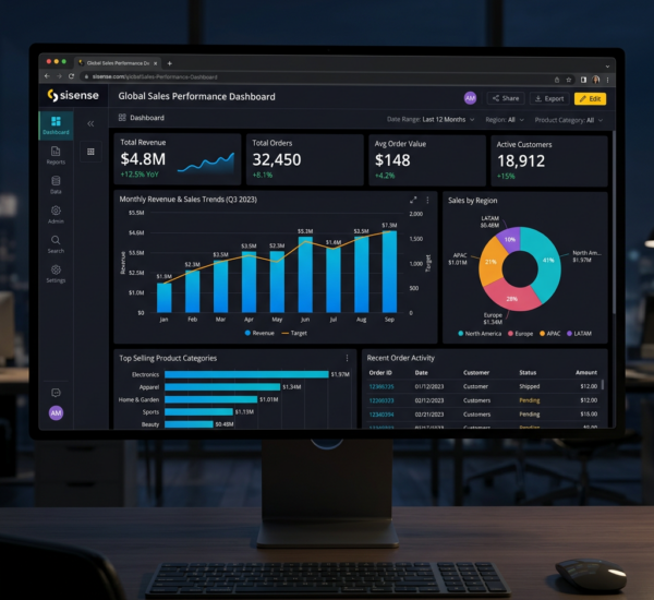
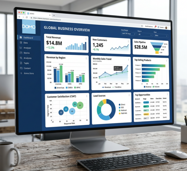
Traditional BI tools stop at “what happened.” AI-powered platforms like Pulse AI go further — automatically detecting insights, explaining drivers, and suggesting actions in plain language.
The Anatomy of a Data Story
Great data stories follow a consistent structure:
1. The Hook — Start with the most important insight. “Revenue growth is accelerating, but profitability is declining faster than expected.” Lead with what matters.
2. The Context — Frame the numbers. How does this compare to last quarter, last year, or the industry benchmark? Is this trend surprising or expected?
3. The Evidence — Show the data that supports your claim. Charts, tables, and specific numbers. Visuals should clarify, not clutter.
4. The Explanation — Why is this happening? Connect the data to real-world events, strategic decisions, or market dynamics.
5. The Implication — What does this mean for the business? If this trend continues, what happens? What’s at risk or what’s the opportunity?
6. The Recommendation — What should we do? Be specific. “Increase marketing budget in Region A by $50K” not “explore growth opportunities.”
How AI Enhances Data Storytelling
Automated insight discovery. AI scans thousands of data points to surface statistically significant changes, anomalies, and patterns. Instead of manually hunting for insights, the system highlights what’s worth your attention. Pulse AI’s insight engine detects revenue spikes, unusual churn patterns, or emerging trends and surfaces them as natural language alerts.
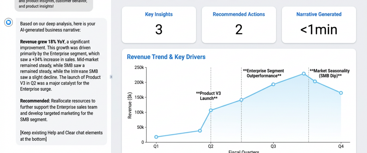
Natural language generation (NLG). AI writes the narrative for you. Modern language models can transform “Q4 revenue: $2.4M (+18% YoY)” into “Revenue grew 18% year-over-year to $2.4M, driven primarily by strong performance in the Enterprise segment which grew 34% while SMB growth remained flat at 3%.”
Audience personalization. The same data tells different stories to different stakeholders. A CFO cares about margins and cash flow. A CMO cares about customer acquisition cost and lifetime value. AI can generate tailored narratives for each audience from the same underlying data.
Visual narrative design. AI doesn’t just generate text — it recommends the right chart types, highlights key data points, and sequences visuals to guide the viewer through the story.
Real-World Example: Monthly Board Report
Traditional approach: Analyst spends 8 hours building a 30-slide PowerPoint deck with charts pulled from various tools. Board members see the slides during the meeting but have limited time to ask questions. Key insights get buried in chart clutter.
AI-powered data storytelling approach: The analytics platform auto-generates a narrative report that reads like an executive summary. It opens with the three most important trends, explains what’s driving them, compares performance to plan, and recommends actions. Charts are embedded inline to support specific claims, not dumped in bulk. Time savings: 7 hours. Clarity improvement: significant.
One VP described the difference: “Before, our board decks felt like data dumps. Now they feel like strategic briefings. The AI highlights what matters and explains it in a way that makes the next steps obvious.”
Use Case: Customer Churn Analysis
Raw data version: A dashboard showing churn rate by customer segment over time. The viewer has to figure out what’s important and why.
Data storytelling version (AI-generated narrative):
“Customer churn increased from 4.2% to 5.8% this quarter, the highest rate in 18 months. The increase is concentrated in the SMB segment, where churn jumped to 8.1% (+3.2pp). Enterprise churn remained stable at 2.1%.
Analysis of churned SMB customers shows three common patterns: 1) Low feature adoption (50% never used integrations), 2) Price sensitivity (32% cited cost as the primary reason), 3) Lack of onboarding follow-up (churned customers had 60% fewer touchpoints in their first 90 days compared to retained customers).
Recommendation: Launch a targeted retention program for new SMB customers focusing on onboarding support and early feature adoption. Pilot a lower-priced tier for price-sensitive segments. Projected impact: reduce SMB churn to 6% within 2 quarters, retaining an estimated $180K ARR.”
That narrative took 30 seconds for AI to generate. A human analyst would need 30-60 minutes of exploration, cross-referencing, and writing to produce something similar.
Best Practices for AI-Generated Data Stories
Start with a clear question. “Why did churn increase?” generates a better story than “show me churn data.” AI works best when it knows what you’re trying to understand.
Validate AI insights. AI is excellent at pattern detection but can miss business context. Always review AI-generated narratives for accuracy and relevance. Think of AI as a research assistant, not a replacement for human judgment.
Customize for your audience. An AI-generated narrative for a CEO should be concise, strategic, and outcome-focused. The same story for an operations team should be more detailed and tactical. Use AI’s personalization features to adjust tone and depth.
Combine AI efficiency with human editing. Let AI generate the first draft in seconds, then refine it. Add context the AI doesn’t know (market dynamics, internal initiatives, qualitative feedback). The result: 80% time savings with 100% quality.
Use progressive disclosure. Start with the executive summary (AI-generated), then provide deeper detail for those who want it. Interactive reports let readers drill down from headline insights to underlying data.
Data Storytelling Anti-Patterns (What to Avoid)
Chart dump syndrome. Showing 20 charts and calling it a story. Data storytelling is selective — show only the data that supports your narrative.
Jargon overload. “Leverage synergies across cross-functional verticals” says nothing. Write like you’re explaining to a smart colleague who isn’t a data expert.
Ignoring the “so what?” Every data point should answer: why does this matter? If a metric doesn’t lead to action, leave it out.
Overwhelming with precision. “Revenue was $2,438,392.17” is less readable than “Revenue was $2.4M.” Use appropriate precision — exact numbers for financial reports, rounded numbers for narratives.
Burying the lede. Don’t make your audience hunt for the key insight. Lead with it. “Sales declined 15% — here’s why” is stronger than building up to the decline after three paragraphs.
Tools and Techniques
Natural Language Query. Platforms like Pulse AI let you ask questions in plain English: “Why did revenue drop in the Midwest region last month?” The system analyzes the data and responds with a narrative explanation, not just a chart.
Automated Anomaly Detection. AI monitors your metrics and alerts you to statistically significant changes. “Customer acquisition cost spiked 40% this week” with automatic drill-down into the root cause.
Narrative Templates. Pre-built story templates for common scenarios — monthly business reviews, campaign performance recaps, product launch retrospectives. AI fills in the specifics from your data.
Interactive Storytelling. Modern platforms let readers interact with the story — click to see more detail, filter by segment, adjust date ranges. The narrative adapts dynamically based on user selections.
Measuring the Impact of Better Data Storytelling
Decision speed. How quickly do teams move from “here’s the data” to “here’s the action”? Better storytelling compresses decision cycles.
Meeting efficiency. Do stakeholders come to meetings already informed, or does the meeting turn into a data interpretation session? Clear narratives shift meetings from explanation to decision-making.
Alignment. Are teams aligned on what the data means and what to do about it? Data storytelling reduces misinterpretation and conflicting conclusions from the same dataset.
Analyst productivity. How much time do analysts spend creating reports versus doing analysis? AI-generated narratives can reduce reporting time by 60-80%, freeing analysts for strategic work.
The Future of Data Storytelling
The next frontier is multimodal AI storytelling — systems that combine text, voice, and visuals to tell data stories. Imagine asking your AI analytics platform, “Give me a 2-minute video summary of this quarter’s performance” and receiving a narrated, animated presentation with key insights highlighted.
We’re also seeing adaptive narratives that change based on who’s viewing them. The same dashboard generates a different story for a marketer versus a finance leader, emphasizing the metrics each cares about most.
The goal isn’t to replace human storytellers — it’s to democratize storytelling. With AI, anyone in the organization can turn data into a compelling narrative without needing advanced analytics skills or hours of manual work.
Frequently Asked Questions
Can AI really write compelling narratives, or does it just template-fill?
Modern large language models (like those powering Pulse AI) go far beyond template filling. They understand context, detect causal relationships, and generate genuinely insightful narratives. That said, the best results come from combining AI generation with human editing — let AI create the first draft, then refine it with business context only humans know.
How do you prevent AI from hallucinating or misinterpreting data?
Quality data storytelling AI is grounded in your actual data — it only makes claims that can be verified by the underlying numbers. Look for platforms that cite data sources, show their work (which data points support each claim), and allow you to drill down from narrative to raw data. Always validate AI insights against the data before sharing externally.
Doesn’t data storytelling introduce bias by cherry-picking what to highlight?
All storytelling is selective by nature — the question is whether the selection is intentional or accidental. Good AI storytelling uses statistical significance to determine what’s worth highlighting (largest changes, biggest anomalies, most impactful metrics). This is less biased than a human analyst unconsciously cherry-picking data that confirms their hypothesis.
Is data storytelling just for executives, or can frontline teams benefit too?
Everyone benefits. Sales teams can use AI-generated narratives to understand why deals are won or lost. Customer success teams can get personalized stories about each account’s health. Operations teams can receive automated explanations of process inefficiencies. Data storytelling democratizes insights across all levels of the organization.