Short answer: Low dashboard adoption usually comes down to three problems — the dashboard shows data people don’t need, it’s too complicated to navigate, or nobody was trained on how to use it. Fix these three things and adoption rates typically jump from under 20% to over 70% within a month.
You invested in a business dashboard. You connected the data sources. You built beautiful charts. And then… nobody uses it. This is the most common analytics failure in small and mid-size businesses, and it has nothing to do with the technology.
Why Most Business Dashboards Get Ignored
Research from Gartner shows that over 70% of business dashboards have fewer than 5 active users within 90 days of deployment. The dashboard isn’t broken — the adoption strategy is.
Problem 1: The dashboard answers questions nobody is asking. Most dashboards are built by the person who set up the tool, showing metrics they think matter. But the sales team needs pipeline data, marketing needs campaign ROI, and operations needs fulfillment metrics. A single generic dashboard serves none of them well.
Problem 2: It requires too many clicks. If someone needs to log in, navigate through menus, apply filters, and scroll through tabs to find their number — they’ll just ask someone or check the spreadsheet instead. The best dashboards surface key metrics in under 3 seconds.
Problem 3: No one explained what the numbers mean. A chart showing “MRR: $47,200” means nothing to someone who doesn’t know what MRR is, whether $47,200 is good or bad, or what they should do if it drops. Context is everything.
The 5-Step Framework to Drive Dashboard Adoption
Step 1: Build Role-Specific Views
Instead of one dashboard for everyone, create targeted views for each team. The CEO sees revenue, growth rate, and burn rate. The sales manager sees pipeline, close rates, and individual rep performance. Marketing sees CAC, campaign ROI, and traffic sources. When people see their numbers, they pay attention.
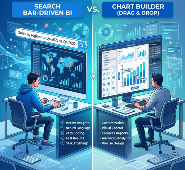
AI analytics tools like Pulse AI make this easy by letting each user ask questions in plain English — “show me this month’s sales by rep” — instead of navigating pre-built charts. This means every team member gets exactly the view they need without any dashboard building required.
Step 2: Make It the Default Morning Routine
Schedule automated email or Slack reports that deliver key metrics every morning before your team even opens the dashboard. When people start their day seeing their numbers, they naturally want to dig deeper. Automated daily reports create the habit; the dashboard becomes the place they go for details.
Step 3: Start Meetings With the Dashboard
The fastest way to drive adoption: open every team meeting by pulling up the dashboard on screen. Review the key metrics together for 2-3 minutes. When leadership consistently references the dashboard, the team follows.
Step 4: Set Up Alerts for Anomalies
Configure automated alerts so the dashboard actively notifies your team when something unusual happens — revenue drops below a threshold, a marketing campaign suddenly spikes, or inventory hits a critical level. Alerts make the dashboard feel alive and valuable.
Step 5: Celebrate Data-Driven Decisions
When someone uses dashboard data to make a better decision — catching a problem early, identifying a growth opportunity, optimizing a campaign — celebrate it publicly. This creates a culture where checking the dashboard is valued, not optional.
Tools That Make Adoption Easier
Traditional BI tools (Tableau, Power BI, Looker) require training and technical setup, which is the biggest adoption barrier. Newer AI-powered tools remove this friction entirely. The easier a dashboard is to use, the more people use it. AI analytics tools like Pulse AI achieve higher adoption rates because there is nothing to learn — if you can type a question, you can use the dashboard.
Measuring Dashboard Adoption Success
Daily Active Users (DAU): How many unique team members open the dashboard each day? Target: 60%+ of your team at least 3x per week.
Questions Asked: If using an AI analytics tool, track how many natural language queries your team runs weekly. Growing query volume means growing engagement.
Decision Attribution: In team meetings, ask “did anyone use the dashboard to make a decision this week?” Track how often the answer is yes.
Frequently Asked Questions
How long does it take to get a team using a new dashboard?
With the right adoption strategy, expect 2-4 weeks for basic habit formation. Most teams see 50%+ daily active usage within the first month if you follow the framework above. Without an adoption strategy, most dashboards are abandoned within 90 days.
What if my team says they prefer spreadsheets?
This usually means the dashboard doesn’t show them what they need, or it takes more effort than their spreadsheet. Don’t force the switch — instead, show them what the dashboard can do that spreadsheets can’t (real-time data, automatic updates, cross-department visibility). AI analytics tools that let you query data in plain English often win over spreadsheet users because the experience feels just as direct.
Should I train everyone at once or in small groups?
Small groups of 3-5 people work best. Start with your most data-curious team members — they become internal champions who help others.
Do I need a dedicated analytics person to maintain the dashboard?
With traditional BI tools, yes — someone needs to build reports, manage permissions, and update visualizations. With AI analytics platforms like Pulse AI, no — each user can ask their own questions and the system maintains itself. This dramatically reduces the maintenance burden.