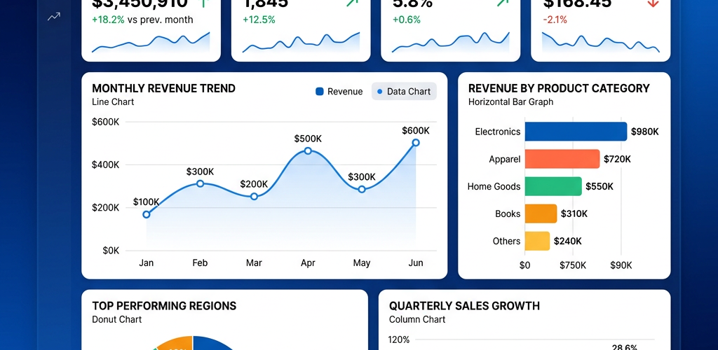
Tracking business performance starts with a clear KPI dashboard. Tableau is one of the most popular tools for building them — but it requires a significant time investment and technical know-how. This guide walks you through the full process of creating a KPI dashboard in Tableau, from connecting your data to publishing a finished dashboard. We also cover a faster alternative for teams that don’t have the time or technical resources to go through Tableau’s setup.
What Is a KPI Dashboard?
A KPI (Key Performance Indicator) dashboard is a visual display that tracks your most important business metrics in one place. Instead of digging through spreadsheets or running manual reports, a KPI dashboard gives you an at-a-glance view of how your business is performing — revenue, sales growth, customer churn, marketing ROI, or whatever matters most to your team.
A well-built KPI dashboard answers three questions instantly: Where are we now? Are we on track? What needs attention?
Tableau is a powerful data visualization platform used by data analysts and BI teams worldwide to build these dashboards. It supports complex calculations, dozens of chart types, and connects to virtually any data source. The tradeoff is complexity — building a polished KPI dashboard in Tableau typically takes several hours and assumes familiarity with the platform.
What You’ll Need Before You Start
Before building your KPI dashboard in Tableau, make sure you have:
Tableau Desktop or Tableau Public — Tableau Desktop requires a paid license (starting at $75/user/month). Tableau Public is free but your dashboards will be publicly visible and you can only connect to file-based data sources like Excel and CSV.
Your data source ready — This could be an Excel file, a CSV export, a SQL database, Google Sheets, Salesforce, or any of Tableau’s 80+ supported connectors. Your data should include the metrics you want to track (e.g., revenue, units sold, customer count) and a time dimension (dates) for trend analysis.
Clear KPI definitions — Know exactly which metrics matter. Common examples include monthly revenue, customer acquisition cost (CAC), churn rate, average order value, and net promoter score. Define targets for each so you can show performance against goals.
Basic Tableau familiarity — This guide covers each step, but you’ll move faster if you understand Tableau’s interface: the Data pane, Marks card, Shelves (Rows/Columns), and the concept of dimensions vs. measures.
Step 1: Connect to Your Data Source
Open Tableau Desktop and click Connect in the start screen. Choose your data source type — for this walkthrough, we’ll use an Excel file with monthly sales data.
Select your file and Tableau will show a preview of the data. Drag the relevant sheet to the canvas area. Check that Tableau has correctly identified your field types — dates should show a calendar icon, numbers should show a # symbol, and text fields should show “Abc.”
Common gotcha: If your dates aren’t being recognized, check that your date column is formatted consistently in your source file. Inconsistent date formats (mixing “01/15/2025” and “January 15, 2025”) will cause Tableau to read the column as text instead of dates.
Click Sheet 1 at the bottom to start building your first visualization.
Step 2: Create Individual KPI Worksheets
The best approach in Tableau is to build each KPI as a separate worksheet, then combine them into a dashboard later. This gives you full control over formatting and layout.
KPI 1: Total Revenue (Big Number)
This creates the classic “big number” KPI card you see on executive dashboards.
- Drag Sales (or your revenue measure) to the Text mark on the Marks card.
- Tableau will show SUM(Sales) as a single number.
- Right-click the number and select Format. Increase the font size to 20-28pt, bold it, and set the color to something that stands out — dark blue or green works well.
- To add context, create a calculated field for year-over-year change: go to Analysis → Create Calculated Field and enter a formula like:
(SUM([Sales]) - LOOKUP(SUM([Sales]), -1)) / ABS(LOOKUP(SUM([Sales]), -1)) - Drag this calculated field to Text as well, and format it as a percentage.
- Rename the sheet tab to “Revenue KPI.”
KPI 2: Sales by Region (Bar Chart)
- Drag Region to Rows and Sales to Columns.
- Tableau creates a horizontal bar chart automatically.
- Click Sort Descending on the toolbar to rank regions from highest to lowest revenue.
- Drag Sales to Color on the Marks card to create a gradient from low to high.
- Drag Sales to Label to show the exact values on each bar.
- Rename this sheet “Sales by Region.”
KPI 3: Revenue Trend Over Time (Line Chart)
- Drag Order Date to Columns. Tableau defaults to YEAR — click the pill and change it to Month (continuous) for a smoother trend line.
- Drag Sales to Rows.
- You’ll see a line chart showing revenue over time.
- To add a target line: go to Analysis → Reference Line, select the axis, and set a constant value for your revenue target.
- Format the target line as dashed and red so it stands out against the actual performance line.
- Rename this sheet “Revenue Trend.”
KPI 4: KPI Scorecard With Conditional Indicators
This is where Tableau gets powerful — you can create color-coded KPI indicators that show green for “on track” and red for “below target.”
- Create a calculated field called KPI Status:
IF SUM([Sales]) > [Target] THEN "Above Target"

   ELSEIF SUM([Sales]) > [Target] * 0.8 THEN "Near Target"

   ELSE "Below Target"

END - Drag Category or Sub-Category to Rows.
- Drag Sales to Text.
- Drag KPI Status to Color. Assign green to “Above Target,” yellow to “Near Target,” and red to “Below Target.”
- Change the mark type to Shape if you want to use checkmarks and warning icons instead of colors.
- Rename this sheet “KPI Scorecard.”
Step 3: Build the Dashboard Layout
Now you’ll combine all four worksheets into a single dashboard.
- Click Dashboard → New Dashboard (or the dashboard icon at the bottom).
- Set the dashboard size — Fixed size at 1200×800 pixels works well for most displays. For presentations, use 16:9 (1920×1080).
- From the left panel, drag your worksheets onto the canvas:
- Place the Revenue KPI big number at the top left.
- Place a second big number KPI (like customer count or average order value) at the top right.
- Place the Revenue Trend line chart in the middle, spanning the full width.
- Place Sales by Region on the bottom left and KPI Scorecard on the bottom right.
- Add a Text object at the top for your dashboard title: “Sales Performance Dashboard — 2025.”
- Use Blank objects to add spacing between sections.
Step 4: Add Interactivity and Filters
Static dashboards are useful, but interactive ones are much more powerful.
Add a date filter: Drag Order Date to the Filters shelf on any worksheet. Right-click and select Show Filter. Then right-click the filter on the dashboard and select Apply to All Worksheets Using This Data Source. Now your date filter controls every KPI on the dashboard simultaneously.
Add filter actions: Go to Dashboard → Actions → Add Action → Filter. This lets users click a region on the bar chart and have all other KPIs filter to that region automatically.
Add highlight actions: Similar to filter actions, but instead of filtering, they highlight the selected data across all sheets. Useful for presentations.
Tooltips: Hover over any data point and Tableau shows a tooltip. Customize these by clicking Tooltip on the Marks card — add context like “vs. last year” comparisons or additional metrics.
Step 5: Format and Polish
The difference between a good dashboard and a great one is formatting.
Remove clutter: Right-click gridlines and hide them. Remove row/column dividers. Hide sheet titles you don’t need (the dashboard title is usually enough).
Consistent color palette: Pick 2-3 brand colors and stick with them. Avoid Tableau’s default rainbow palette for KPI dashboards — it’s distracting.
Font hierarchy: Use larger, bold fonts for KPI numbers and titles. Use smaller, regular fonts for labels and axis text. Tableau’s default font sizes are often too small for executive dashboards.
Borders and backgrounds: Use light gray backgrounds on KPI cards to create visual separation. Add thin borders between sections.
Step 6: Publish and Share
Tableau Server / Tableau Cloud: If your organization uses Tableau Server or Tableau Cloud, click Server → Publish Workbook. Set permissions so the right people can view it. You can schedule data refreshes so the dashboard stays current.
Tableau Public: If you’re using the free version, publish to Tableau Public. Be aware that your data and dashboard will be publicly visible.
Export options: You can export to PDF, PowerPoint, or image formats for one-time sharing. But the real value is a live dashboard that updates automatically.
Common Challenges With Tableau KPI Dashboards
The learning curve is real. If you’re not already a Tableau user, expect to spend 10-20 hours learning the basics before you can build a polished KPI dashboard. Calculated fields, LOD expressions, and dashboard formatting have significant complexity.
Licensing costs add up. Tableau Creator is $75/user/month. If you want 5 people to build and edit dashboards, that’s $4,500/year — before you factor in Tableau Server for sharing.
Data prep is a separate problem. Tableau visualizes data, but it doesn’t clean or transform it well. Messy data (duplicate rows, inconsistent categories, missing values) needs to be fixed before it reaches Tableau, typically with a separate ETL tool.
Maintenance is ongoing. When data sources change (new columns, renamed fields, schema updates), Tableau dashboards break. Someone needs to fix the connections, update calculated fields, and re-publish.
Non-technical stakeholders can’t self-serve. Your CEO probably won’t open Tableau Desktop to tweak a filter. They’ll ask the data team, and the data team becomes a bottleneck.
Side-by-Side Comparison
| Feature | Tableau | Pulse AI |
|---|---|---|
| Setup time for KPI dashboard | 4-6 hours | Under 5 minutes |
| Technical skills required | Yes — calculated fields, data modeling, formatting | None — plain English |
| Learning curve | 10-20+ hours for proficiency | Immediate — just type |
| Cost | $75/user/month (Creator) | More affordable (see pricing) |
| Data connections | 80+ connectors | 100+ integrations |
| Self-serve for non-technical users | Limited — viewers can filter but not build | Full — anyone can ask questions |
| AI-powered insights | No (manual analysis) | Yes — anomaly detection, trend analysis |
| Maintenance when data changes | Manual fixes required | Automatic adaptation |
When to Use Tableau vs. Pulse AI
Choose Tableau if you have a dedicated data team, need pixel-perfect custom visualizations, work with massive datasets (millions of rows with complex joins), or your organization has already invested in the Tableau ecosystem.
Choose Pulse AI if you want KPI dashboards without the setup time, your team is non-technical, you need fast answers from your data without writing queries, or you’re a small-to-mid-sized business that wants BI capabilities without enterprise BI costs.
FAQ
How long does it take to build a KPI dashboard in Tableau?
For someone experienced with Tableau, a basic KPI dashboard takes 2-4 hours. For a beginner, expect 8-16 hours including learning the interface, connecting data, building individual worksheets, formatting, and assembling the dashboard. More complex dashboards with calculated fields, parameters, and interactivity can take days.
Can I build a Tableau KPI dashboard for free?
Yes — Tableau Public is free. The limitations: your dashboards are publicly visible (no private dashboards), you can only connect to file-based data sources (Excel, CSV, Google Sheets — no live database connections), and you can’t schedule data refreshes. For business use with sensitive data, you’ll need Tableau Desktop ($75/month).
What are the most important KPIs to put on a business dashboard?
This depends on your business, but common ones include: revenue and revenue growth rate, customer acquisition cost (CAC), customer lifetime value (LTV), churn rate, gross margin, monthly active users, net promoter score (NPS), and cash runway. Start with 5-8 KPIs max — dashboard clutter kills usability.
Do I need to know SQL to use Tableau?
Not necessarily for basic dashboards. Tableau has a drag-and-drop interface and its own formula language (calculated fields). However, for advanced use cases — custom SQL data sources, LOD expressions, performance optimization — SQL knowledge helps significantly. Pulse AI eliminates this requirement entirely by accepting plain English queries.
Can I automate Tableau dashboard updates?
Yes, but only with Tableau Server or Tableau Cloud (paid). You schedule “extract refreshes” that pull new data on a set interval (daily, hourly, etc.). Tableau Public does not support automated refreshes — you’d need to manually re-publish. Pulse AI refreshes automatically whenever your underlying data sources update.
Ready to skip the setup and start getting insights from your data in minutes? Try Pulse AI free — connect your data sources and build your first KPI dashboard in under 5 minutes.