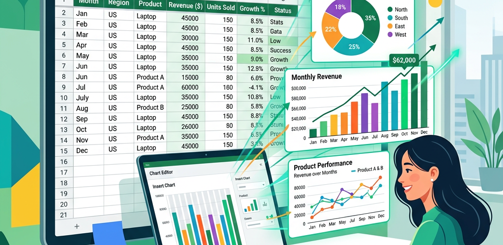
Need to turn your Google Sheets data into a chart? Select your data range, click Insert → Chart, choose your chart type, and customize using the Chart Editor panel. Google Sheets supports bar charts, line charts, pie charts, scatter plots, and more — all built directly from your spreadsheet data.
This guide walks you through every step, from preparing your data to publishing a polished, professional chart. We’ll also show you a faster way to create charts if you want to skip the manual setup entirely.
Why Visualize Data in Google Sheets?
Google Sheets is where most teams already live. Sales numbers, marketing metrics, survey responses, project timelines — it’s all sitting in rows and columns. But raw data in a spreadsheet is hard to interpret at a glance. Charts turn that data into patterns you can actually see: trends going up or down, comparisons between categories, proportions of a whole.
The problem? Google Sheets charting works fine for simple visuals, but it gets clunky fast when you need anything beyond the basics. Let’s walk through how to do it — and where the limitations start showing up.
Step 1: Prepare Your Data
Good charts start with clean data. Before you touch the Insert menu, make sure your spreadsheet is structured correctly.
Headers in the first row. Google Sheets uses your column headers as labels. If Row 1 says “Month” and “Revenue,” your chart automatically knows what to label each axis.
Consistent data types. Don’t mix text and numbers in the same column. If column B is revenue, every cell should be a number — no “N/A” or “TBD” mixed in. Those break your chart.
No blank rows or columns in your range. Gaps in your data confuse the chart engine. If you have blank rows separating sections, remove them or select your data range manually instead of relying on auto-detection.
Example data structure:
| Month | Revenue | Expenses | Profit |
|---|---|---|---|
| Jan | 42,000 | 28,000 | 14,000 |
| Feb | 45,500 | 29,200 | 16,300 |
| Mar | 51,000 | 30,100 | 20,900 |
| Apr | 48,200 | 31,500 | 16,700 |
| May | 55,800 | 32,000 | 23,800 |
| Jun | 62,100 | 33,400 | 28,700 |
This is chart-ready: clear headers, consistent numbers, no gaps.
Step 2: Select Your Data Range
Click and drag to highlight the cells you want to chart. Include the header row — Google Sheets needs those labels.
For the example above, you’d select A1:D7 (all four columns including headers and six months of data).
Pro tip: If your data is in a contiguous block with no gaps, you can click any cell in the range and Google Sheets will auto-detect the full range when you insert a chart. But explicit selection is safer — it prevents the chart from accidentally pulling in adjacent data you don’t want.
For non-contiguous data (e.g., you want Month and Profit but not Revenue or Expenses), hold Ctrl (Cmd on Mac) while clicking to select multiple separate columns. Select A1:A7, then hold Ctrl and select D1:D7.
Step 3: Insert the Chart
With your data selected:
- Click Insert in the top menu bar
- Click Chart
Google Sheets immediately creates a chart and opens the Chart Editor panel on the right side. It auto-detects a chart type based on your data — usually a bar or line chart. This default is often wrong for what you actually need, so don’t worry about it yet.
Step 4: Choose the Right Chart Type
In the Chart Editor panel, click the Setup tab. The first option is Chart type — click the dropdown to see all available options.
Which chart type to use:
Line chart — Best for showing trends over time. Use this when your X-axis is dates, months, quarters, or any time series. Our revenue-over-months example is a perfect line chart use case.
Bar chart (horizontal) or Column chart (vertical) — Best for comparing categories. Use when you want to show how different items stack up: revenue by product, sales by region, responses by category.
Pie chart — Best for showing parts of a whole, but only when you have 2-6 categories. More than that and pie charts become unreadable. Use sparingly.
Scatter plot — Best for showing relationships between two variables. Use when you want to see if there’s a correlation: ad spend vs. revenue, hours studied vs. test score.
Area chart — Like a line chart but filled underneath. Good for showing cumulative totals or comparing the magnitude of trends.
Combo chart — Mixes bars and lines on the same chart. Useful when you have metrics at different scales (e.g., revenue in dollars on bars, growth rate in percentage on a line).
For our example, select Line chart to show the revenue, expenses, and profit trends over six months.
Step 5: Customize the Chart Appearance
Click the Customize tab in the Chart Editor. This is where you turn a default chart into something presentable.
Chart & axis titles: Expand “Chart & axis titles” to add a descriptive title. Instead of leaving the auto-generated title, write something clear: “Monthly Revenue, Expenses & Profit — H1 2025.”
Series: Click “Series” to change colors, line thickness, point shapes, and add data labels for individual data series. You can make Revenue green, Expenses red, and Profit blue — instantly more readable.
Legend: Move the legend position (top, bottom, right, none) or change its font size. For simple charts, “Top” works best. For charts with many series, “Right” keeps things organized.
Gridlines and ticks: Reduce visual clutter by adjusting or removing gridlines. Minor gridlines are usually unnecessary — remove them for a cleaner look.
Data labels: Add data labels to show exact values on each data point. Useful for presentations, but can clutter charts with many data points.
Step 6: Resize and Position Your Chart
Click on the chart to select it, then drag the corners to resize. Drag the chart body to reposition it on your sheet.
For presentations: Make the chart large enough that labels are readable at a glance. A common mistake is leaving the chart at the small default size.
For dashboards: If you’re building a multi-chart dashboard in Google Sheets, align your charts in a grid. Use consistent sizes — it looks much more professional.
Step 7: Share or Export Your Chart
Share the whole spreadsheet: Click Share and add collaborators. They see the charts live and updated.
Download the chart as an image: Click the three-dot menu (⋮) on the chart → Download as → PNG or PDF. Use this for embedding in presentations, documents, or emails.
Publish to web: Chart menu → Publish chart → get an embed link or iframe code. The chart updates automatically when your data changes. Useful for internal wikis or dashboards.
Copy to Google Slides or Docs: Click the chart → Ctrl+C → paste into Slides or Docs. Choose “Link to spreadsheet” to keep it synced, or “Paste unlinked” for a static snapshot.
Common Google Sheets Charting Problems (and Fixes)
Chart shows data in the wrong orientation. In Chart Editor → Setup, toggle “Switch rows/columns.” This flips whether Google Sheets reads your data horizontally or vertically.
Too many data points make the chart unreadable. Filter your data before charting. Instead of showing all 365 days, aggregate to weekly or monthly. Or use the Data Range option to limit what’s included.
Dates aren’t sorting correctly. Make sure your date column is formatted as actual dates (Format → Number → Date), not plain text. Google Sheets sorts text dates alphabetically (“Apr” before “Aug” before “Dec”), not chronologically.
Chart colors are too similar. Manually set series colors in Customize → Series. Don’t rely on the default palette — it often assigns similar shades to adjacent series.
Pie chart has too many tiny slices. If you have more than 5-6 categories, group the smaller ones into an “Other” category. Or switch to a bar chart, which handles many categories much better.
Frequently Asked Questions
How do I make a chart from Google Sheets on mobile?
Open Google Sheets app → select your data → tap the + icon → Insert → Chart. The mobile editor is more limited than desktop — you get basic chart type selection and minimal customization. For anything complex, use a desktop browser.
Can I make a chart from multiple Google Sheets?
Not directly. Google Sheets charts can only pull data from the sheet they’re in. To chart data from multiple sheets, use IMPORTRANGE() formulas to pull data into one sheet first, then chart from there. It’s a workaround, not a native feature.
What’s the best chart type for comparing two things?
A grouped bar chart or column chart for side-by-side comparison. A line chart if you’re comparing trends over time. A scatter plot if you’re looking for correlation. Avoid pie charts for comparison — they’re designed for composition, not comparison.
How do I make my Google Sheets chart update automatically?
It already does — as long as your chart’s data range includes the cells where new data will go. If you add new rows beyond the original range, you’ll need to manually expand the data range in Chart Editor → Setup → Data Range. Or use a dynamic named range to auto-expand.
Can I embed a Google Sheets chart on a website?
Yes. Click the three-dot menu on the chart → Publish chart → choose “Interactive” or “Image” → copy the embed code or link. Interactive embeds let viewers hover for data points. The chart auto-updates when your spreadsheet data changes. Note: the spreadsheet’s sharing settings must allow public access or “anyone with the link.”