Salesforce holds your most valuable business data — pipeline, revenue, win rates, activity. But Salesforce’s built-in reporting is clunky, slow, and limited. Building reports takes too long. Customizing dashboards requires admin expertise. Sharing insights across teams is a pain.
The solution: Connect Salesforce to a real dashboard. See your sales data in clean, actionable visualizations. Track pipeline, quota attainment, and forecast in real-time. Share insights with anyone, even non-Salesforce users.
Pulse AI makes this simple. Connect Salesforce in 3 clicks. Choose the metrics you care about. Build a dashboard in minutes, not days. No Salesforce admin required. No coding.
This guide shows you how to connect Salesforce to a dashboard, which metrics to track, and why Pulse AI is the fastest way to turn Salesforce data into insights.
Why Connect Salesforce to a Dashboard?
Salesforce is a powerful CRM, but its reporting has major limitations:
Slow to build. Creating custom reports and dashboards in Salesforce takes hours. You need admin training or a Salesforce consultant.
Hard to customize. Salesforce dashboards are rigid. Want to combine Salesforce data with marketing spend or website analytics? Not easy.
Limited sharing. Only Salesforce users can view dashboards. If executives, marketing, or other teams don’t have Salesforce licenses, they can’t see the data.
Clunky interface. Salesforce reports are functional but not beautiful or intuitive.
No real-time updates. Salesforce dashboards refresh slowly or require manual refreshes.
A modern BI dashboard fixes all of this. You choose the metrics, visualize them clearly, and share with anyone — Salesforce license not required.
Key Salesforce Metrics to Track in Your Dashboard
You don’t need to track every field in Salesforce. Focus on metrics that drive sales decisions.
Pipeline Metrics
Total Pipeline Value: Sum of all open opportunities. Shows how much potential revenue is in the funnel.
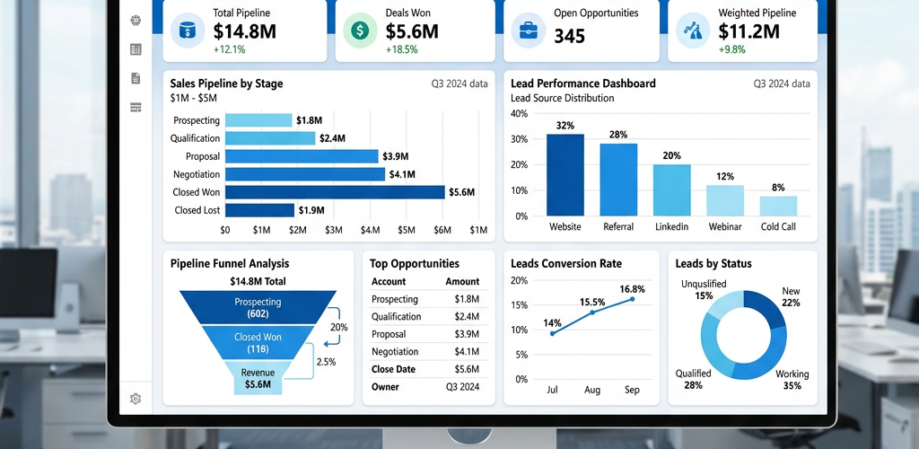
Pipeline by Stage: Breakdown of opportunities by sales stage (Prospecting, Qualification, Proposal, Negotiation, etc.). Shows where deals are concentrated and where they get stuck.
Pipeline Coverage Ratio: Pipeline ÷ Quota. Shows if you have enough pipeline to hit your number. Most teams aim for 3x-5x coverage.
Weighted Pipeline: Pipeline × Win Probability. More realistic forecast than raw pipeline.
Pipeline Added (This Week/Month): New opportunities created. Shows if pipeline generation is healthy.
Pipeline Movement: Deals that moved forward, backward, or stayed stuck. Highlights sales velocity.
Revenue Metrics
Closed Won Revenue: Total revenue from closed deals (this month, this quarter, this year).
Quota Attainment: Revenue vs. Quota (team and individual). Shows if reps are on track.
Revenue by Product/Service: Which offerings drive the most revenue?
Revenue by Region/Team: Breakdown by geography or sales team.
Revenue Growth: Month-over-month or year-over-year revenue change.
Performance Metrics
Win Rate: Percentage of opportunities that close as won. Overall and by deal type, size, or industry.
Sales Cycle Length: Average days from opportunity created to closed won. Shows deal velocity.
Average Deal Size: Average revenue per closed deal.
Deals Closed (by Rep): Number of deals each rep closes.
Activity by Rep: Calls, emails, meetings logged in Salesforce. Leading indicator of future pipeline.
Forecast Metrics
Forecasted Revenue: Sum of opportunities weighted by close probability. Shows expected revenue.
Forecast Accuracy: Actual revenue vs. forecasted revenue. Shows if your team forecasts realistically.
Commit vs. Best Case: Conservative forecast vs. optimistic forecast.
Deals by Close Date: Opportunities expected to close this month, next month, this quarter.
At-Risk Deals: Opportunities past their expected close date or with stalled activity.
Most sales teams only need 15-20 of these metrics. Pulse AI lets you pick exactly what matters.
How to Connect Salesforce to Pulse AI (Step-by-Step)
Connecting Salesforce to Pulse AI takes 5 minutes. No coding. No API keys. No Salesforce admin required.
Step 1: Log into Pulse AI
Go to usepulseai.com and sign in.
Step 2: Add Salesforce as a Data Source
Click “Add Data Source” → Select “Salesforce” → Authenticate with your Salesforce account.
Pulse AI uses OAuth, so you just log in to Salesforce and click “Allow.” It connects instantly.
Step 3: Choose Salesforce Objects
Select which Salesforce objects you want to sync: Opportunities, Accounts, Leads, Activities, Users, etc.
Most teams start with Opportunities (for pipeline and revenue) and Activities (for rep performance).
Step 4: Select Metrics
Choose which metrics you want to track. Pulse AI suggests the most common ones (pipeline, closed revenue, win rate, quota attainment), but you can add or remove any metric.
Step 5: Build Your Dashboard
Drag and drop visualizations onto your dashboard:
- Line charts for revenue trends
- Funnel charts for pipeline by stage
- Bar charts for quota attainment by rep
- Tables for top deals or at-risk opportunities
Customize colors, labels, and time ranges.
Step 6: Set Refresh Frequency
Choose how often Pulse AI syncs with Salesforce. Real-time, hourly, or daily.
Step 7: Share
Send a link to your team (Salesforce license not required), embed in Slack, or schedule automated email reports.
Total time: 5-10 minutes.
Use Cases: What You Can Do with a Salesforce Dashboard
Use Case 1: Track Sales Pipeline Performance
See total pipeline, pipeline by stage, and pipeline coverage in real-time.
Metrics to track:
- Total pipeline value
- Pipeline by stage
- Pipeline coverage ratio (pipeline ÷ quota)
- Weighted pipeline
- Pipeline added this month
- Deals stuck longer than 30/60/90 days
Why it works: Instant visibility into deal flow. If pipeline is too thin, reps need to prospect more. If deals are piling up in one stage, there’s a process problem.
Use Case 2: Monitor Quota Attainment
Track individual and team quota performance. See who’s on track and who needs help.
Metrics to track:
- Closed revenue by rep
- Quota attainment percentage by rep
- Number of reps at 100%+ quota
- Number of reps below 50% quota
- Trending toward quota (based on current pace)
Why it works: Makes quota attainment visible. Reps see where they stand. Managers see who needs coaching.
Use Case 3: Forecast Revenue
Build accurate revenue forecasts based on weighted pipeline, historical win rates, and close dates.
Metrics to track:
- Forecasted revenue (committed, best case, worst case)
- Closed revenue vs. forecast
- Forecast accuracy (did we hit last quarter’s forecast?)
- Deals by close date (this month, next month, this quarter)
- At-risk deals (deals past expected close date)
Why it works: Sales forecasts are notoriously optimistic. This dashboard forces discipline and shows variance between forecast and actuals.
Use Case 4: Analyze Win/Loss Patterns
Why do you win deals? Why do you lose them? Analyze closed deals to uncover patterns.
Metrics to track:
- Win rate (overall)
- Win rate by deal size (small, medium, large)
- Win rate by industry
- Win rate by lead source
- Common win reasons
- Common loss reasons (pricing, competitor, timing, etc.)
- Competitor analysis (which competitors are we losing to?)
Why it works: Most teams don’t analyze why they win or lose. This dashboard surfaces patterns that inform strategy.
Use Case 5: Track Sales Rep Activity
Monitor calls, emails, and meetings to ensure reps hit activity targets. Activity is a leading indicator of future pipeline.
Metrics to track:
- Total calls/emails/meetings by rep (daily, weekly, monthly)
- Activity trends over time
- Reps hitting activity targets vs. missing targets
- Activity-to-opportunity conversion rate
Why it works: Catches problems early. If a rep’s activity drops 50% in two weeks, you can intervene before it tanks their pipeline.
Salesforce Dashboards: Pulse AI vs. Other Tools
| Feature | Pulse AI | Salesforce Reports | Tableau CRM | Power BI | Google Looker Studio | |———|———-|——————-|————-|———-|———————| | Setup time | 5-10 minutes | Hours | Days | Days | Hours | | Requires Salesforce admin | No | Sometimes | Yes | No | No | | Requires coding/SQL | No | No | Sometimes | Sometimes | No | | Combines Salesforce with other data | ✅ Yes (marketing, finance, etc.) | ❌ No | ⚠️ Limited | ✅ Yes | ✅ Yes | | Real-time updates | ✅ Yes | ⚠️ Manual refresh | ✅ Yes | ✅ Yes | ⚠️ Limited | | Shareable outside Salesforce | ✅ Yes | ❌ No (requires SF license) | ❌ No (requires SF license) | ✅ Yes | ✅ Yes | | Pricing | From $29/month | Included (limited) | From $75/user/month | From $10/user/month | Free | | Best for | Teams who want results fast | Basic reporting | Salesforce power users | Microsoft-heavy orgs | Budget-conscious teams |
Salesforce Reports are included but rigid and limited. Only Salesforce users can view them.
Tableau CRM (formerly Einstein Analytics) is powerful but expensive ($75+/user/month), requires Salesforce admin expertise, and takes days to set up.
Power BI and Google Looker Studio can connect to Salesforce but require manual configuration and technical skills.
Pulse AI gives you enterprise BI power with zero complexity. Connect Salesforce in minutes, not days.
Common Mistakes When Building Salesforce Dashboards
Mistake 1: Tracking too many metrics
Dashboards with 50 KPIs overwhelm users. Focus on 15-20 metrics that drive decisions.
Mistake 2: Not weighting pipeline
Raw pipeline is misleading. A $1M opportunity at 10% probability is worth $100K, not $1M. Always use weighted pipeline for forecasts.
Mistake 3: Ignoring sales cycle length
If your sales cycle is creeping from 45 days to 75 days, something changed. Track it.
Mistake 4: Not tracking activity
Revenue is a lagging indicator. Activity (calls, emails, meetings) is a leading indicator. Track both.
Mistake 5: Not combining Salesforce with other data
Salesforce shows pipeline and revenue, but it doesn’t show marketing spend, website traffic, or ad performance. Combine Salesforce with marketing tools for full attribution.
Pulse AI helps you avoid these mistakes with smart defaults and suggested metrics.
Advanced: Combine Salesforce with Other Data Sources
Salesforce is powerful, but combining it with other data sources unlocks deeper insights.
Salesforce + Marketing Automation (HubSpot, Marketo, Pardot)
Track the full funnel from marketing lead to closed deal.
Example: 10,000 marketing leads → 2,000 MQLs → 500 SQLs → 100 opportunities → 20 closed deals. See conversion rates at each stage and optimize weak points.
Salesforce + Ad Platforms (Google Ads, Facebook Ads)
See how much ad spend is required to generate pipeline and revenue.
Example: $10,000 ad spend → 500 leads → 50 opportunities → $100,000 pipeline → $20,000 closed revenue. ROI = 2x.
Salesforce + Finance/Accounting (QuickBooks, NetSuite)
Compare forecasted revenue (from Salesforce) to actual revenue (from accounting software).
Example: Salesforce forecast was $500K but actual revenue was $400K. 80% forecast accuracy. Adjust future forecasts.
Salesforce + Customer Success (Zendesk, Intercom)
Track post-sale health. Are customers who had support issues more likely to churn or upsell?
Example: Customers with 5+ support tickets churn at 40%. Customers with 0-2 tickets churn at 10%. Prioritize proactive support for high-ticket customers.
Pulse AI connects all of these in one dashboard. No manual data merging.
Pulse AI connects Salesforce (and all your other tools) automatically. Track pipeline, revenue, and performance in real-time. Try Pulse AI free.
Frequently Asked Questions
How do you connect Salesforce to a dashboard?
Use a BI tool like Pulse AI that has a pre-built Salesforce connector. Log in, authenticate with Salesforce, select the objects you want to sync (Opportunities, Accounts, Leads, etc.), choose metrics, and build visualizations. With Pulse AI, this takes 5-10 minutes.
Can you build Salesforce dashboards without a Salesforce admin?
Yes. Pulse AI connects to Salesforce with standard OAuth authentication. No admin access required. Just log in with your Salesforce credentials and click “Allow.”
What metrics should a Salesforce dashboard include?
Focus on pipeline (total value, pipeline by stage, coverage ratio), revenue (closed deals, quota attainment), performance (win rate, sales cycle length), and forecast (weighted pipeline, forecast accuracy). Choose 15-20 KPIs that drive decisions.
Can you share Salesforce dashboards with people who don’t have Salesforce licenses?
Yes, with Pulse AI. Anyone with the dashboard link can view it — no Salesforce license required. Salesforce’s built-in dashboards require a Salesforce license to view.
How often should a Salesforce dashboard update?
Real-time or hourly for fast-moving sales teams. If reps are closing deals daily, you want live data. If your sales cycle is 6+ months, daily updates are fine. Pulse AI lets you set custom refresh rates.
What’s better: Salesforce Reports or Pulse AI for Salesforce dashboards?
Salesforce Reports are included and work for basic reporting, but they’re rigid, slow to customize, and only Salesforce users can view them. Pulse AI is better if you need flexibility, faster setup, or want to share dashboards outside Salesforce.
Can you combine Salesforce with other data sources in one dashboard?
Yes. Pulse AI lets you combine Salesforce with marketing automation (HubSpot, Marketo), ad platforms (Google Ads, Facebook Ads), accounting software (QuickBooks, NetSuite), and more in one dashboard.
Do you need coding skills to connect Salesforce to a dashboard?
No. Tools like Pulse AI use OAuth authentication (just click “Allow”). No API keys, no coding, no technical setup required.
Conclusion: Turn Salesforce Data into Decisions with Pulse AI
Salesforce holds critical sales data, but its reporting interface makes insights hard to find. Building a custom dashboard turns Salesforce data into clear, actionable visualizations your whole team can see.
Most Salesforce dashboard tools are slow to set up, require admin expertise, or cost a fortune.
Pulse AI is different. Connect Salesforce in 3 clicks. Choose the metrics that matter. Build a dashboard in minutes. Share with anyone — Salesforce license not required. No coding. No complexity.
Stop wasting time wrestling with Salesforce reports. Start making better sales decisions.