Track revenue, pipeline, and team performance — or skip the complexity and build one in minutes with AI.
Building a sales dashboard in Power BI gives your team a centralized view of revenue performance, pipeline health, and individual rep activity. Power BI is one of the most popular tools for this — but the learning curve is real. This guide walks you through the full process step by step, from connecting your CRM data to publishing a polished, interactive sales dashboard.
If you’re looking for a faster alternative, we’ll also show you how to build the same dashboard using Pulse AI in under 5 minutes — no DAX formulas or data modeling required.
What Your Sales Dashboard Should Track
Before you start dragging visuals around, define the KPIs your sales team actually needs. A solid sales dashboard typically includes:
Revenue metrics: Total revenue, revenue by product/region/rep, month-over-month growth, revenue vs. target.
Pipeline metrics: Total pipeline value, deals by stage, average deal size, pipeline coverage ratio (pipeline ÷ quota — healthy is 3x+).
Activity metrics: Win rate, sales cycle length, conversion rate by funnel stage, new leads vs. closed deals.
Rep performance: Revenue per rep, quota attainment, activity volume (calls, meetings, proposals sent).
Start with 5–7 KPIs maximum. You can always add more later — but a cluttered dashboard is worse than no dashboard.
Step 1: Connect Your Data Source
Power BI supports dozens of connectors — CRM systems (Salesforce, HubSpot, Dynamics 365), databases (SQL Server, PostgreSQL), spreadsheets (Excel, Google Sheets), and cloud services.
To connect:
Open Power BI Desktop and click Home → Get Data. Select your data source — for most sales teams, this is either a CRM connector or an Excel/CSV export.
If you’re using Salesforce, select the Salesforce Objects connector, sign in with your credentials, and choose the objects you need (typically Opportunities, Accounts, Contacts, and Users).
If you’re working from Excel, select the Excel Workbook connector and browse to your file. Make sure your data is in a proper table format — column headers in row 1, no merged cells, no blank rows.
Click Transform Data to open Power Query Editor before loading. This is where you clean the data.
Step 2: Clean and Shape Your Data in Power Query
Raw CRM data is messy. Power Query lets you fix it before it hits your dashboard.
Common cleaning steps for sales data:
Remove unnecessary columns — you don’t need every CRM field. Keep only what maps to your KPIs. Right-click column headers and select Remove Columns for anything you won’t use.
Fix data types — make sure dates are recognized as dates, currency fields as decimal numbers, and text fields as text. Click the icon in the column header to change types.
Filter out junk — remove test deals, internal opportunities, and any records with null values in critical fields (like Close Date or Amount). Use the dropdown arrow on column headers to filter.
Create calculated columns if needed — for example, Sales Cycle Length = Close Date minus Created Date. Go to Add Column → Custom Column and enter the formula.
Rename columns to human-readable names — “Opportunity.Amount” becomes “Deal Value”, “CloseDate” becomes “Close Date”. Double-click column headers to rename.
When your data looks clean, click Close & Apply to load it into the data model.
Step 3: Build Your Data Model and Relationships
If you imported multiple tables (Opportunities, Accounts, Users), Power BI needs to understand how they relate.
Go to Model view (the diagram icon on the left sidebar). Power BI often auto-detects relationships, but verify them:
Opportunities → Accounts should link on Account ID (many-to-one). Opportunities → Users (Sales Rep) should link on Owner ID (many-to-one).
If a relationship is missing, drag the key field from one table to the matching field in another. Set the cardinality (usually many-to-one) and cross-filter direction (usually single).
Create a Date table — this is critical for time-based analysis. Go to Modeling → New Table and enter:
DateTable = CALENDAR(DATE(2023,1,1), DATE(2026,12,31))
Then add calculated columns for Year, Month, Quarter, and Month Name:
Year = YEAR(DateTable[Date])
Month = MONTH(DateTable[Date])
Quarter = "Q" & QUARTER(DateTable[Date])
MonthName = FORMAT(DateTable[Date], "MMM YYYY")
Mark this table as a Date Table (right-click → Mark as date table) and create a relationship between your Opportunities close date and the Date table.
Step 4: Create DAX Measures for Sales KPIs
DAX (Data Analysis Expressions) is Power BI’s formula language. You need it for any metric that isn’t a simple sum or count.
Go to Report view, select your Opportunities table, and click New Measure for each KPI:
Total Revenue:
Total Revenue = SUM(Opportunities[Deal Value])
Revenue vs Target:
Revenue vs Target = [Total Revenue] - SUM(Targets[Target Amount])
Win Rate:
Win Rate =
DIVIDE(
    COUNTROWS(FILTER(Opportunities, Opportunities[Stage] = "Closed Won")),
    COUNTROWS(FILTER(Opportunities, Opportunities[Stage] IN {"Closed Won", "Closed Lost"})),
    0
)
Average Deal Size:
Avg Deal Size = AVERAGE(Opportunities[Deal Value])
Sales Cycle Length (days):
Avg Sales Cycle =
AVERAGEX(
    FILTER(Opportunities, Opportunities[Stage] = "Closed Won"),
    DATEDIFF(Opportunities[Created Date], Opportunities[Close Date], DAY)
)
Pipeline Value (open deals):
Pipeline Value =
CALCULATE(
    SUM(Opportunities[Deal Value]),
    FILTER(Opportunities, Opportunities[Stage] NOT IN {"Closed Won", "Closed Lost"})
)
Pipeline Coverage Ratio:
Pipeline Coverage = DIVIDE([Pipeline Value], SUM(Targets[Target Amount]), 0)
Monthly Revenue Growth:
Revenue MoM Growth =
VAR CurrentMonth = [Total Revenue]
VAR PreviousMonth = CALCULATE([Total Revenue], DATEADD(DateTable[Date], -1, MONTH))
RETURN DIVIDE(CurrentMonth - PreviousMonth, PreviousMonth, 0)
Each measure needs to be created individually. Format them appropriately — currency for dollar values, percentage for rates, whole number for counts.
Step 5: Design the Dashboard Layout
Now the visual part. Switch to Report view and start building.
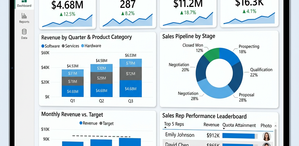
Top row — KPI cards: Add Card visuals for your headline numbers. Place 4–5 across the top: Total Revenue, Pipeline Value, Win Rate, Avg Deal Size, and Deals Closed. Format each with a clear title and appropriate number format.
Middle section — charts: Add a Clustered Bar Chart for Revenue by Sales Rep (reps on the Y-axis, revenue on the X-axis — horizontal bars are easier to read with names). Add a Line Chart for Monthly Revenue Trend (Date on X-axis, Total Revenue on Y-axis). Add a Funnel Chart for your sales pipeline by stage.
Bottom section — detail table: Add a Table or Matrix visual showing individual deals: Account Name, Deal Value, Stage, Close Date, Sales Rep. This gives users the ability to drill into the numbers.
Layout tips: Keep the background white or very light gray. Use your brand colors consistently. Align everything to a grid — Power BI has snap-to-grid in Format → Page settings. Leave breathing room between visuals.
Step 6: Add Interactivity — Slicers, Filters, and Drill-Through
Static dashboards are reports. Interactive dashboards are tools.
Add slicers for the most common filters. Insert a Slicer visual and add these fields:
Time period — use the Date table’s Month or Quarter column. Set it to a dropdown or between-slider style. Sales rep — use the rep name field from your Users table. Region/Territory — if applicable. Product line — if you sell multiple products.
Place slicers at the top or left side of the dashboard where users expect them.
Enable cross-filtering — by default, clicking a bar in one chart filters the other visuals on the page. This is powerful for sales analysis (“click a rep’s name to see only their pipeline and trends”).
Set up drill-through for deal-level detail. Create a second page called “Deal Detail.” Add a table with all deal fields. Right-click the detail page tab → set Drill through filters for Account Name or Deal ID. Now users can right-click any account in the main dashboard and jump to the detail page.
Add tooltips — hover text that shows extra context. Create a small tooltip page (Format → Page size → Tooltip), add a few key metrics, and assign it as the tooltip for your revenue chart.
Step 7: Format, Polish, and Publish
Formatting checklist:
Add a dashboard title bar at the very top — use a text box or a colored rectangle with white text. Include the dashboard name and last-refreshed date.
Make sure all chart titles are clear and descriptive: “Monthly Revenue Trend” not “Chart 1.” Remove chart legends when there’s only one data series — they waste space. Set consistent number formats (e.g., $1.2M not $1,234,567.89 for large numbers). Use conditional formatting on your KPI cards — green when above target, red when below.
Publishing:
Click Home → Publish and select your Power BI workspace. Open the Power BI Service (app.powerbi.com), find your report, and pin key visuals to a Dashboard (this is a separate concept from the report — dashboards show pinned tiles from multiple reports).
Set up scheduled refresh — go to your dataset in the Power BI Service, click Settings → Scheduled Refresh, and configure it to refresh daily or however often your CRM data updates. You’ll need to configure a gateway if your data source is on-premises.
Share the dashboard with your sales team by adding them to the workspace or creating a sharing link.
Total Time and Effort
| Phase | Time Estimate |
|---|---|
| Data connection and cleaning | 1–2 hours |
| Data model and relationships | 30–60 minutes |
| DAX measures (8–10 KPIs) | 1–2 hours |
| Visual design and layout | 2–3 hours |
| Interactivity (slicers, drill-through) | 1–2 hours |
| Formatting and publishing | 1 hour |
| Total | 6–10 hours |
And that’s for someone who already knows Power BI. If you’re learning as you go, double it. Plus ongoing maintenance — when your CRM fields change, your DAX breaks. When a new rep joins, your filters need updating. When leadership wants a new metric, you’re back in the formula editor.
Comparison: Power BI vs. Pulse AI for Sales Dashboards
| Feature | Power BI | Pulse AI |
|---|---|---|
| Setup time | 6–10 hours | Under 5 minutes |
| Technical skill required | DAX, Power Query, data modeling | Plain English questions |
| Data connections | Manual configuration per source | Auto-detected, guided setup |
| KPI creation | Write DAX formulas for each metric | Describe the metric in words |
| Dashboard design | Manual drag-and-drop layout | AI-generated, auto-formatted |
| Adding new metrics | Write new DAX, adjust visuals | Ask in natural language |
| Interactivity | Manual slicer/filter setup | Built-in by default |
| Maintenance burden | High — formulas break, models drift | Low — AI adapts to schema changes |
| Cost | $10/user/month (Pro) or $20/user (Premium Per User) | Starts free |
| Best for | Power users, complex enterprise models | Teams that need answers fast |
Frequently Asked Questions
Can I build a sales dashboard in Power BI without knowing DAX?
You can build a basic one using simple drag-and-drop visuals and built-in aggregations (sum, count, average). But any calculated metric — win rate, pipeline coverage, period-over-period growth — requires DAX. For a genuinely useful sales dashboard, DAX knowledge is essential.
How often should a sales dashboard refresh?
Daily is standard for most sales teams. If your reps need real-time visibility during closing periods, you can set up DirectQuery mode (queries the source live) instead of Import mode, but this impacts performance. Pulse AI connects live to your data, so it’s always current.
What’s the difference between a Power BI Report and a Power BI Dashboard?
A Report is a multi-page canvas where you build visuals. A Dashboard is a single-page collection of pinned tiles from one or more reports. Think of reports as the workspace and dashboards as the executive summary. Both are shared through the Power BI Service.
Can Power BI connect directly to Salesforce or HubSpot?
Yes — Power BI has native connectors for both. For Salesforce, use the “Salesforce Objects” connector. For HubSpot, you’ll typically use the HubSpot REST API connector or export to a database first. Pulse AI also connects to both with less configuration.
What if my sales data is just in Excel spreadsheets?
Power BI works fine with Excel — just make sure your data is in a clean table format. But if your data is in spreadsheets, you might not need Power BI’s complexity at all. Pulse AI can read your spreadsheet directly and build a dashboard from a single question: “Show me a sales dashboard from this data.”
Ready to build your sales dashboard in minutes instead of days? Try Pulse AI free — connect your data source and ask for what you need in plain English.