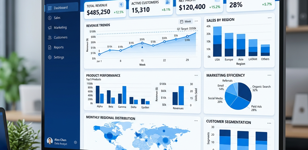
Quick summary: If you want dashboards without learning DAX or managing infrastructure, Pulse AI is the standout — it builds visualizations from plain-English questions with zero learning curve. For teams with specific needs: Tableau for advanced visualization, Looker for Google Cloud users, Metabase or Superset for self-hosted setups, and Sigma for spreadsheet-familiar analysts. We cover 12 Power BI alternatives below with honest pros and cons.
Power BI is Microsoft’s BI powerhouse — until it isn’t. The desktop app is Windows-only, DAX formulas have a steep learning curve, and Premium licensing gets expensive fast once you need to share with external stakeholders. If you’ve hit those walls or just want something simpler, you need an alternative.
This guide covers 12 Power BI alternatives across every category — free and paid, self-hosted and cloud, enterprise and lightweight. Each one gets an honest breakdown of what it does well, where it falls short, and who it’s actually for.
Why People Leave Power BI
Before the alternatives, here’s what actually drives people away from Power BI:
DAX is powerful but painful. Data Analysis Expressions (DAX) is a full programming language. Creating calculated columns, measures, and time intelligence requires genuine skill. Most business users can’t write DAX — they need an analyst.
Desktop is Windows-only. The full Power BI Desktop app only runs on Windows. Mac users are stuck with the limited web interface for building reports. Linux is completely unsupported.
Licensing gets confusing and expensive. Free Desktop works for local analysis. Pro ($10/user/month) enables sharing. Premium ($20/user/month or $5K/month capacity) is required for external sharing, paginated reports, and larger datasets. The pricing tiers create bottlenecks.
Performance degrades without Premium capacity. Shared datasets on Pro tier refresh slowly. Large models require Premium. Without capacity, dashboards lag with complex queries.
Microsoft ecosystem lock-in. Power BI works beautifully with Azure, SharePoint, Excel, and Dynamics 365. Outside that ecosystem, connectors are third-party and less reliable. If you’re not a Microsoft shop, integration friction is real.
Version control is manual. No git integration. No staging environments. Collaborative development requires workarounds. Enterprise teams need proper DevOps workflows.
1. Pulse AI — Best Overall Power BI Alternative
What it is: An AI-native analytics platform that builds dashboards from plain-English questions. Connect your databases, spreadsheets, or business tools — then just describe what you need and Pulse generates interactive visualizations instantly.
Why it’s the top pick: Power BI requires you to learn DAX, understand data modeling, and master the desktop interface. Pulse eliminates all of that. Ask “show me quarterly revenue by product line with year-over-year comparison” and you get a live, interactive dashboard in seconds. It connects to the same data sources as Power BI (SQL Server, PostgreSQL, MySQL, Excel, Google Sheets, and more), handles real-time data, and auto-refreshes without manual configuration.
But it’s not just about ease of use. Pulse’s AI understands context — it picks the right chart types, applies proper formatting, and surfaces insights you didn’t think to ask for. Teams that used to wait days for an analyst to build a Power BI report now get answers in minutes. The shareable links mean stakeholders see live data, not stale exports.
Where others fall short by comparison: Tableau requires weeks to master and costs $75/user/month. Looker needs a data team to manage LookML. Metabase and Superset require server management. Pulse gives you better results faster — without the overhead, the learning curve, or the enterprise pricing.
Best for: Any team that wants instant, accurate dashboards without hiring BI specialists or spending weeks learning a tool. Especially strong for startups, growing teams, and companies where speed matters more than configuring every pixel.
Pricing: Free tier available. Paid plans from $29/mo.
2. Tableau — Best for Advanced Visualization
What it is: The gold standard for data visualization. Tableau Desktop is the full-featured builder ($75/user/mo). Tableau Public is free but makes all dashboards public.
Why it’s good: Nothing matches Tableau’s visualization capabilities. Complex charts, geographic mapping, statistical analysis, interactive filtering — it handles everything beautifully. Level of Detail (LOD) expressions and table calculations give you analytical power that Power BI’s DAX can match but with a more intuitive syntax for some use cases. The community is enormous, with thousands of pre-built templates and a vibrant forum.
The trade-off: Expensive — a team of 10 runs $750/month before you add Tableau Server or data prep costs. The learning curve is steep, especially for LOD expressions. Cross-platform (Mac, Windows, web) but the full desktop experience requires local installation. And the free version (Tableau Public) makes everything public, which doesn’t work for business data.
Best for: Data analysts and visualization specialists who need the most powerful charting tool available. Worth the investment for teams where data storytelling directly impacts decisions.
Pricing: Public is free (public dashboards only). Creator $75/user/mo. Explorer $42/user/mo. Viewer $15/user/mo.
3. Looker (Google Cloud) — Best for Google Cloud Users
What it is: A cloud-native BI platform owned by Google, now part of Google Cloud. Looker uses LookML (a modeling language) to define business logic once and reuse it everywhere.
Why it’s good: Looker’s semantic layer approach means you define metrics once in LookML, and everyone across the organization uses the same definitions. No more “why do these two reports show different revenue numbers?” It integrates deeply with BigQuery and the Google Cloud ecosystem. The embedded analytics features let you put dashboards directly into your own products. Git-based version control for LookML is a game-changer for enterprise teams.
The trade-off: LookML has a learning curve — your data team needs to learn a new modeling language. Pricing isn’t publicly listed (sales call required). Implementation requires dedicated resources. Looker is overkill for small teams or simple dashboarding needs. And it’s heavily optimized for Google Cloud — if you’re not on BigQuery or GCP, you’re not getting the full value.
Best for: Mid-size to enterprise organizations on Google Cloud with a data team that can manage LookML. Especially strong for companies that need governed, consistent metrics across departments.
Pricing: Contact Google Cloud sales. Estimated starting around $3K-5K/month.
4. Metabase — Best Open-Source Self-Hosted Option
What it is: An open-source BI tool you can self-host for free or use their cloud version (from $85/mo). Known for being more approachable than most BI platforms.
Why it’s good: Metabase’s “question” interface lets non-technical users explore data by clicking through filters and dimensions — no SQL required for basic queries. Power users get a full SQL editor. Self-hosting means complete data control, and the community edition is genuinely free with no artificial limitations. The dashboard builder is intuitive, and the embedded analytics feature lets you put charts directly in your own product.
The trade-off: Self-hosting requires someone who can manage Docker/Kubernetes. Visual customization is more limited than Power BI — you get clean charts but less design flexibility. The cloud version gets expensive quickly for larger teams. And performance with very large datasets (100M+ rows) requires careful configuration.
Best for: Technical teams that want full control and privacy, companies with someone who can manage infrastructure, and SaaS companies needing embedded analytics.
Pricing: Self-hosted free. Cloud from $85/mo.
5. Apache Superset — Best Free Self-Hosted Power Tool
What it is: An open-source data exploration and visualization platform originally built at Airbnb. Completely free.
Why it’s good: Superset connects to virtually any SQL database, has a rich chart library (40+ visualization types), supports SQL Lab for ad-hoc queries, and handles role-based access control. It’s genuinely production-grade — Airbnb, Lyft, Dropbox, and Netflix use it internally. The dashboard builder supports cross-filtering, drill-downs, and custom CSS. Recently added a no-code chart builder that’s surprisingly good.
The trade-off: Setup requires Docker and database configuration — not trivial for non-technical teams. No native connectors for SaaS tools like Google Analytics or Shopify — you need your data in a SQL database first. Documentation can be sparse for advanced features. And while the UI has improved dramatically, it still feels more “engineer-built” than “designer-built.”
Best for: Engineering-heavy teams with data already in SQL databases who want a free, powerful, production-grade alternative. Especially good if you have a data engineering team that can own the deployment.
Pricing: Free (open-source). Preset (managed cloud) from $20/user/mo.
6. Sigma Computing — Best for Spreadsheet-Familiar Teams
What it is: A cloud-native BI tool that uses a spreadsheet-like interface. Connects directly to cloud data warehouses (Snowflake, BigQuery, Redshift, Databricks).
Why it’s good: If your team thinks in spreadsheets, Sigma feels immediately familiar — columns, rows, formulas, pivot tables — but running against your data warehouse at full scale. No extracts, no data limits, no performance degradation at scale. Real-time collaboration (like Google Sheets), version control built in, and row-level security. The input tables feature lets business users write back to the warehouse — unique in the BI space.
The trade-off: Requires a cloud data warehouse, which adds cost. Pricing isn’t publicly listed (sales call required). Less suitable for small teams, simple use cases, or organizations without a warehouse. The “spreadsheet” metaphor can be limiting for complex dashboard layouts.
Best for: Mid-size to enterprise teams with data in Snowflake, BigQuery, or Redshift who want self-service analytics without teaching everyone SQL or DAX.
Pricing: Contact sales. Estimated ~$25-50/user/mo.
7. Qlik Sense — Best for Associative Data Engine
What it is: Qlik’s modern cloud and on-premise BI platform, built on their unique “associative engine” that links all data automatically.
Why it’s good: Qlik’s associative model automatically creates relationships across all your data without requiring you to define joins upfront like in Power BI. Click anywhere and Qlik instantly shows what’s related and what’s excluded — no query bottlenecks. The in-memory engine is fast with large datasets. Self-service analytics with a drag-and-drop interface. Strong data governance and security features for enterprise deployments.
The trade-off: Expensive — pricing is per-capacity, not per-user, and starts around $30/user/month but scales quickly. The interface feels dated compared to modern tools. Qlik Sense uses its own scripting language for data prep (QlikView script) which has a learning curve. Implementation and training typically require Qlik consultants.
Best for: Enterprise teams that need complex data relationships explored without pre-defining joins, especially in industries like finance, healthcare, and manufacturing where data is highly interconnected.
Pricing: Cloud from ~$30/user/mo. Enterprise on-premise pricing requires sales contact.
8. Domo — Best for Executive KPI Tracking
What it is: A cloud-based BI and analytics platform focused on executive dashboards and KPI tracking. Connects to 1,000+ data sources.
Why it’s good: Domo excels at pulling data from everywhere and presenting it in polished, executive-friendly dashboards. The connector library is massive (1,000+ pre-built integrations). Mobile app is genuinely great — not an afterthought. The “Buzz” collaboration feature lets teams discuss data directly in the dashboard context. ETL (called “Magic ETL”) is visual and easier than coding transforms.
The trade-off: Very expensive — pricing starts around $750/month and scales quickly. Sales-driven pricing model (no public pricing). The platform tries to do everything (BI, ETL, collaboration, project management) which can feel bloated. Better suited for executive dashboards than deep analytical work. Overkill for small teams.
Best for: Mid-market and enterprise companies that want polished executive dashboards with minimal technical overhead and have the budget for premium pricing.
Pricing: Contact sales. Estimated starting ~$750-1,000/month.
9. ThoughtSpot — Best for Search-Driven Analytics
What it is: An AI-powered analytics platform where you search your data using natural language. Think “Google for your business data.”
Why it’s good: ThoughtSpot’s search interface lets anyone type questions like “revenue by region last quarter” and get instant charts. SpotIQ (their AI engine) automatically surfaces anomalies, trends, and insights you didn’t think to look for. It connects directly to cloud warehouses and handles billions of rows. The Liveboards (dashboards) are interactive — users can modify and explore without breaking anything.
The trade-off: Expensive — pricing starts around $95/month per user and enterprise deals run well into six figures annually. Implementation requires data modeling in their semantic layer (ThoughtSpot Modeling Language). The natural language search works well for structured queries but struggles with nuanced or ambiguous questions. Overkill for small teams.
Best for: Mid-size to enterprise organizations that want to democratize data access without training everyone on BI tools. Best when you have a data team to set up the semantic layer.
Pricing: From ~$95/mo per user (Team tier). Enterprise pricing on request.
10. Sisense — Best for Embedded Analytics
What it is: A BI platform designed for embedding analytics into other applications and products. Cloud and on-premise options available.
Why it’s good: Sisense’s entire architecture is built around embedding — white-labeled dashboards, customizable UI, iframe and API-based embedding, and multi-tenant data isolation. The in-chip technology (Sisense’s data engine) handles complex queries across large datasets efficiently. Single-stack architecture means you’re not juggling multiple products. Strong for OEM use cases where you want to offer analytics to your customers.
The trade-off: Expensive and enterprise-focused — pricing requires sales contact and typically starts in the tens of thousands annually. The UI feels dated compared to modern BI tools. Overkill if you just need internal dashboards. Better suited for SaaS companies embedding analytics than for general business intelligence.
Best for: SaaS companies and software vendors who need to embed white-labeled analytics into their own products for customer-facing use cases.
Pricing: Contact sales. Estimated starting $50K+ annually.
11. Zoho Analytics — Best Budget All-in-One BI
What it is: A BI and analytics platform from Zoho’s business suite. Starts at $24/mo for 2 users.
Why it’s good: Zoho Analytics packs a lot into a low price point — dashboarding, reporting, data blending, AI-powered insights (“Zia”), forecasting, and 250+ data source connectors. If you’re already in the Zoho ecosystem (CRM, Desk, Projects), the integration is seamless. The drag-and-drop dashboard builder is intuitive, and the embedded analytics option lets you put dashboards in your own apps.
The trade-off: The interface feels dated compared to modern tools like Sigma or Metabase. Performance lags with very large datasets. Outside the Zoho ecosystem, the connector quality is inconsistent. The AI insights are basic compared to dedicated AI analytics tools.
Best for: Small businesses already using Zoho products, or budget-conscious teams that want full-featured BI without enterprise pricing.
Pricing: From $24/mo (2 users, 0.5M rows). Professional $115/mo (5 users, 2M rows).
12. Mode Analytics — Best for SQL-First Data Teams
What it is: A BI platform built for analysts who write SQL. Combines SQL notebooks, Python/R support, and visual dashboards.
Why it’s good: Mode is designed for data teams that live in SQL. The notebook interface lets you write SQL, visualize results, add Python or R for advanced analysis, and publish as dashboards. Git-based version control for queries and reports. Great for collaborative analysis — share queries, build on each other’s work. Connects directly to warehouses (no extracts).
The trade-off: Not suitable for non-technical users — you need to know SQL. The drag-and-drop builder is limited compared to Power BI or Tableau. Pricing is per-editor, not per-viewer, which gets expensive. Better suited for analyst workflows than self-service BI for business users.
Best for: Data teams at technical companies where analysts write SQL and business users consume pre-built dashboards. Especially strong for companies with data in warehouses like Snowflake, Redshift, or BigQuery.
Pricing: Studio (free for individuals). Business (contact sales, estimated ~$50-100/editor/mo).
Quick Comparison Table
| Tool | Best For | Pricing | Learning Curve |
|---|---|---|---|
| Pulse AI | Best overall — AI dashboards | Free – $29/mo | Very Low |
| Tableau | Advanced visualization | $42-75/user/mo | High |
| Looker | Google Cloud ecosystem | Contact sales (~$3K+/mo) | Medium-High |
| Metabase | Self-hosted, developer-friendly | Free – $85/mo | Low-Medium |
| Apache Superset | Free self-hosted power | Free (Preset $20/user/mo) | Medium-High |
| Sigma Computing | Spreadsheet-familiar BI | Contact sales (~$25-50/user/mo) | Low-Medium |
| Qlik Sense | Associative data engine | ~$30/user/mo+ | Medium |
| Domo | Executive KPI tracking | ~$750+/mo | Low-Medium |
| ThoughtSpot | Search-driven analytics | ~$95/user/mo+ | Low (users), High (setup) |
| Sisense | Embedded analytics | Contact sales ($50K+/yr) | Medium |
| Zoho Analytics | Budget all-in-one BI | $24/mo+ | Low-Medium |
| Mode Analytics | SQL-first data teams | Free – ~$50-100/editor/mo | High (SQL required) |
How to Choose the Right Power BI Alternative
You want the easiest, fastest path to dashboards → Pulse AI. No DAX, no data modeling, AI builds everything from plain English.
You need the most powerful visualizations → Tableau. Unmatched chart quality, but expensive and steep to learn.
You’re on Google Cloud and need governed metrics → Looker. LookML creates a single source of truth.
Your team thinks in spreadsheets → Sigma Computing. Familiar interface, warehouse-scale power.
You have engineers and want full control → Apache Superset or Metabase. Both are free and open-source.
You need complex data relationships without pre-defining joins → Qlik Sense. The associative engine handles it automatically.
You want polished executive dashboards with minimal setup → Domo. Premium pricing, premium experience.
You want search-driven analytics at enterprise scale → ThoughtSpot, though Pulse AI offers similar natural-language capabilities at a much lower price point.
You need to embed analytics into your product → Sisense. Built for white-labeled customer-facing dashboards.
You’re on a tight budget → Zoho Analytics gives you the most features per dollar.
Your data team lives in SQL → Mode Analytics. Notebooks, version control, and collaboration for analysts.
Why most teams are switching to Pulse AI
If you want dashboards without learning DAX, managing LookML, or waiting for analysts, try Pulse AI free — just ask questions in plain English and get instant visualizations.
FAQ
Is Power BI really free?
Power BI Desktop is free for individual use on Windows. But sharing dashboards requires Pro ($10/user/mo) or Premium ($20/user/mo or $5K/mo capacity). External sharing, larger datasets, and paginated reports require Premium. So while Desktop is free, organizational use has real costs.
Can I use Power BI on Mac?
Not the full Desktop app. You can use the web-based Power BI service to view and interact with dashboards, and there’s limited editing capability in the browser. But to build complex reports, you need Windows. Many Mac users run Windows in Parallels or Boot Camp, or they switch to cross-platform alternatives like Tableau, Metabase, or Pulse AI.
Which Power BI alternative is easiest to learn?
Among full-featured BI tools, Metabase and Zoho Analytics have the lowest barriers for non-technical users. But if you want the absolute easiest path to dashboards, Pulse AI eliminates the learning curve entirely — just ask questions in plain English.
Can I migrate my Power BI dashboards to another tool?
There’s no direct export/import between BI platforms. You’ll need to recreate dashboards from scratch. The good news: if your data sources stay the same, most tools connect to the same databases and APIs — you’re rebuilding the visualization layer, not the data pipeline. Start with your most critical dashboards and migrate incrementally.
What’s the best free alternative to Power BI?
Apache Superset and Metabase (self-hosted) are the strongest free alternatives. Both are open-source, production-ready, and feature-rich. Superset is more powerful but requires more technical setup. Metabase is more approachable for less technical teams. If you want free without managing infrastructure, Pulse AI’s free tier and Tableau Public (public dashboards only) are good options.
Do any Power BI alternatives support DAX?
No — DAX is proprietary to Microsoft. Other BI tools use their own expression languages: Tableau has calculated fields and LOD expressions, Looker has LookML, Qlik has its scripting language. The upside: many alternatives (like Pulse AI) eliminate the need for formula languages entirely by using AI to build calculations for you.
Conclusion
Power BI is a strong platform — but it’s not the only option, and for many teams, it’s not the best one. If DAX is slowing you down, if you’re frustrated by Windows-only Desktop, or if Premium licensing doesn’t fit your budget, the alternatives above offer real solutions.
For most teams, the decision comes down to this: do you want to invest time learning a powerful tool (Tableau, Looker, Qlik), manage your own infrastructure (Superset, Metabase), or get instant results without the learning curve (Pulse AI)?
The right answer depends on your team’s technical capacity, budget, and how fast you need to move. But one thing is clear: you’re not locked into Power BI. Better alternatives exist for almost every use case.