What You'll Learn
This guide walks you through building a business dashboard in Looker Studio (Google's free data visualization tool) from scratch. You'll connect data sources, create charts, add filters, and share an interactive dashboard with your team.
Time required: 20-30 minutes
Skill level: Beginner (no coding required)
What you need: A Google account, data in Google Sheets/Analytics/Ads or a connected database
Step 1: Access Looker Studio
Looker Studio is completely free and web-based — no installation needed.
- Go to lookerstudio.google.com
- Sign in with your Google account
- Click Create → Report
Note: Looker Studio was rebranded from "Google Data Studio" in 2022. They're the same product.
Step 2: Connect Your Data Source
Looker Studio can connect to 800+ data sources, including databases, SaaS tools, and files.
Most Common Data Sources:
Google Sheets (easiest start):
- Click Create Data Source
- Select Google Sheets from the connector list
- Choose your spreadsheet and worksheet
- Click Connect
- Looker Studio automatically detects column types — review and adjust if needed
- Click Add to Report
Google Analytics: - Select Google Analytics connector
- Choose your account → property → view
- Click Connect → Add to Report
Google Ads: - Select Google Ads connector
- Choose your account
- Click Connect → Add to Report
Database (MySQL, PostgreSQL, BigQuery): - Select your database type from connectors
- Enter connection details (host, database name, credentials)
- Click Authenticate → Connect
Third-party connectors (Salesforce, HubSpot, Stripe, etc.):
- Go to Partner Connectors in the connector gallery
- Most require installation from Google Workspace Marketplace
- Follow the connector-specific auth flow
Step 3: Add Your First Chart
Once your data is connected, you'll see a blank canvas.
Create a scorecard (single number metric):
- Click Add a chart in the toolbar
- Select Scorecard
- Click anywhere on the canvas to place it
- In the Data panel (right side):
- Metric: Select the field you want to display (e.g., Total Revenue, Sessions, Leads)
- Resize the scorecard by dragging corners
Make it better:
- Add a comparison: Comparison Date Range → Previous Period
- Change style: Style tab → adjust font size, colors, number format
Create a time series chart:
- Add a chart → Select Time Series
- Place it on the canvas
- In the Data panel:
- Date Range Dimension: Your date field (usually auto-detected)
- Metric: Value to plot (Revenue, Sessions, etc.)
- Looker Studio draws the trend line automatically
Customization:
- Change time granularity: Click Date Range Dimension → select Day/Week/Month
- Add a second metric: Drag another field to Metric
- Smooth the line: Style tab → Line type → Smooth
Step 4: Build a Comparison Table
Tables are essential for breaking down metrics by category, product, or campaign.
- Add a chart → Table
- Place it on canvas
- Configure dimensions and metrics:
- Dimension: Category to group by (Product Name, Campaign, Region, etc.)
- Metric: Values to show (Revenue, Clicks, Conversion Rate)
- Click + Add metric to add more columns
Pro tips:
- Sort by metric: Click the column header in the table
- Add conditional formatting: Highlight high/low performers
- Style tab → Table bars → Enable to show mini bar charts in cells
- Or: Heat map → Enable to color-code cells by value
- Add a total row: Style tab → Show summary row
Step 5: Create a Pie or Bar Chart
Visual comparisons help stakeholders quickly understand proportions.
Pie chart (for category distribution):
- Add chart → Pie chart
- Data panel:
- Dimension: Category field (Product Category, Traffic Source, etc.)
- Metric: Value to compare (Revenue, Users, Orders)
- Looker Studio automatically calculates percentages
Best for: Showing share of total when you have 3-8 categories
Bar chart (for rankings):
- Add chart → Bar chart
- Data panel:
- Dimension: Item to rank (Sales Rep, Product, Campaign)
- Metric: Value to measure
- Sort: Descending by metric
- Set bar limit: Style tab → Number of bars → 10 (shows top 10)
Step 6: Add Filters and Date Controls
Interactive filters let viewers explore the data themselves.
Add a date range selector:
- Click Add a control → Date range control
- Place it at the top of your dashboard
- Viewers can now adjust the date range for all charts
Tip: Set a default date range: Select the control → Data tab → Auto date range → Last 30 days
Add a dropdown filter:
- Add a control → Drop-down list
- Place it on the canvas
- Data panel:
- Control field: Select the dimension to filter by (Region, Product, Sales Rep)
- Viewers can now filter the entire dashboard by that dimension
Multi-select filter:
- Use List control instead of dropdown to allow multiple selections
- Useful for comparing multiple products or campaigns side-by-side
Step 7: Organize Your Dashboard Layout
A clean layout makes your dashboard easier to read and use.
Layout best practices:
- Grid alignment: Enable View → Snap to grid to keep charts aligned
- Hierarchy: Place the most important metrics at the top
- White space: Don't cram everything together — leave breathing room
- Logical grouping: Put related charts near each other
Add section headers:
- Click Text in the toolbar
- Type a section title (e.g., "Sales Performance", "Traffic Sources")
- Increase font size and make it bold
- Use a background box: Draw a Rectangle shape behind the text
Step 8: Style Your Dashboard
Make your dashboard match your brand and improve readability.
Apply a theme:
- Click Theme and layout in the toolbar
- Choose a preset theme OR
- Click Customize to set:
- Primary and secondary colors
- Font styles
- Chart colors
Pro tip: Use your brand colors consistently across all charts
Format numbers:
- Select a chart with numbers
- Style tab → Number → choose format:
- Currency ($1,234.56)
- Percent (12.5%)
- Abbreviated (1.2K, 1.2M)
Add your logo:
- Insert → Image
- Upload your logo or paste image URL
- Resize and position (usually top-left or top-center)
Step 9: Share Your Dashboard
Looker Studio makes it easy to share interactive dashboards with your team.
Share with specific people:
- Click Share button (top-right)
- Enter email addresses
- Choose permission level:
- View: Can see the dashboard
- Edit: Can modify the dashboard
- Click Send
Access controls:
- Link sharing: Click Get shareable link → set to:
- Anyone with the link can view
- Anyone in your organization can view
- Restricted (only invited users)
Embed in a website:
- Click File → Embed report
- Copy the embed code
- Paste into your website HTML
Schedule email reports:
- Click Schedule email delivery (near Share button)
- Set frequency: Daily, weekly, or monthly
- Add recipients
- Choose file format: PDF or link
- Save schedule
Note: Scheduled reports send a static snapshot, not an interactive dashboard
Step 10: Set Up Automatic Data Refresh
Keep your dashboard current without manual updates.
Google Sheets/Analytics/Ads:
- Data refreshes automatically when someone opens the dashboard
- Cache settings: Click on data source → Data credentials → Refresh fields
Database connections: - Looker Studio caches data for performance
- Default cache: 12 hours
- To force refresh: Resource → Manage added data sources → click Refresh icon
For real-time dashboards: - Use BigQuery as your data source (refreshes every 4 hours automatically)
- Or: Connect directly to your database (no caching, live queries)
Common Issues and Fixes
"Unable to connect to data source" error:
- Check that your Google account has permission to access the data
- For Google Sheets: Ensure the sheet is shared with your Google account
- For databases: Verify connection details and credentials
Charts showing wrong numbers: - Check aggregation settings: Click chart → Data panel → verify Metric is set to SUM (not AVG or COUNT)
- Date filters applied? Check date range selector settings
Dashboard loading slowly: - Reduce data range (show last 90 days instead of all-time)
- Use data extracts instead of live queries
- Limit the number of charts on one page (split into multiple pages if needed)
Formatting not applied to all charts: - Use Theme and layout to apply consistent styling dashboard-wide
- Individual chart styles override theme settings
—💡 Want a faster alternative to Looker Studio?
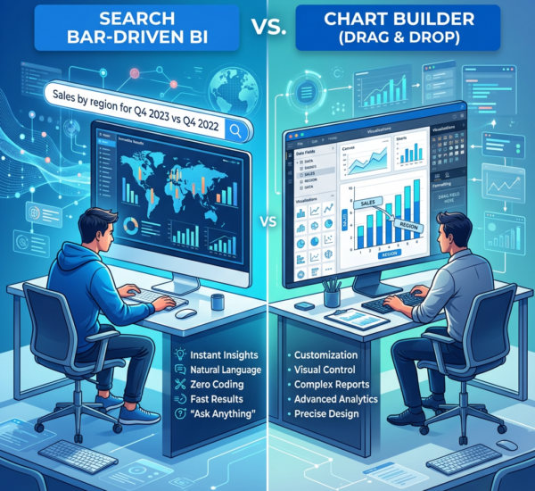
Looker Studio is powerful but requires manual configuration for every data source, chart, and update. Pulse AI connects to your data and generates dashboards automatically — just ask a question in plain English and get an interactive visual in seconds. Most teams have their first dashboard running in under 5 minutes.
Looker Studio vs Other BI Tools
| Feature | Looker Studio | Power BI | Tableau | Pulse AI |
|---|---|---|---|---|
| Price | Free | $10-20/user/month | $15-70/user/month | Free tier available |
| Setup time | 30-45 min | 60+ min | 60+ min | 30 seconds |
| Data sources | 800+ (via connectors) | 100+ native | 80+ native | 50+ (growing) |
| Learning curve | Low-Medium | High | High | Very Low |
| AI insights | None | Basic (Copilot) | Basic | Advanced |
| Best for | Google Workspace users, marketing dashboards | Enterprise teams with Microsoft stack | Large orgs with analyst teams | Non-technical users who need instant insights |
What to Do Next
Level up your Looker Studio dashboards:
- Add calculated fields: Create custom metrics like Conversion Rate or Average Order Value
- Data panel → Add a field → enter formula (e.g.,
Revenue / Orders)
- Data panel → Add a field → enter formula (e.g.,
- Use blended data: Combine multiple data sources in one chart
- Resource → Manage blended data → select sources to merge
- Create drill-down pages: Let viewers click a metric to see details
- Add a new page → Link charts using Report-level filter
Explore alternatives if Looker Studio isn't working:
- Add a new page → Link charts using Report-level filter
- Too slow or complex? Try Pulse AI for automated dashboard generation
- Need advanced analytics? Power BI or Tableau offer more analytical depth
- Real-time updates critical? Use BigQuery as your data source or switch to a real-time BI tool
Frequently Asked Questions
Is Looker Studio really free?
Yes, completely free with unlimited dashboards and viewers. There are no hidden costs. The only potential cost is if you use premium data connectors from third-party providers (most connectors are free).
Can I use Looker Studio without Google Analytics?
Absolutely. You can connect to Google Sheets, databases, CRMs, advertising platforms, and hundreds of other sources. Google Analytics is just one option — not required.
How do I make my dashboard update automatically?
Looker Studio refreshes data when someone opens the dashboard. For database connections, set refresh frequency in your data source settings. For real-time updates, connect to BigQuery or your database directly (without caching).
Can non-technical people use Looker Studio?
Yes, with some training. The interface is more user-friendly than Power BI or Tableau, but you still need to understand data concepts like dimensions, metrics, and aggregations. Expect a 2-3 hour learning curve for basic dashboards.
What's the difference between Looker Studio and Looker?
They're different products:
- Looker Studio (formerly Google Data Studio): Free web-based BI tool for creating dashboards
- Looker (acquired by Google): Enterprise data platform ($$$) with modeling layer and advanced analytics
Most small to mid-size businesses use Looker Studio, not Looker.
Can I connect Looker Studio to Salesforce or HubSpot?
Yes, via partner connectors. Search for "Salesforce connector" or "HubSpot connector" in the connector gallery. Most are free, but some premium connectors charge a fee.
How does Looker Studio compare to Tableau?
Looker Studio pros: Free, easier to learn, great for Google Workspace users
Tableau pros: More advanced analytics, better for large datasets, more customization
Choose Looker Studio if: You need a free tool, use Google data sources, want quick setup
Choose Tableau if: You have analyst resources, need advanced statistical analysis, budget allows
—
Related guides:
- How to Build a KPI Dashboard in Tableau
- Google Sheets vs Excel for Business Dashboards
- Best Looker Studio Alternatives in 2026