You have been tracking everything in spreadsheets — revenue, expenses, customer data, marketing metrics — and now you need a way to actually see what is going on. Scrolling through rows of numbers is not working anymore. You need a dashboard. The question is: what is the fastest, most effective way to turn your spreadsheet data into something visual and actionable?
In 2026, you have more options than ever, from free drag-and-drop tools to AI-powered platforms that build dashboards for you automatically. Here is a complete breakdown of your options, what works best for different situations, and how to get from spreadsheet to dashboard in the least amount of time.
Why Spreadsheets Are Not Enough for Data Visualization
Spreadsheets are excellent for data storage and basic calculations, but they were never designed to be dashboards. The charts you can build in Excel or Google Sheets are static, limited in interactivity, and difficult to share in a way that non-technical team members can explore on their own.
The core limitations include lack of real-time updating (you have to manually refresh), no drill-down capability (you cannot click a chart element to see the underlying data), poor mobile experience, and no automated alerting. When your business depends on timely decisions, these limitations cost you money.
Method 1: AI-Powered Dashboard Builders (Fastest, Recommended)
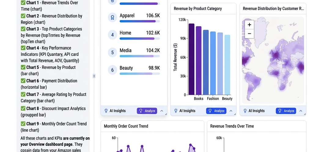
AI-powered platforms like Pulse AI represent the newest and fastest approach. You upload or connect your spreadsheet, and the AI analyzes your data structure, suggests relevant visualizations, and builds a dashboard automatically. You can then ask questions in natural language like “show me monthly revenue trends” or “which product category is growing fastest” and the dashboard updates in real time.
How it works with Pulse AI: Connect your Google Sheets or upload a CSV file. The AI scans your columns, identifies data types (dates, currencies, categories, metrics), and creates an initial dashboard with the most relevant charts. You refine by asking questions or dragging elements. The entire process takes under 10 minutes for most spreadsheets.
Best for: Business owners and teams who want insights fast without learning dashboard design. Especially powerful when you have complex data with many columns and want AI to surface the most important patterns automatically.
Time to first dashboard: 5-10 minutes.
Method 2: Google Looker Studio (Free, Manual)
Google Looker Studio (formerly Data Studio) connects directly to Google Sheets and is completely free. You create dashboards by manually adding charts, selecting data ranges, and configuring each visualization. It offers good design flexibility but requires you to know what you want to show before you start building.
Best for: Teams already using Google Sheets who have time to learn the tool and a clear idea of what metrics to visualize.
Time to first dashboard: 30-60 minutes for a basic dashboard, several hours for something polished.
Method 3: Microsoft Power BI (Powerful, Steeper Learning Curve)
Power BI connects to Excel files and has powerful data modeling capabilities. The free desktop version is surprisingly capable, though the learning curve is steeper than other options. If you are already in the Microsoft ecosystem and comfortable with formulas and data relationships, Power BI gives you the most control.
Best for: Excel power users who want advanced data modeling and are willing to invest time learning the tool.
Time to first dashboard: 1-3 hours depending on Excel proficiency.
Method 4: Notion or Airtable (Simple, Limited)
If your data is relatively simple (under 10 columns, straightforward metrics), tools like Notion and Airtable offer built-in chart views that can create basic dashboards directly from your data tables. They are not full BI tools, but for simple tracking dashboards — sales pipeline, project status, inventory counts — they work surprisingly well.
Best for: Simple datasets where you need a quick visual overview, not deep analysis.
Time to first dashboard: 10-20 minutes.
Step-by-Step: Creating Your First Dashboard From a Spreadsheet
Regardless of which tool you choose, the process follows the same pattern:
Step 1: Clean your data. Make sure your spreadsheet has clear column headers in the first row. Remove merged cells, empty rows between data, and inconsistent formatting. Dates should be in a consistent format. Numbers should not have text mixed in. This step prevents 90% of dashboard problems.
Step 2: Identify your key metrics. Before building anything, write down the 3-5 questions you want the dashboard to answer. “What is our monthly revenue trend?” “Which products sell best?” “Where is our marketing budget going?” These questions determine which charts you need.
Step 3: Connect your data source. Upload the file or link your cloud spreadsheet. AI tools like Pulse AI will automatically detect your data structure. Manual tools require you to specify which columns contain what.
Step 4: Build or generate your dashboard. With AI tools, this happens automatically — review and refine the suggestions. With manual tools, add one chart at a time: start with the most important metric, get it right, then add the next one.
Step 5: Set up automatic refresh. If your spreadsheet updates regularly, configure your dashboard to pull new data automatically. Most tools support scheduled refreshes or live connections to Google Sheets.
Common Spreadsheet Data Types and Best Dashboard Visualizations
Time-series data (revenue by month, website traffic by week) — use line charts or area charts. These show trends over time and make it easy to spot growth or decline.
Categorical comparisons (sales by product, revenue by region) — use bar charts or horizontal bar charts. These make it easy to compare categories side by side.
Proportions (market share, budget allocation) — use pie charts or donut charts sparingly. They work well for 3-5 categories but become unreadable with more.
Single metrics (total revenue, customer count, conversion rate) — use KPI cards or scorecards. Big numbers with trend indicators give an instant snapshot of performance.
Relationships between variables (ad spend vs revenue, price vs sales volume) — use scatter plots. These reveal correlations that are invisible in spreadsheet rows.
How to Keep Your Dashboard Updated Automatically
The biggest mistake people make with dashboards is building one and then never updating the data. Here is how to keep it fresh without manual effort:
Use Google Sheets instead of Excel files. Most dashboard tools can connect to Google Sheets via a live connection, meaning your dashboard always shows the latest data. With Excel files, you typically need to re-upload or set up scheduled imports.
Connect directly to your data sources. Instead of manually exporting data to a spreadsheet and then to a dashboard, connect your dashboard tool directly to Stripe, HubSpot, Google Analytics, or whatever tools generate the data. Platforms like Pulse AI offer native integrations that eliminate the spreadsheet middleman entirely.
Schedule automated exports. If you must use spreadsheets as an intermediate step, automate the export using Zapier, Make, or native tool integrations. Data flows automatically from source to spreadsheet to dashboard.
Frequently Asked Questions
Can I create a dashboard from an Excel file?
Yes. Most dashboard tools accept Excel (.xlsx) file uploads. Power BI has the deepest Excel integration, but AI tools like Pulse AI and free tools like Google Looker Studio also import Excel files directly. For live updating, consider moving your data to Google Sheets or connecting your dashboard tool directly to the data source.
What is the fastest way to visualize spreadsheet data?
AI-powered tools like Pulse AI are the fastest option. Upload your spreadsheet and the AI generates a dashboard with relevant charts in under 10 minutes — no configuration required. For a free option, Google Looker Studio connected to Google Sheets is the fastest manual approach.
How many rows of data can dashboard tools handle?
Most modern dashboard tools handle hundreds of thousands to millions of rows without issues. Google Looker Studio handles up to 5 million rows from BigQuery sources. Power BI handles tens of millions of rows with proper data modeling. AI tools like Pulse AI scale automatically based on your data size. For most small business spreadsheets (under 100,000 rows), any tool will work fine.
Do I need to know SQL or coding to create a dashboard?
No. All modern dashboard tools designed for business users are no-code. AI-powered tools like Pulse AI go further — you do not even need to know dashboard design principles because the AI handles layout and chart selection for you. You just need your data and the questions you want to answer.