You want to see your business metrics in one place — revenue, customer acquisition, marketing performance, inventory levels — but you don’t know SQL, Python, or any programming language. Good news: in 2026, you can build a fully functional business dashboard in under 10 minutes without writing a single line of code. Here’s exactly how.
What Is a No-Code Dashboard and How Does It Work?
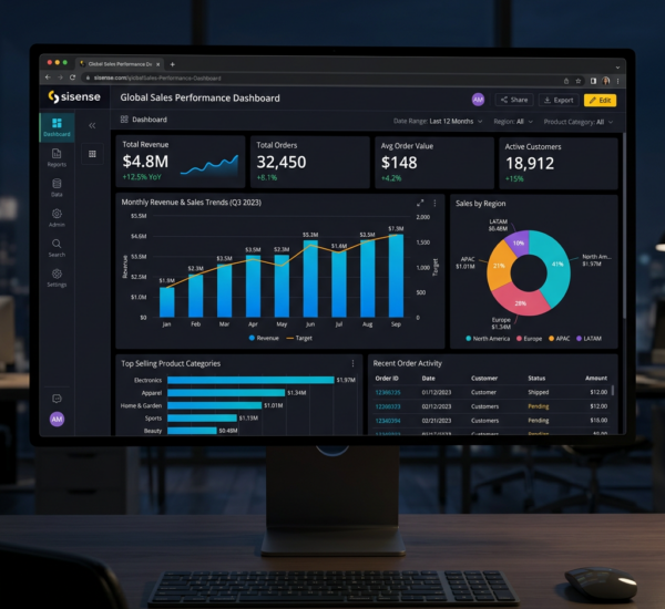
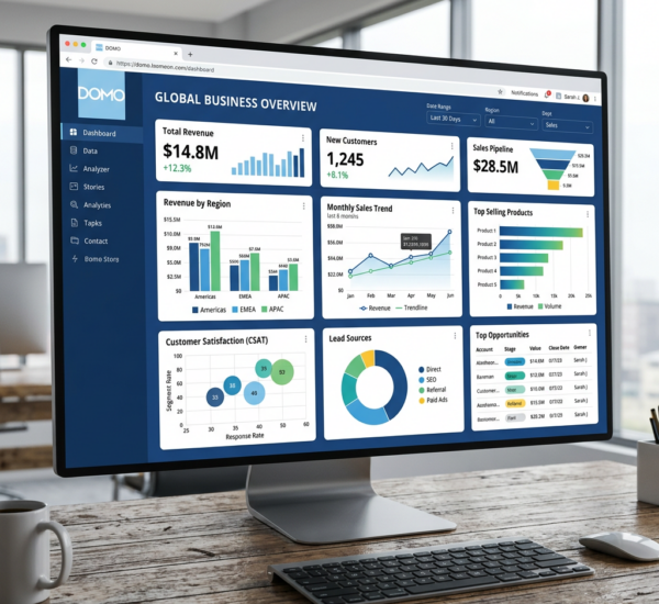
A no-code dashboard is a visual display of your key business metrics that updates automatically. Instead of building charts in spreadsheets or hiring a developer, you use a platform that connects directly to your data sources (Shopify, Google Analytics, QuickBooks, Stripe, etc.) and generates dashboards automatically.
Modern AI-powered dashboard tools go further: they don’t just display data you configure — they analyze your data and suggest which metrics matter most, create visualizations automatically, and alert you when something important changes.
Step-by-Step: Build Your First Dashboard in 10 Minutes
Step 1: Choose your tool (1 minute). For non-technical users, Pulse AI is the fastest path. It’s designed specifically for business owners who want insights without technical complexity. Other options include Databox, Geckoboard, and Google Looker Studio (though Looker Studio requires more manual setup).
Step 2: Connect your data sources (3–5 minutes). Most no-code dashboard tools offer one-click integrations. Common connections include: Shopify/WooCommerce (e-commerce data), Google Analytics (website traffic), Stripe/PayPal (payment data), QuickBooks/Xero (financial data), Google Ads/Meta Ads (advertising data), HubSpot/Salesforce (CRM data). You’ll authorize each connection with your login credentials — no API keys or technical setup needed.
Step 3: Select your key metrics (2 minutes). AI-powered tools like Pulse AI will suggest metrics based on your data sources. For a typical e-commerce business, your starter dashboard might include: total revenue (daily/weekly/monthly), conversion rate, average order value, customer acquisition cost, top-selling products, and traffic sources.
Step 4: Customize and share (2 minutes). Arrange your metrics, choose visualization types (charts, numbers, tables), set your date ranges, and share with your team. Most tools let you create different views for different roles — a CEO view with high-level KPIs, a marketing view with campaign metrics, a finance view with P&L data.
Best No-Code Dashboard Builders for Business in 2026
Pulse AI — Best for AI-powered insights with zero setup. Connects your data sources and automatically generates dashboards with natural language querying. Ask questions like “What’s driving our revenue growth this month?” and get instant answers. Try Pulse AI →
Databox — Best for marketing KPI tracking. Pre-built templates for common marketing dashboards. Good for teams that want templated views rather than AI-generated insights.
Geckoboard — Best for TV dashboard displays. Designed to be displayed on office screens. Clean, simple interface with limited analytics depth.
Google Looker Studio — Best free option. Powerful but requires more manual configuration. Great if you’re already deep in Google’s ecosystem and don’t mind spending time on setup.
Klipfolio — Best for custom metrics. More technical than Pulse AI or Databox, but offers more customization for teams that need precise control over calculations.
AI Dashboard Creation: Why It’s Better Than Drag-and-Drop
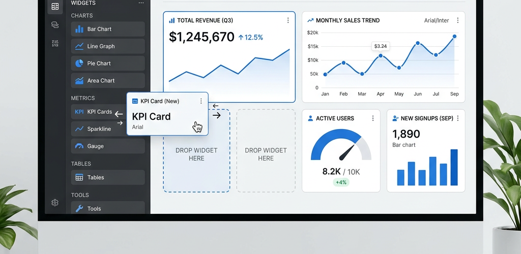
Traditional no-code dashboard tools use drag-and-drop interfaces. You manually select metrics, choose chart types, and arrange layouts. This is better than coding, but it still requires you to know what to measure and how to visualize it.
AI dashboard creation flips this model. Instead of you telling the tool what to show, the AI analyzes your data and shows you what matters. It identifies trends you didn’t know to look for, suggests metrics you should track but aren’t, and creates visualizations optimized for the type of data being displayed.
For example, if your e-commerce revenue suddenly drops 15% on a Tuesday, a drag-and-drop dashboard shows a dip on your revenue chart — if you happen to look at it. An AI dashboard proactively alerts you, explains that the drop correlates with a shipping delay from your main supplier, and shows which products are most affected.
Dashboard Templates for Non-Technical Users
If you’re not sure where to start, here are the most valuable dashboards by business function:
Executive overview: Total revenue, growth rate, profit margin, customer count, top 5 metrics by impact. This is the “how’s the business doing?” dashboard.
Marketing performance: Traffic by source, conversion rates by channel, customer acquisition cost, campaign ROI, top-performing content. This tells you where your growth is coming from.
Sales pipeline: Open deals by stage, conversion rate between stages, average deal size, sales cycle length, forecast vs actual. This tells you if you’ll hit your revenue targets.
Financial health: Cash flow, accounts receivable aging, expense breakdown, burn rate, runway. This tells you if the business is financially healthy.
Customer success: Churn rate, NPS/satisfaction scores, support ticket volume, time to resolution, customer lifetime value. This tells you if customers are happy.
How to Create a KPI Dashboard Without a Developer
The most common reason businesses don’t have dashboards is the assumption that you need a developer or data analyst to build one. In 2026, that’s simply not true. Here’s the reality:
Time to first dashboard: 5–10 minutes with AI tools (Pulse AI), 30–60 minutes with drag-and-drop tools (Databox, Klipfolio), 2–8 hours with Looker Studio (requires manual config), 1–4 weeks with traditional BI tools (Tableau, Power BI — needs analyst).
Ongoing maintenance: AI-powered dashboards update automatically and adapt as your data changes. Traditional dashboards need manual updates when you add new products, campaigns, or data sources.
Cost without a developer: $0–$100/month for the tool itself. Compare this to hiring a data analyst ($5,000–$10,000/month) or a freelance BI developer ($100–$200/hour) to build and maintain custom dashboards.
Frequently Asked Questions
Can I build a dashboard from my Excel spreadsheets?
Yes. Most dashboard tools can import data from Excel/Google Sheets. However, if your data is in spreadsheets, you’ll get more value from a tool like Pulse AI that can also connect to your live business systems (Shopify, QuickBooks, etc.) so your dashboard updates automatically instead of requiring manual CSV uploads.
How many data sources can I connect to one dashboard?
Most AI analytics tools support 10+ simultaneous data source connections. Pulse AI has no hard limit — you can connect your e-commerce platform, accounting software, CRM, marketing tools, and more into a single unified dashboard.
Do I need to clean my data before connecting it to a dashboard tool?
AI-powered tools handle basic data cleaning automatically — deduplication, format normalization, and missing value handling. Traditional dashboard tools may require you to prepare your data first, which can be a significant time investment.
Can I share my dashboard with my team without giving them login access?
Most dashboard tools offer view-only sharing via links, embedded dashboards, scheduled email reports (PDF/screenshot), and role-based access controls so team members see only the data relevant to their role.